01 · The starting point
A connected business. A clearer digital story.
Evolution brings together specialist companies across events, scenic fabrication, technical production, furniture, props and site infrastructure. The challenge was to make that breadth easier to understand without making every visitor read the whole company story.
I explored the website as an AI-assisted design experiment, focusing on the group homepage and the Furniture experience. This is a working redesign concept, rather than a claim that the company has adopted or launched it.
02 · What changed
Less explanation before the first useful step.
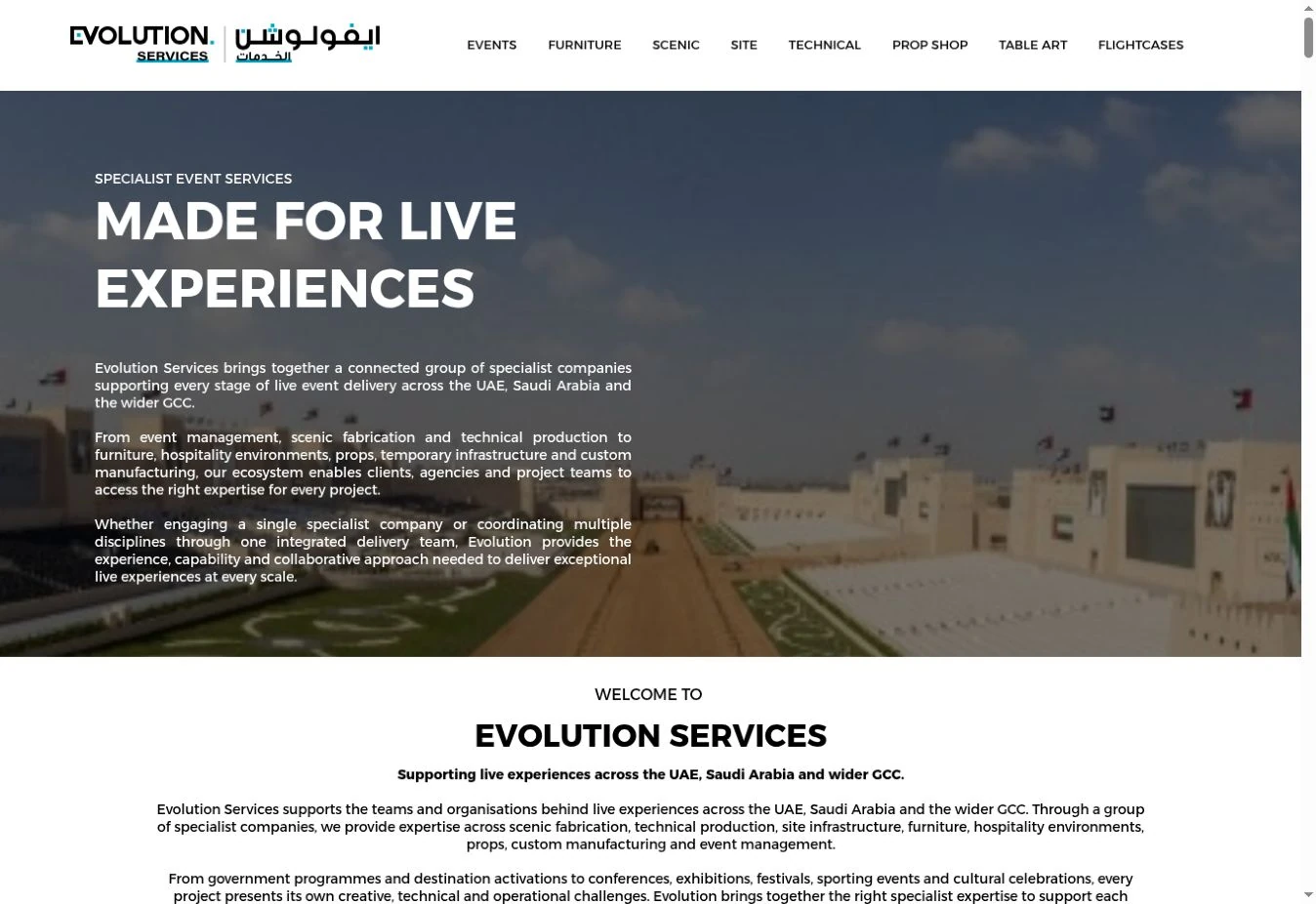
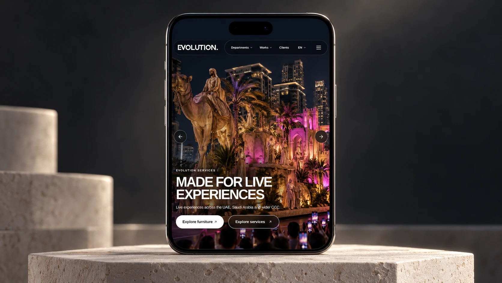
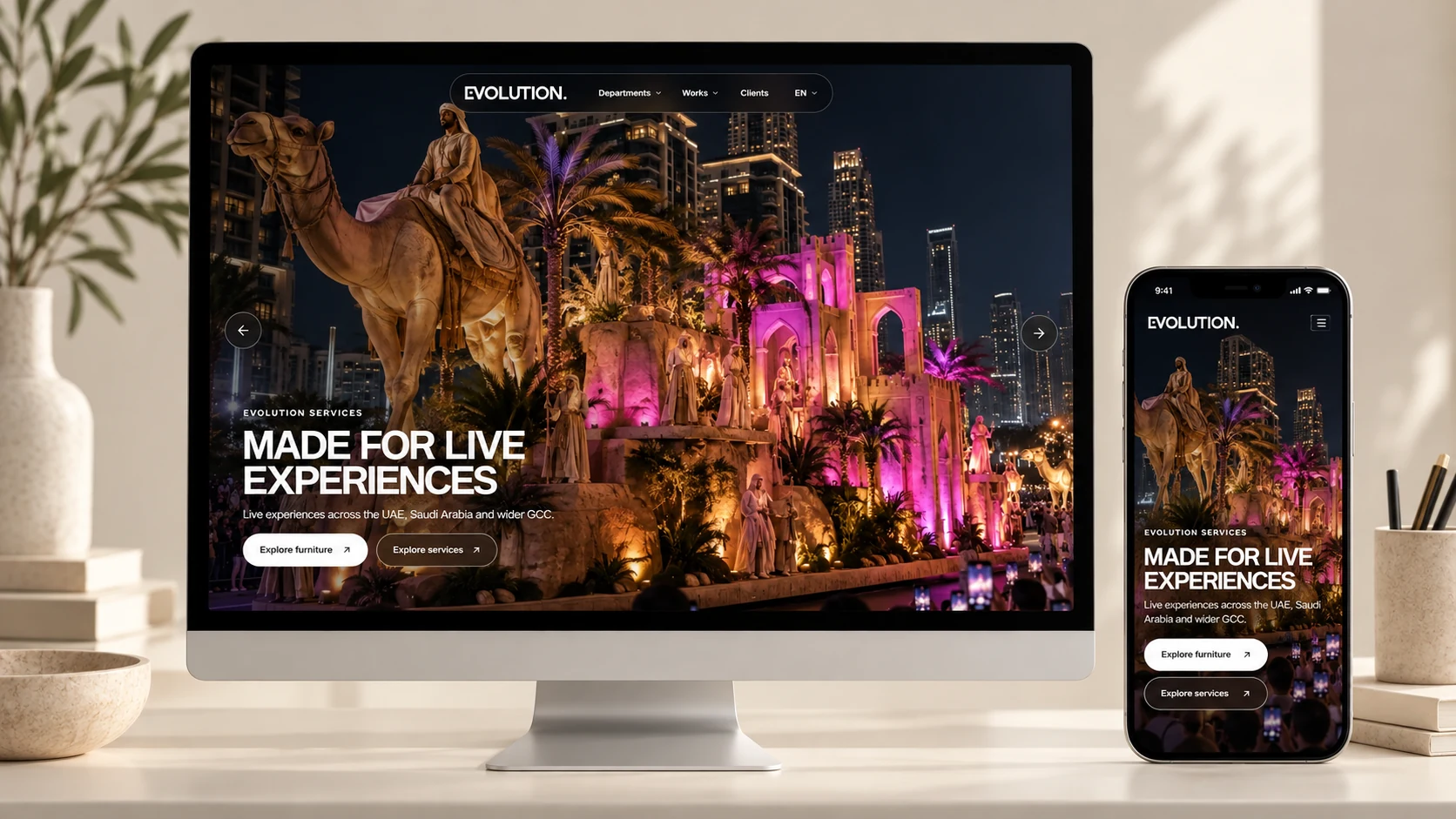
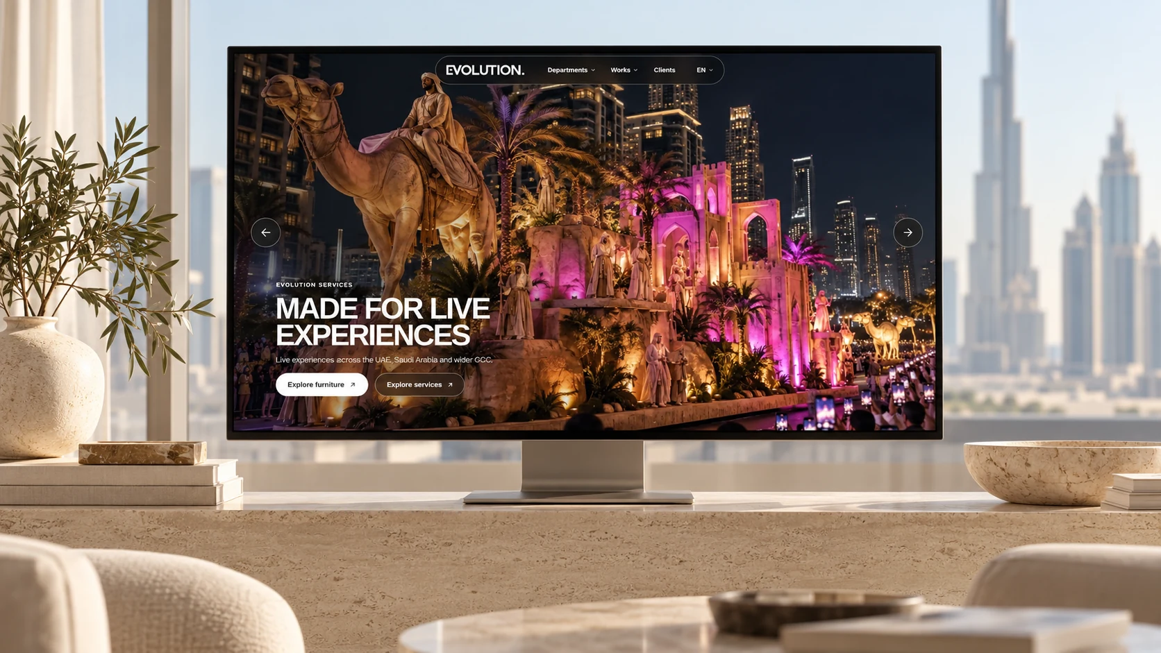
The current homepage places several paragraphs in the opening view, then repeats detailed introductions across its specialist companies. The concept moves the introduction into one short line and brings Furniture and Services into the first view.
This comparison uses the company website as it appears today. It is a present-day reference, not an archived screenshot of the site at the start of the project.
03 · Information architecture
One group. Clear routes into each specialism.
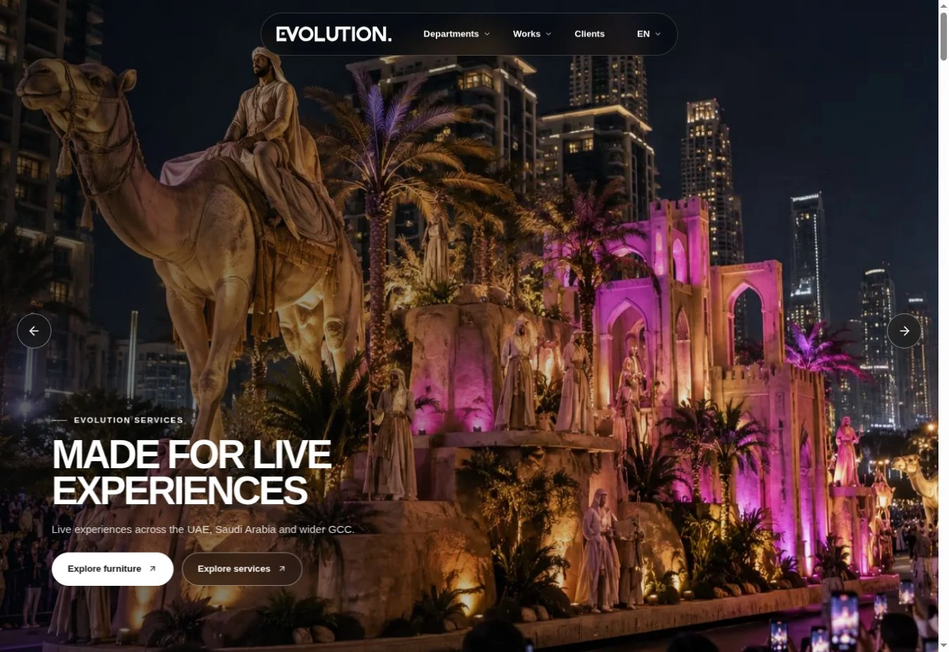
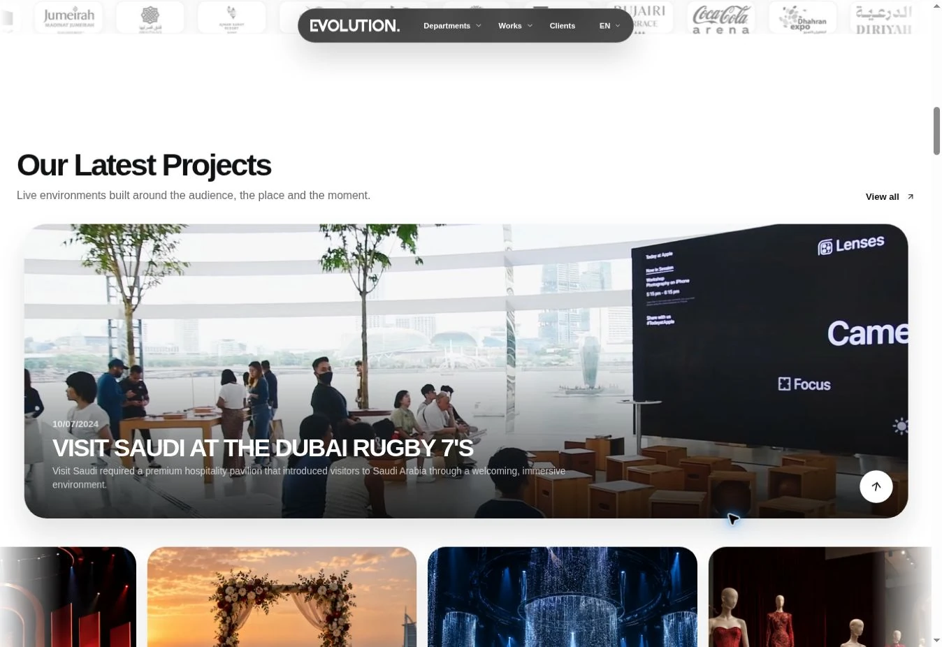
Departments, Works and Clients give visitors different ways into the same business. The ecosystem section introduces the specialist companies together, so the relationship between them stays visible.
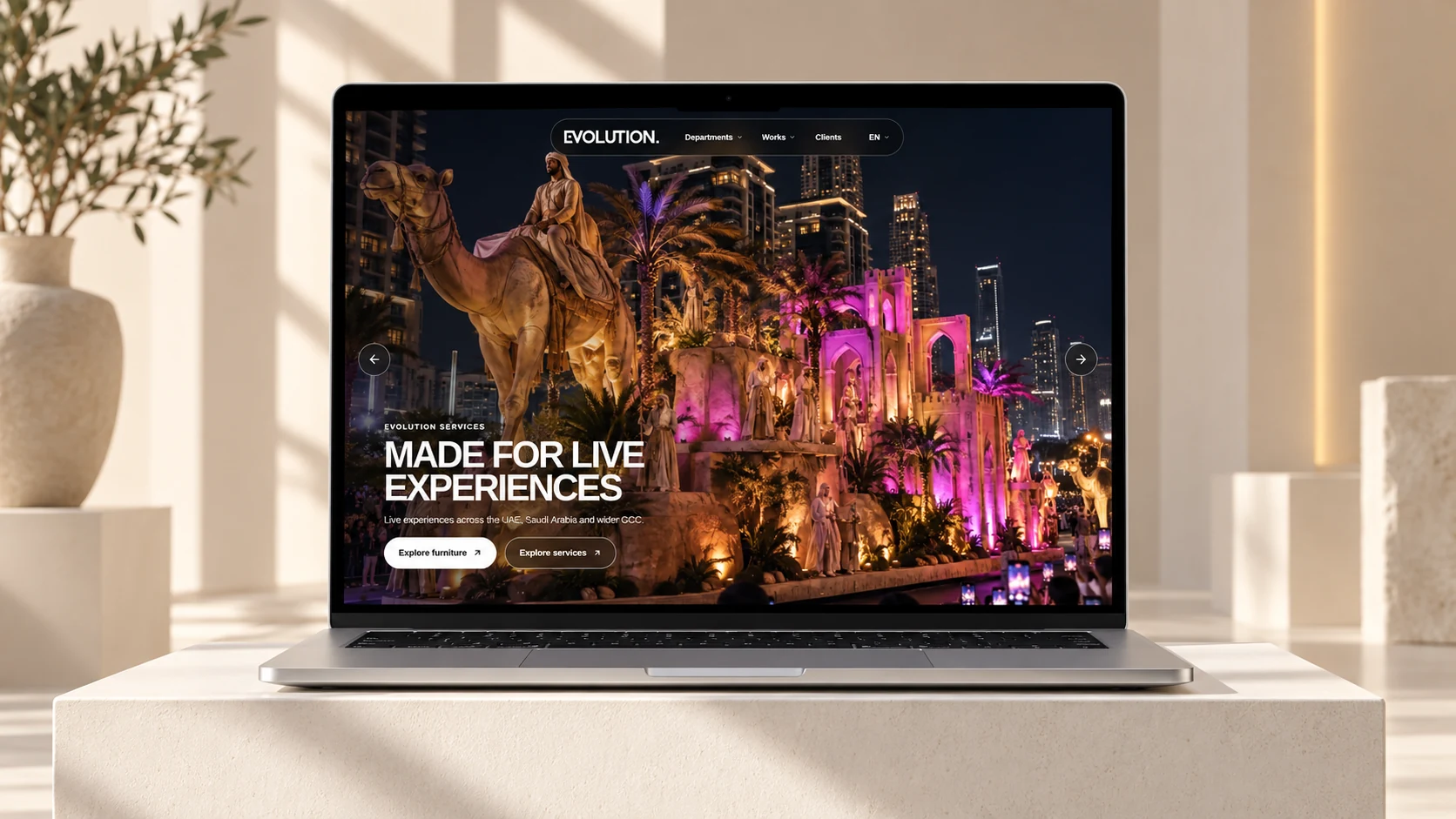
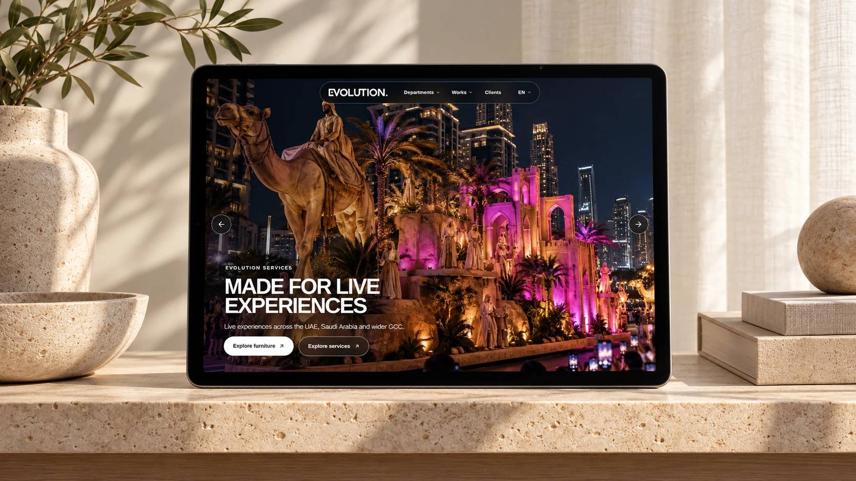
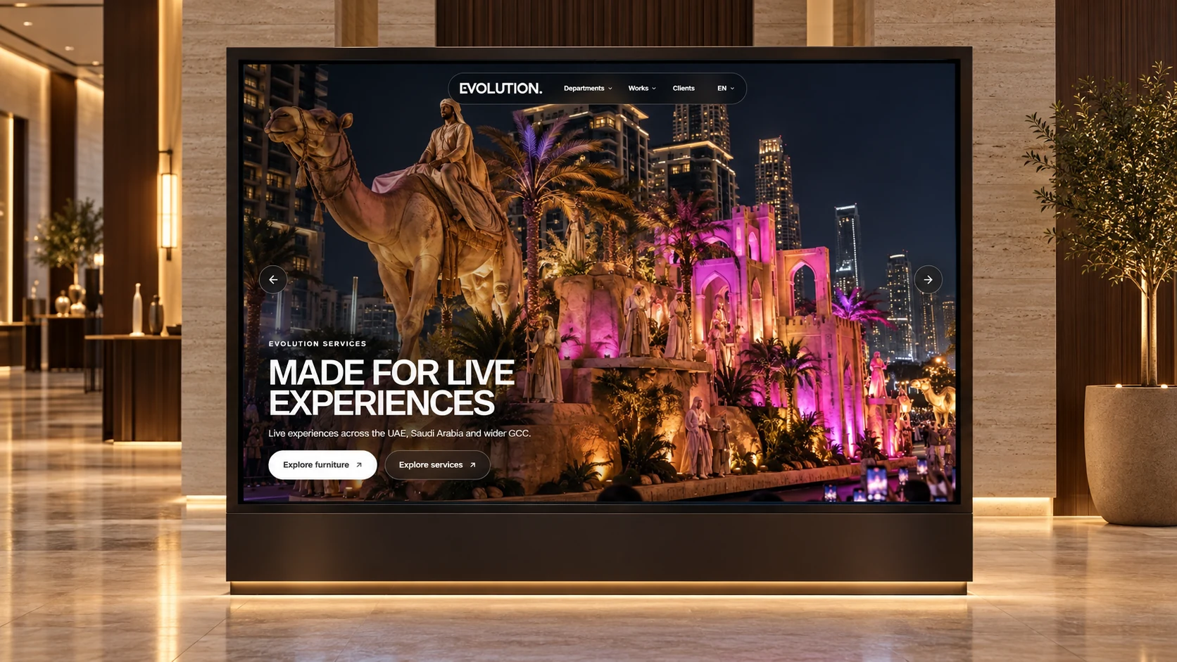
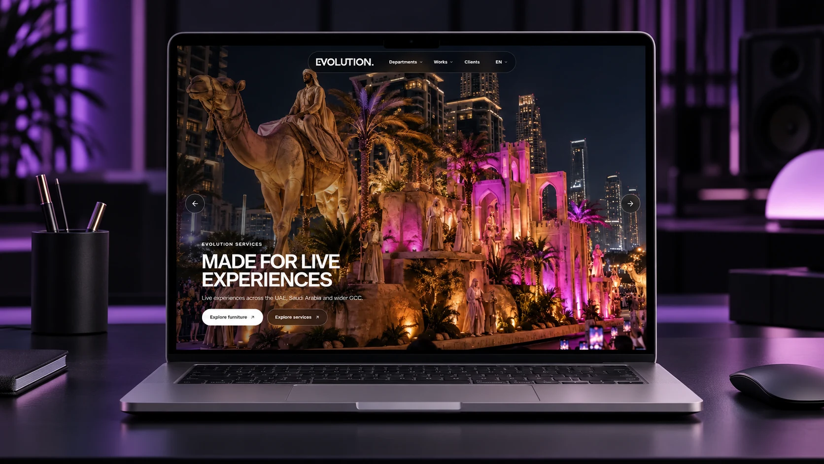
Large project photography establishes the scale of the work. Concise headings and separate sections give each part of the story a clear purpose, while the floating navigation keeps the main routes close.
04 · A more useful catalogue
From the space you need to the pieces that fit.
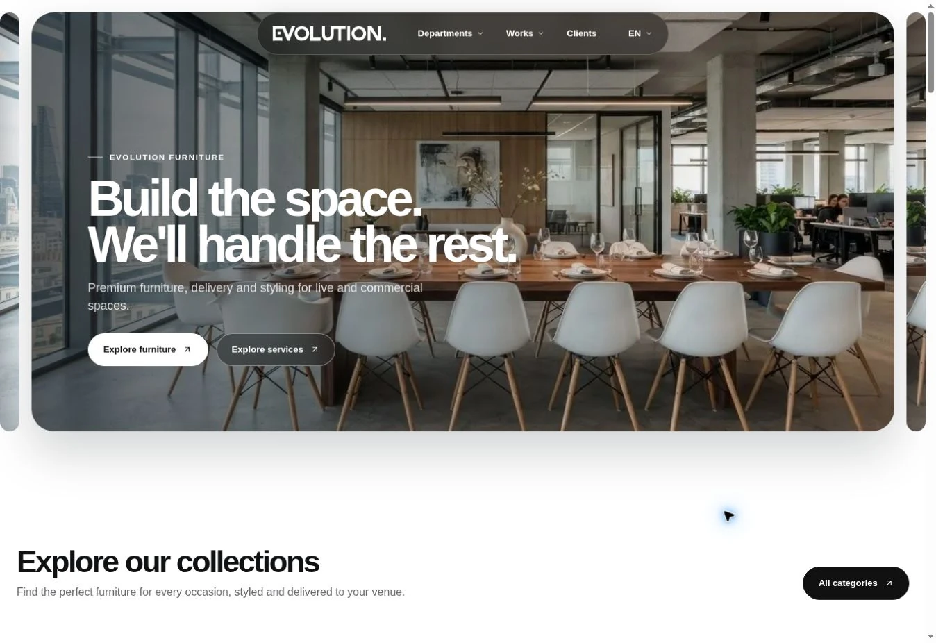
Furniture gets a dedicated journey: a styled environment first, then collections, new arrivals and service categories. Product cards keep the image, name, reference code and starting price together, with an Add to quote action close by.
The intention is to connect inspiration with browsing. The demo illustrates that direction; sample prices and quote actions are part of the prototype, not a live rental or stock commitment.
05 · Behind the website
Make updates easier for the team, too.
The Furniture team was spending substantial manual effort updating content, products and images. I used this experiment to explore how AI could support those repetitive tasks and help the team prepare updates more quickly.
Reusable page patterns and a consistent image direction make that workflow easier to repeat. Automated publishing and measured time savings were not established by this demo, so the opportunity is presented as a next step rather than a delivered result.
06 · Refining the experience
Small fixes that let the story work.
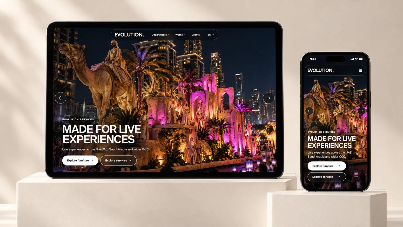
The iteration addressed mobile hero text and button sizing, slider overlaps, header resizing and a white edge around the hero. These were practical layout corrections, helping the content remain readable as the viewport changes.
Emoji glyphs were replaced with consistent SVG icons. Menu and language controls were also reviewed. The aim was a coherent interface across the homepage and Furniture page, rather than adding more visual effects.
07 · The working concept
Explore the direction for yourself.
The live concept includes the group homepage and Furniture page. Explore the hero, departments menu, service selector and catalogue to see how the direction connects.
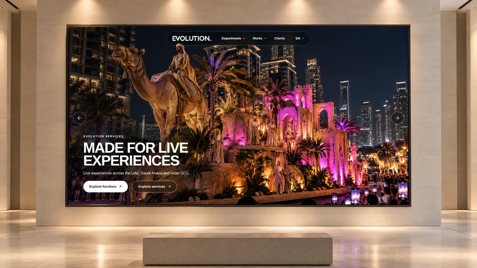
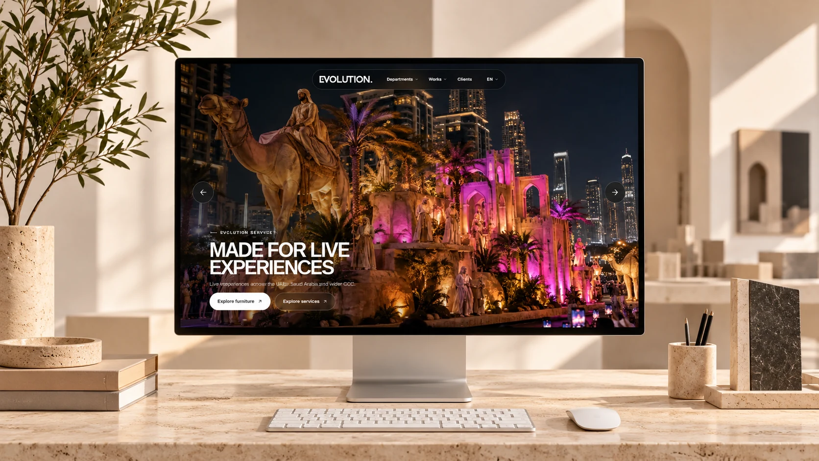
The screenshots above document the real websites. The ten device and spatial images are generated presentation mockups, included to show the visual direction in context.