01 · Brand direction
From Core to Clarity.
Rock layers hold memory. Core samples and sediments record the planet’s history; the lab preserves, decodes and activates that knowledge. The brand had to connect a physical archive with a forward-looking scientific facility.
The central idea moves from physical samples to digital data, from observation to prediction, and from layers to logic. ‘From Core to Clarity’ makes that journey the brand’s promise: depth becomes discovery.
The brief connects scientific work, teaching and preservation, including an archive spanning more than 70 years. The visual direction gives that legacy a language that can also support digital transformation and future energy exploration.
Underground intelligence
The earth holds raw data. ACL reads and activates what is stored in rock.
Scientific infrastructure
A high-tech facility built around accuracy, scale and performance, from teaching rooms to advanced labs.
Learning & legacy
Preserve geological knowledge while creating a place for future geologists, engineers and researchers to learn.
Surface to source
Move from visible landscapes to the depths beneath them, studying what is below to shape what is ahead.
A future energy hub
Decode the underground to inform more sustainable energy strategies.
02 · Strategic foundations
Grounded in science. Built to move forward.
Three qualities guide the identity. Precise means accurate, clear and intentional. Grounded means facts, material and substance. Future-focused means looking ahead while staying rooted in real data.
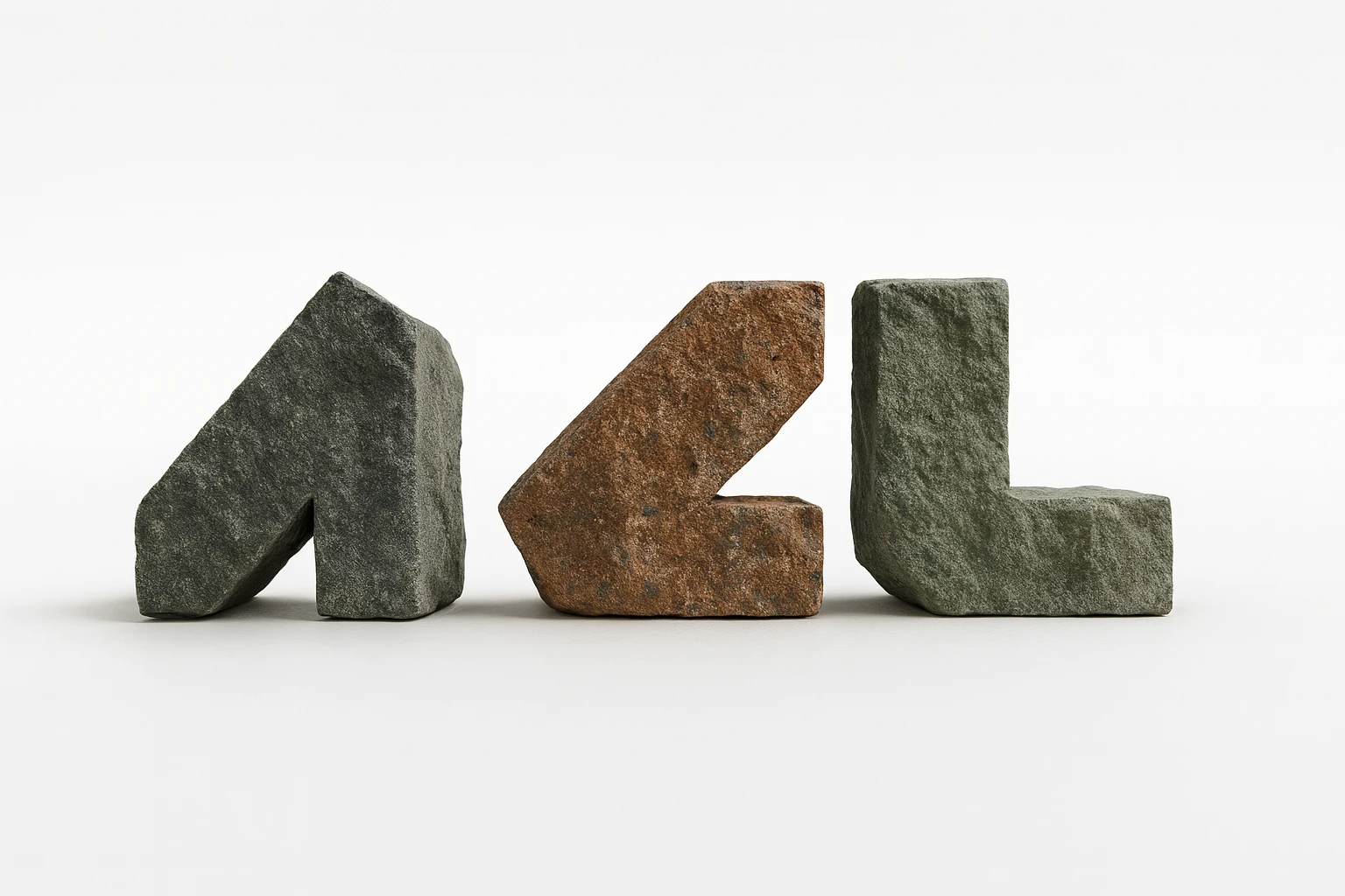
Each visual choice follows that direction: a bold monogram echoes core geometry; graphite reflects stone and the lab environment; electric accents bring innovation and momentum; a responsive identity adapts to different contexts with the reliability of a well-structured data system.
Precise
Clear geometry, deliberate spacing and a consistent construction system.
Grounded
Material references and a restrained graphite foundation establish authority.
Future-focused
Motion, bright accents and adaptable compositions make room for what comes next.
03 · Identity construction
Geological cuts. A clear signature.
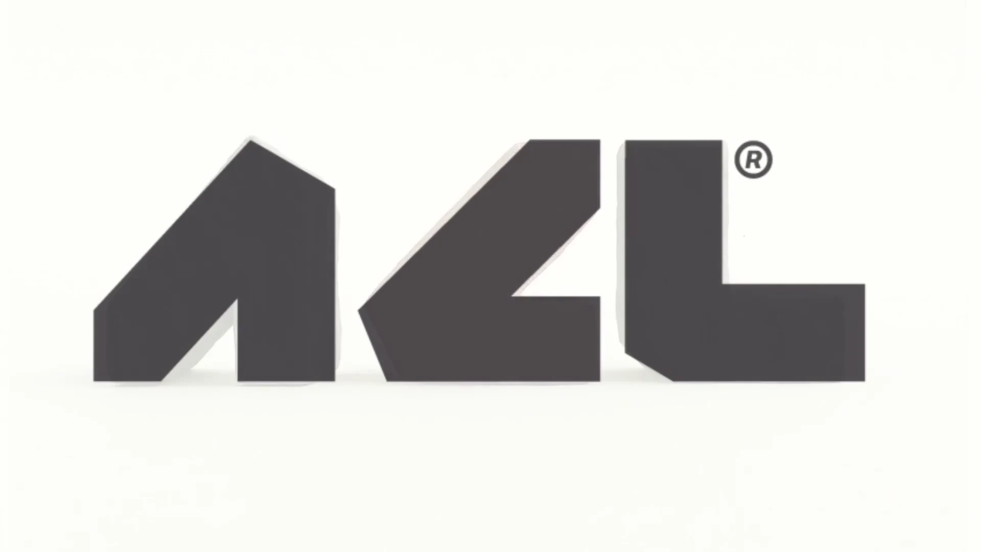
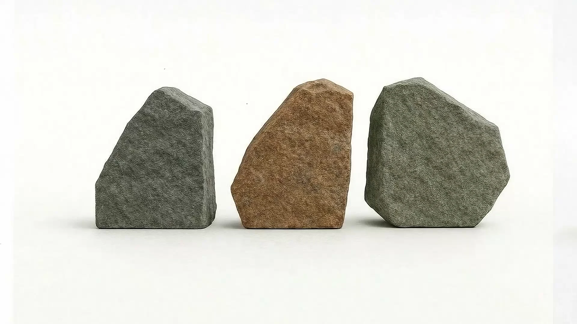
The ACL monogram takes its starting point from rock and core shapes: sliced, stacked and stored. The concept film makes the transformation visible, moving from three stone forms through precise cuts into a flat, recognizable symbol.
A modular grid controls the balance of each letter. Equal proportions and deliberate spacing keep the mark consistent at different scales. The clear-space rule derives from the width of a letterform, while horizontal and vertical arrangements share the same alignment logic.
The monogram can stand alone on icons, stamps and small applications. The full wordmark carries the Aethon Core Labs name when the context needs a complete introduction.
04 · An adaptable system
One identity. Different contexts.
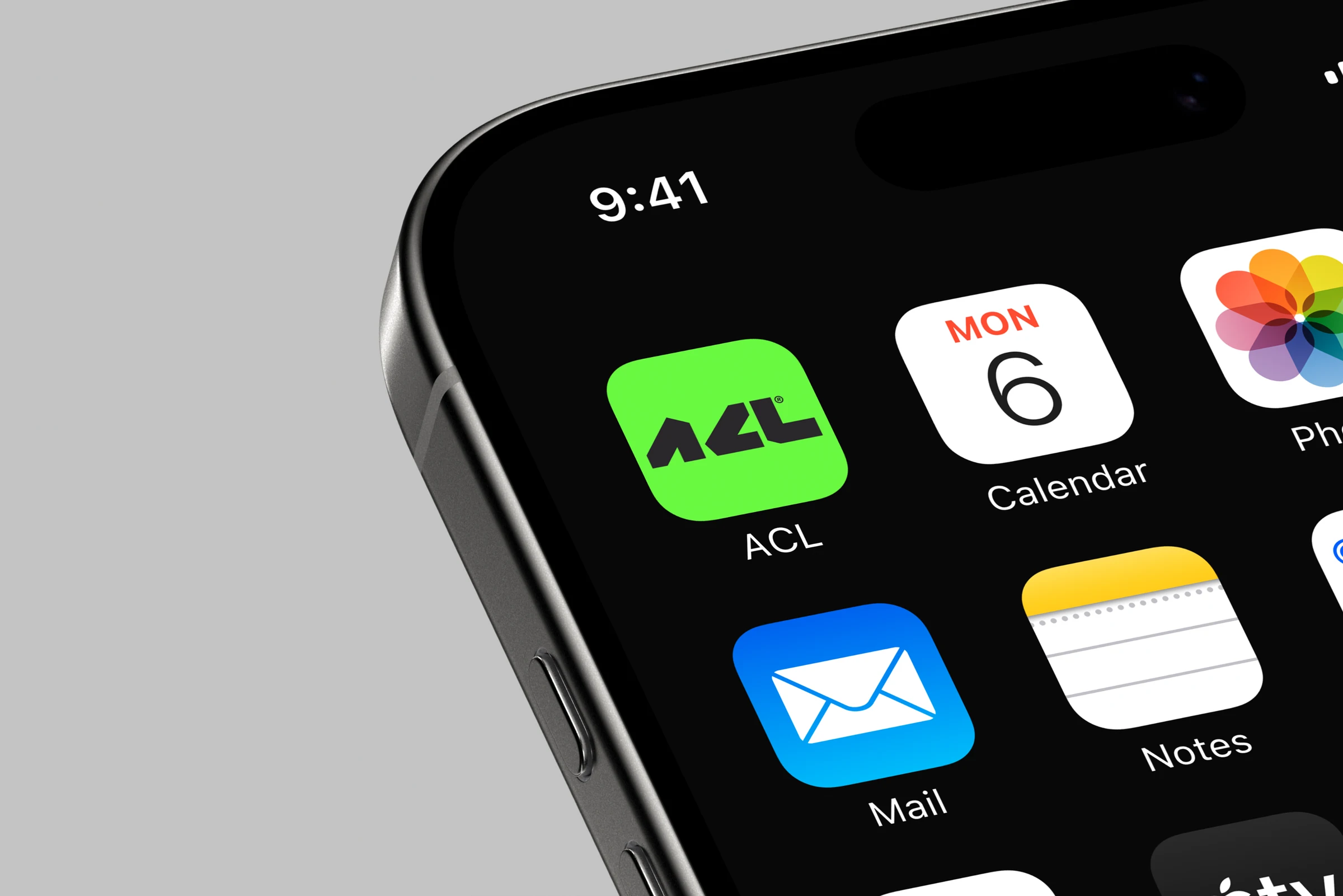
The logo system includes full, stacked and monogram versions in horizontal and vertical compositions. The identity can move between a large sign, a small interface, a laboratory badge and an archive box without losing its construction or character.
The format changes with the space available. The geometry, proportions and relationship between symbol and name stay consistent.



05 · Identity in motion
Precision with a natural rhythm.
The motion direction draws from geological shifts and laboratory sequences. Layering, measured reveals and transitions connect the identity’s technological precision with the flow of natural systems.
The supplied films show two expressions of the same idea: the transformation from stone to monogram, and a quieter logo reveal that introduces the full name on graphite.
06 · Visual language
Science at the core. Innovation in the details.
Graphite and greyscale give the system a grounded, professional foundation. Neon green and electric blue introduce a future-facing technical spark. A broader accent palette supports data visualizations, posters, interfaces and interactive communication.
The working guidelines organize color by brand, information, alert and background roles. Color is used with purpose, connecting scientific authenticity with a more expressive way to communicate information.
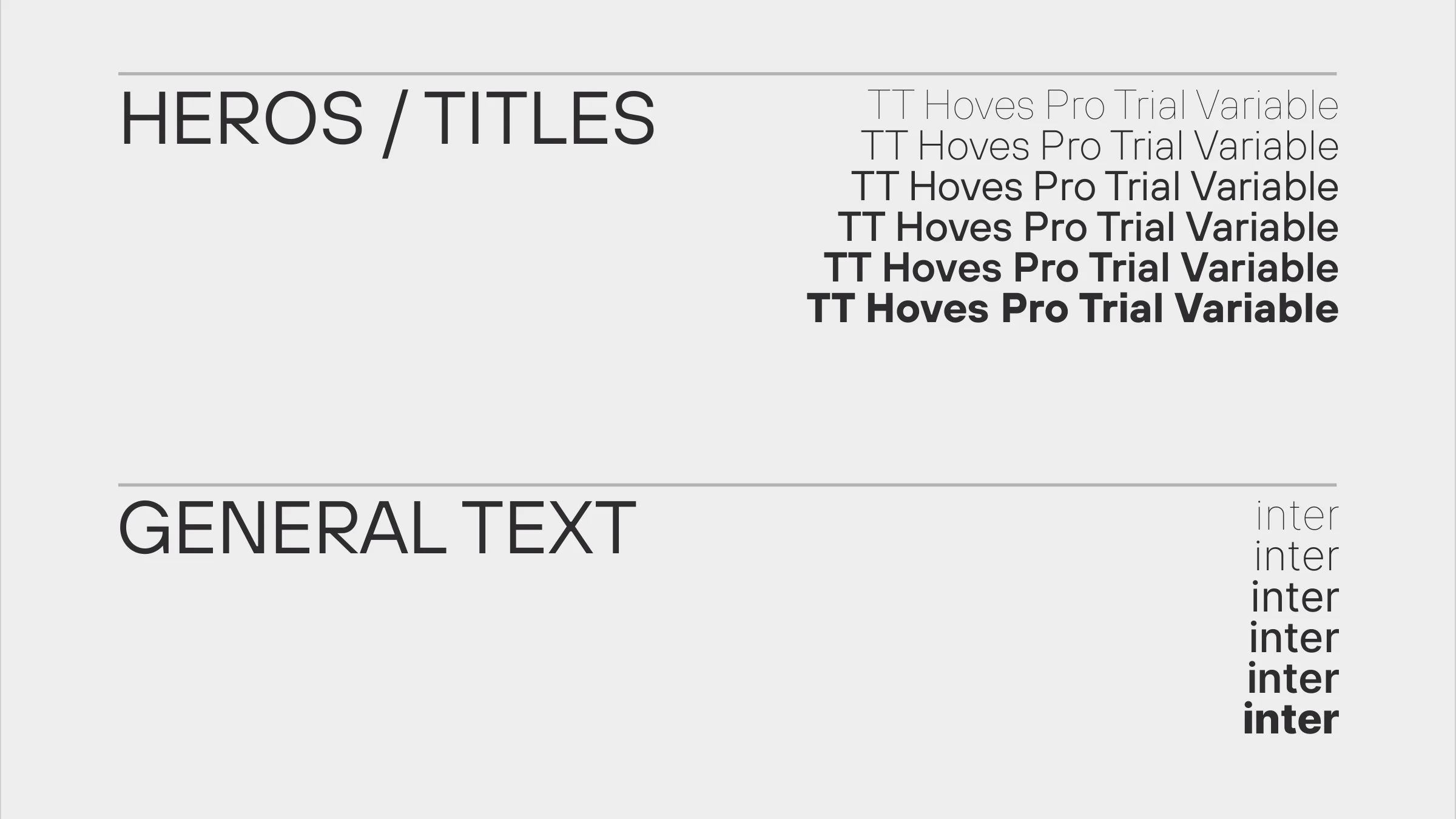
TT Hoves Pro leads the brand’s hero lines and titles. Inter supports general text. The combination is designed to communicate clarity, structure and scientific confidence.
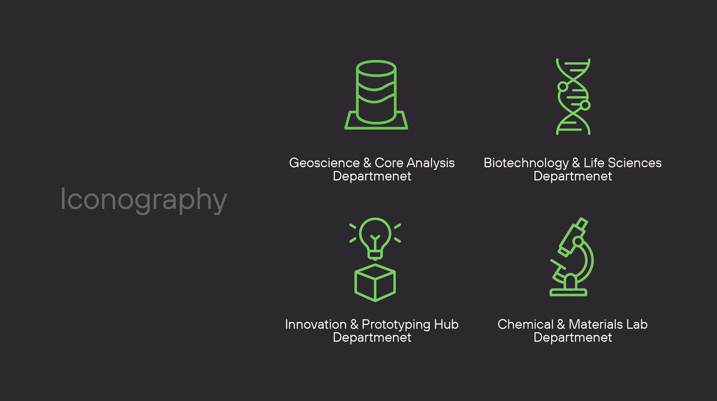
Department iconography gives each area a recognizable cue: Geoscience & Core Analysis, Biotechnology & Life Sciences, the Innovation & Prototyping Hub, and the Chemical & Materials Lab.
07 · Communication direction
Clarity in every word and image.
The voice is clear, factual and confident. Language should be precise, data-informed and professional, with a focus on progress, depth and discovery. Every word has a purpose; claims need scientific logic behind them.
Photography adapts to its audience and platform. A single visual tone is not expected to serve every website, social channel and internal context. The working direction explores macro detail, clean lab environments, contrast lighting, and the relationship between people and stone.
Do
- Be clear, factual and confident.
- Use precise, data-informed language.
- Stay grounded and professional.
- Communicate progress, depth and discovery.
- Give every word a purpose.
Avoid
- Overhype or exaggerate.
- Use slang or trend-driven expressions.
- Add fluff when clarity matters.
- Sound overly corporate or robotic.
- Make claims without scientific logic.
08 · The identity in context
From archive to interface.
The application studies bring the system into real working contexts: identification, archive packaging, signage, digital environments and event communication. The same geometric signature and controlled color language connect the touchpoints.
These are the application mockups from the original presentation, including the GeoFuture Summit 2026 concept. They show the proposed identity in use.
People & access
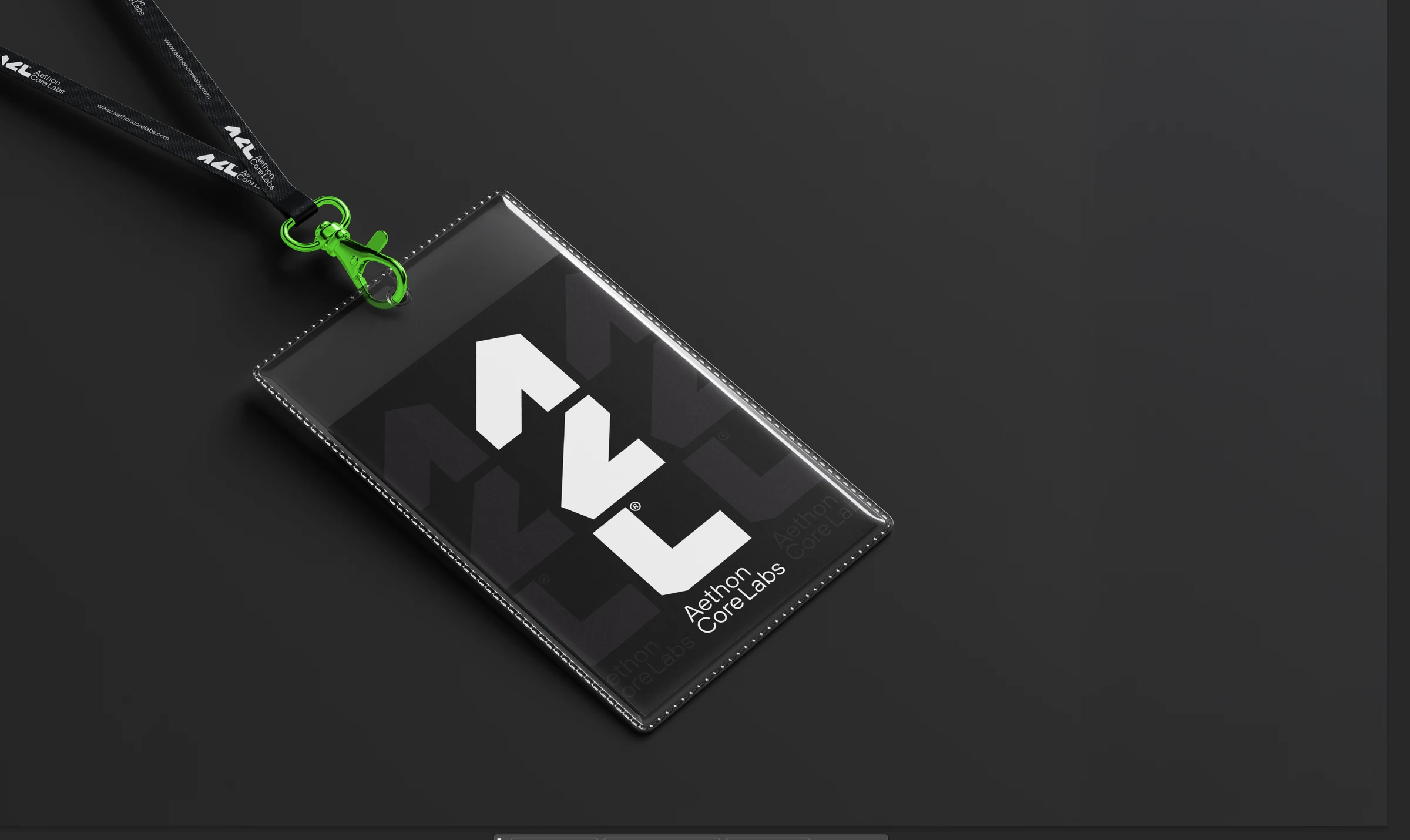
A vertically stacked mark on an ID badge, with a neon accent and restrained pattern.
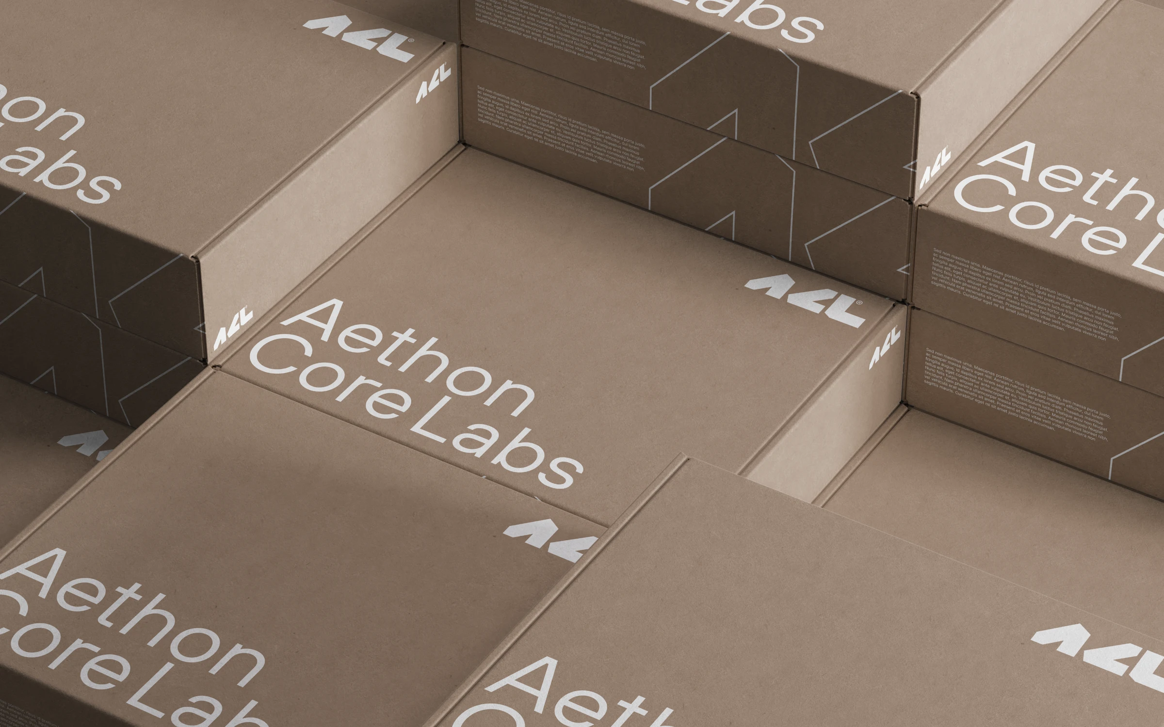
Archive & logistics
A clear, large-scale signature for core storage and archive packaging.
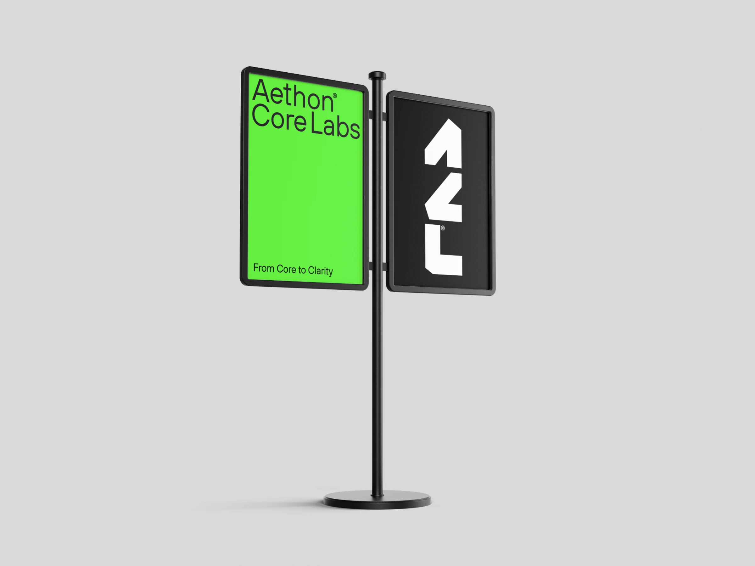
Space & wayfinding
The horizontal wordmark and vertical monogram adapt to different sign proportions.
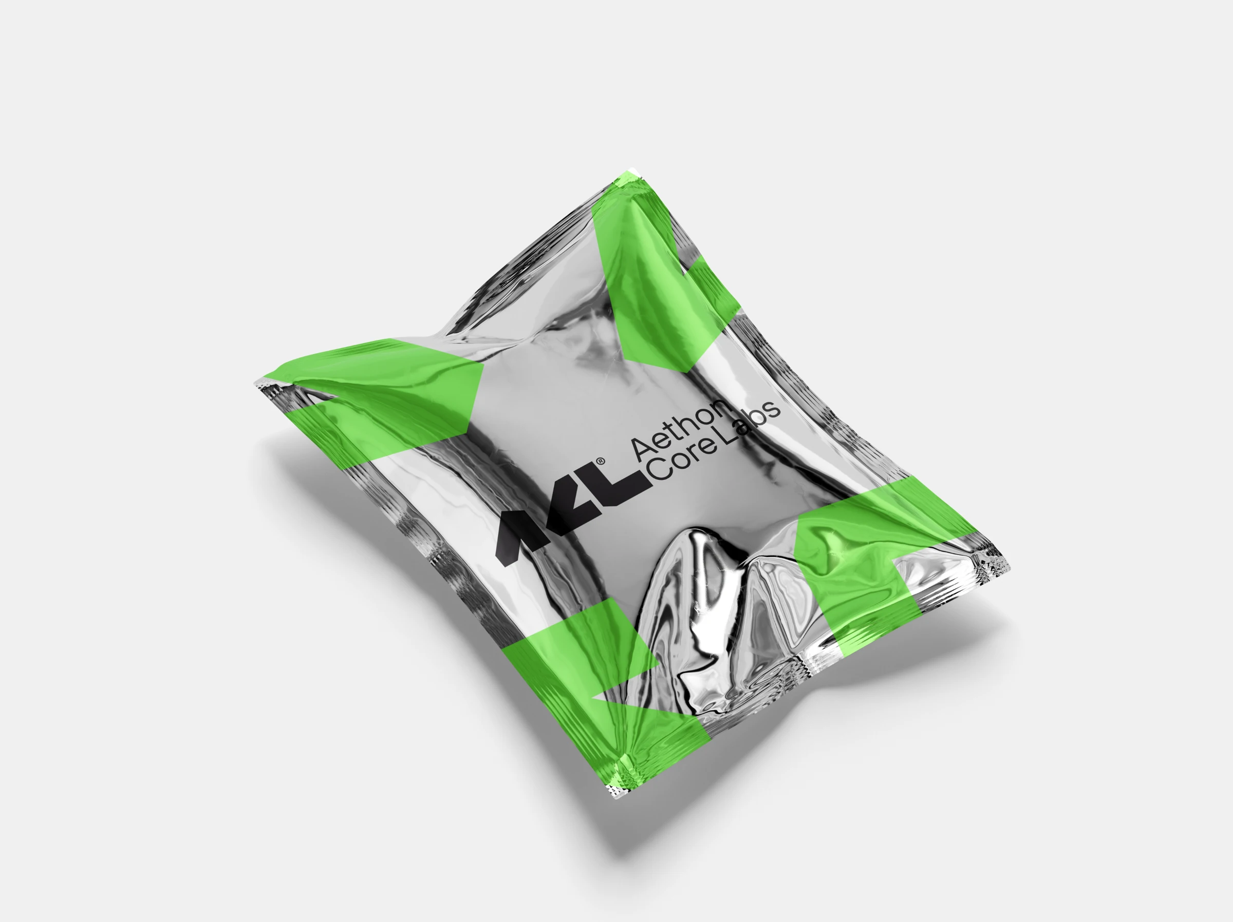
Material & contrast
Graphite letterforms and geometric green accents on reflective packaging.
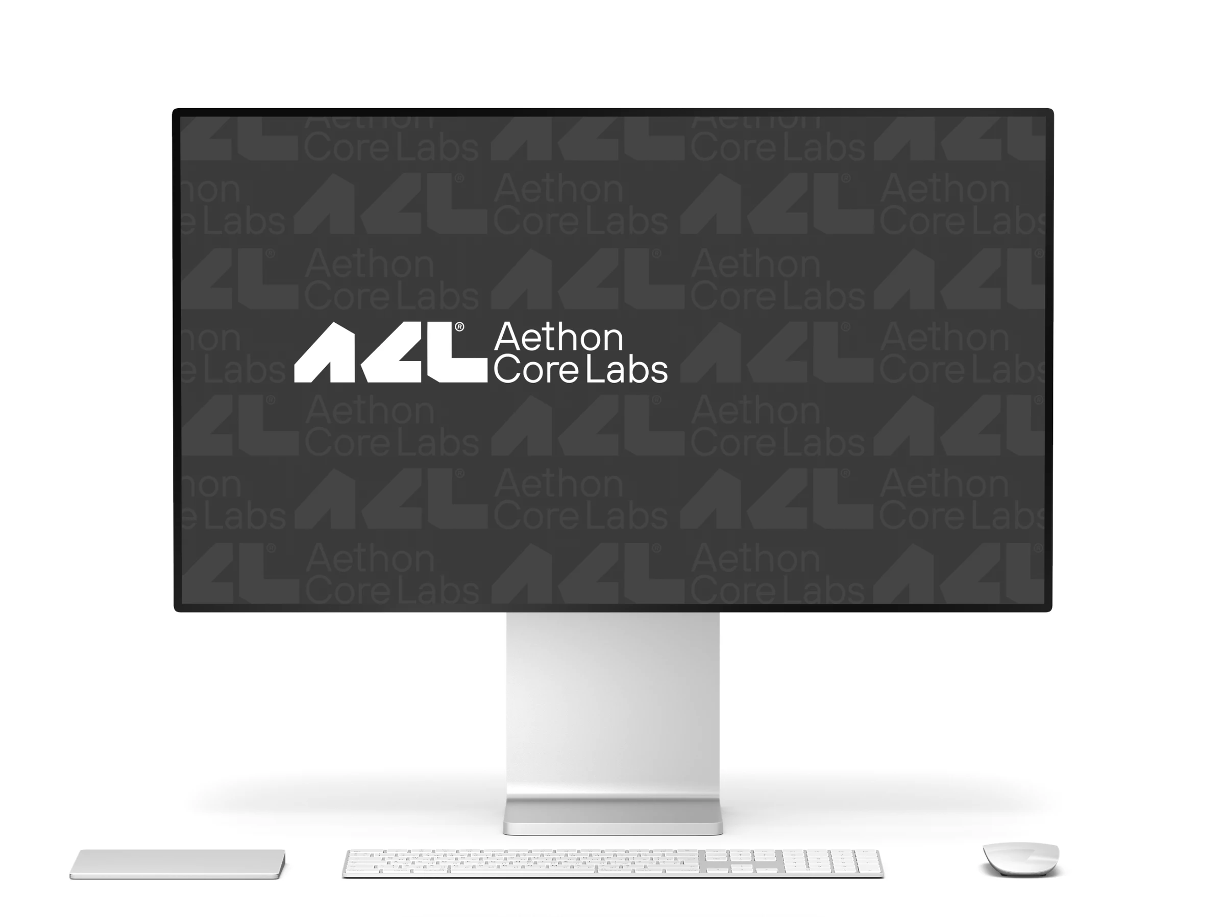
Digital environments
The monogram becomes a repeatable visual pattern behind the full brand signature.
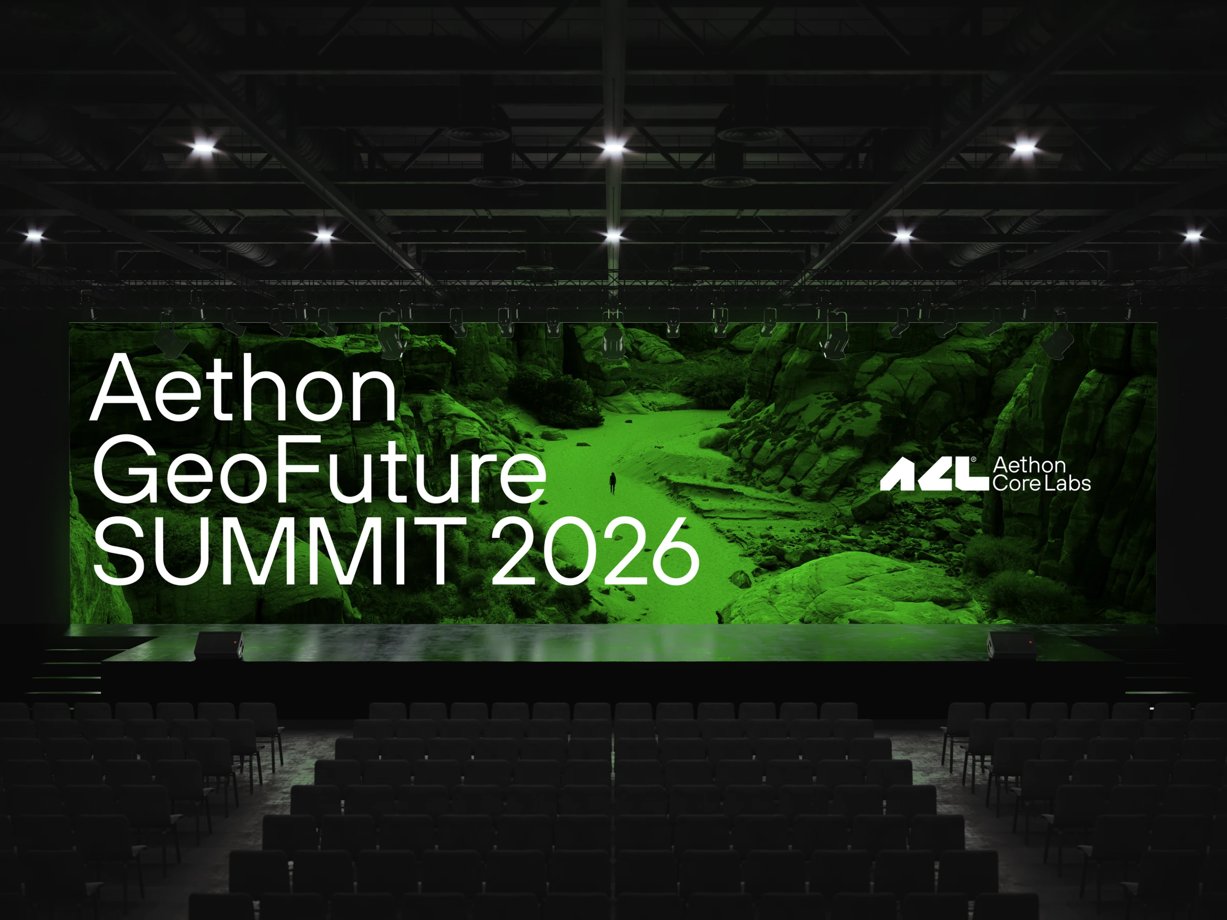
Event communication
A GeoFuture Summit application study using the geology-led visual direction.
09 · The original work
The complete brand story.
Watch the original presentation from beginning to end, or open the guidelines and Illustrator working boards below. The complete source remains available alongside the case study.
Brand guidelines · All 40 slides
Illustrator working boards · All 46 artboards
Design by Alireza Jelodar for BUT Agency · 2025.
Copyrights all rights reserved for BUT Agency.