01 · The business
Comfort, across generations.
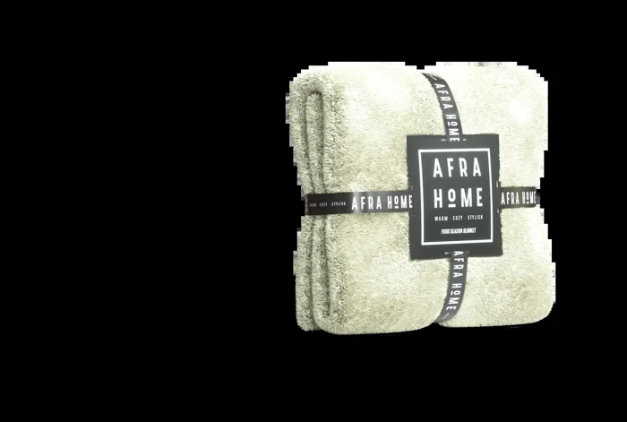
AfraHome is a manufacturer of sleep and comfort goods: blankets, pillows and everyday soft essentials for babies, teenagers and adults, with a collection for pets too.
Alongside quality, lightweight construction and premium-feeling materials, one characteristic stood out: the breadth of colour. Across the original range, individual products could offer roughly 12–36 shades. That was the strongest starting point for the digital experience.

02 · One clear idea
Let the product bring the colour.
The brand identity, documented separately, stays neutral in black and white. Rather than competing with the collection, it gives the colours room to become the identity people remember.
I carried that idea into the website and social content. Colour became a consistent thread through the product renders, room styling, lifestyle imagery and moving image. The interface acts as a quiet frame around the products.
Neutral identity.
A black-and-white frame that lets the collection lead.
Colour first.
One preference connects products, content and discovery.
Product focus.
Material, form and use, with fewer distractions.
03 · A personal way to browse
Choose red. See your world in red.
People do not approach colour neutrally. A favourite shade can be a faster starting point than a long list of product categories. The colour selector lets someone set that preference for the whole experience.
Choose a colour and the collection follows it, showing matching products where that shade is available. Product selection, imagery and the surrounding colour harmony stay connected. The intention is to make discovery feel more personal and bring people closer to a choice they already like.
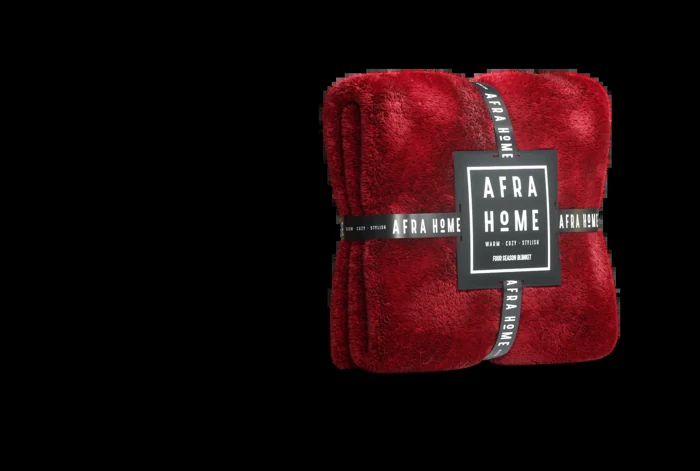
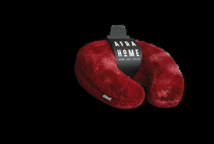
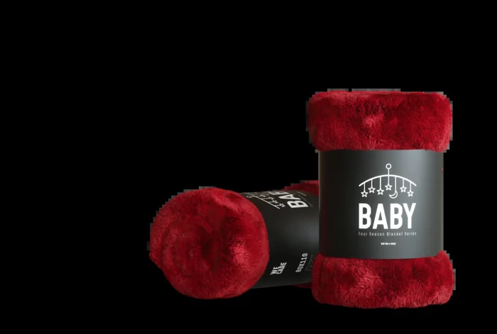
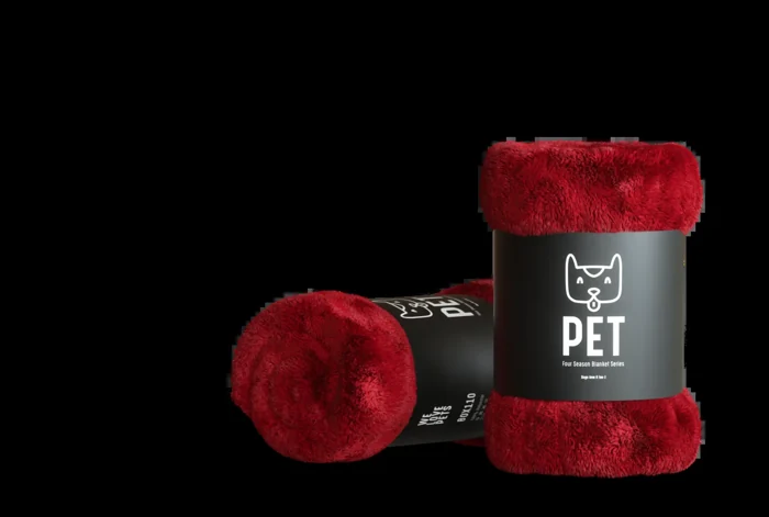
Choose a colour to explore matching products and the four-season blanket’s bedroom world.
Browse this colour04 · The digital experience
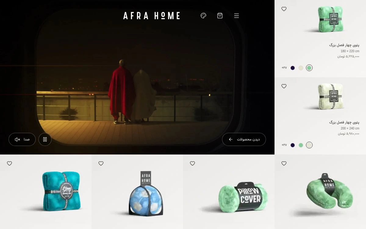
Less interruption. More product.
I removed explanations and interface elements that competed with the collection. The product, its material, its colour and its use should carry the page before anything else asks for attention.
The current storefront brings colour selection into the navigation and product journey. Product details, sizes and the shopping bag remain available without turning the experience into a wall of controls. Persian and English support the same journey, with the appropriate reading direction.
05 · The visual foundation
One 3D language. An entire collection.
Before generative AI became part of this work, I built the products in a consistent 3D visual style. A shared approach to framing, lighting, scale and material helped a large, colourful range feel like one family.
That foundation made it possible to communicate softness and form consistently across the website and social media. The aim was not simply to show more colours, but to make each product recognisable within the same visual world.
06 · Content creation · photography direction
From a product image to a lived-in world.
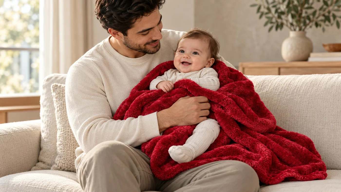
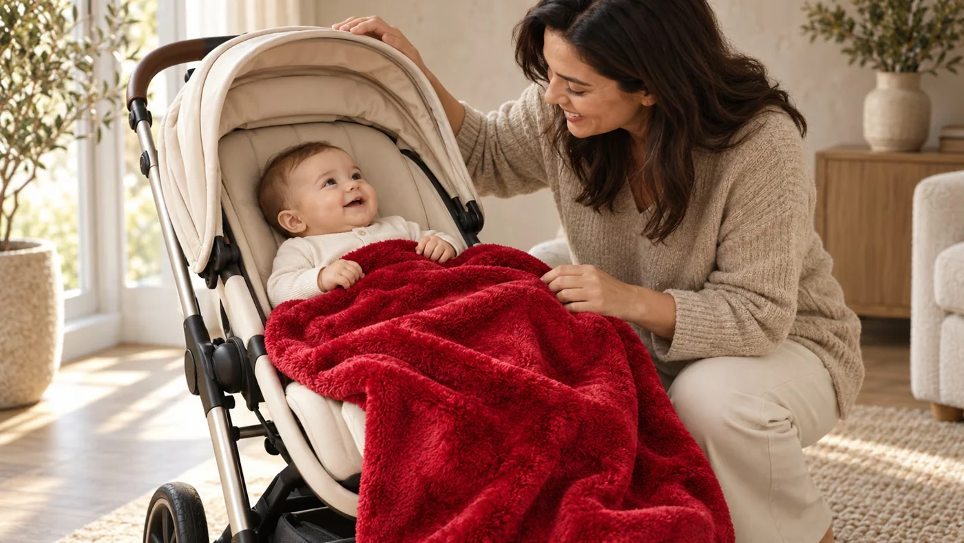
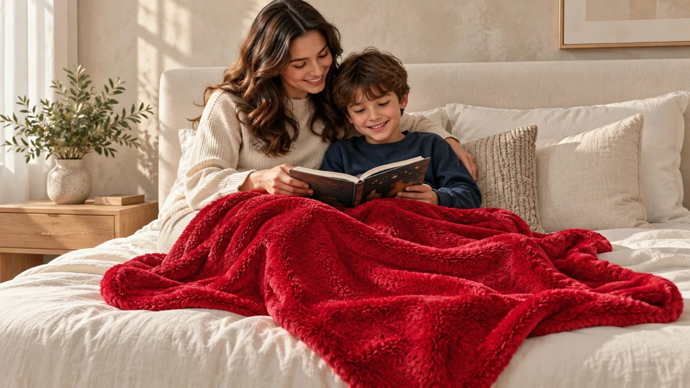
More recently, AI-assisted image creation let me expand that visual world into different uses and settings. The same product could be seen in a bedroom, with a family, during travel or as part of a pet’s everyday comfort.
The colour remains the connecting element. Product, styling, surrounding objects and atmosphere are directed together, so the image helps someone imagine the product in their own life. These examples are existing assets from the AfraHome website; the lifestyle expansion is AI-assisted.

07 · The four-season blanket collection
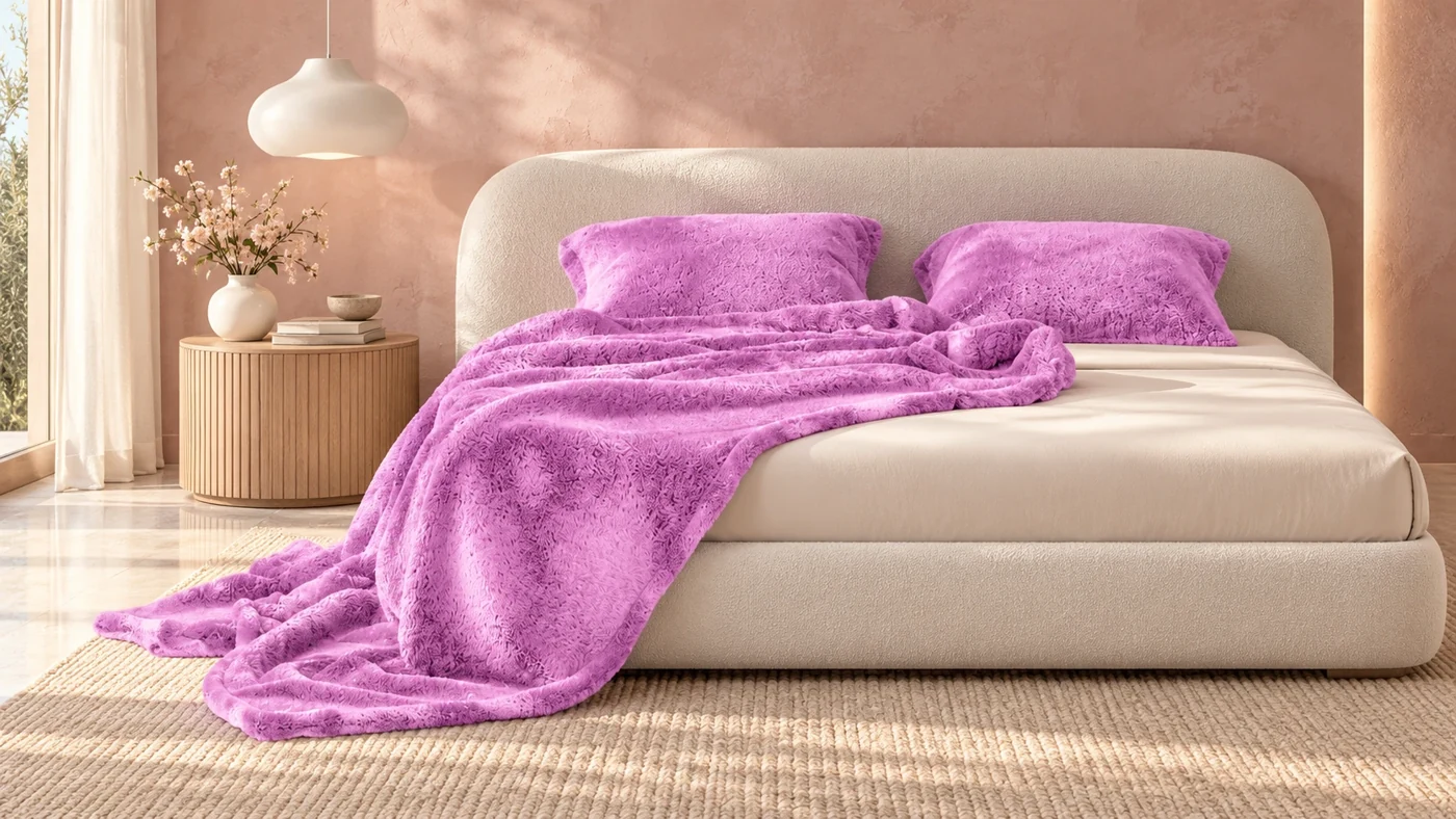
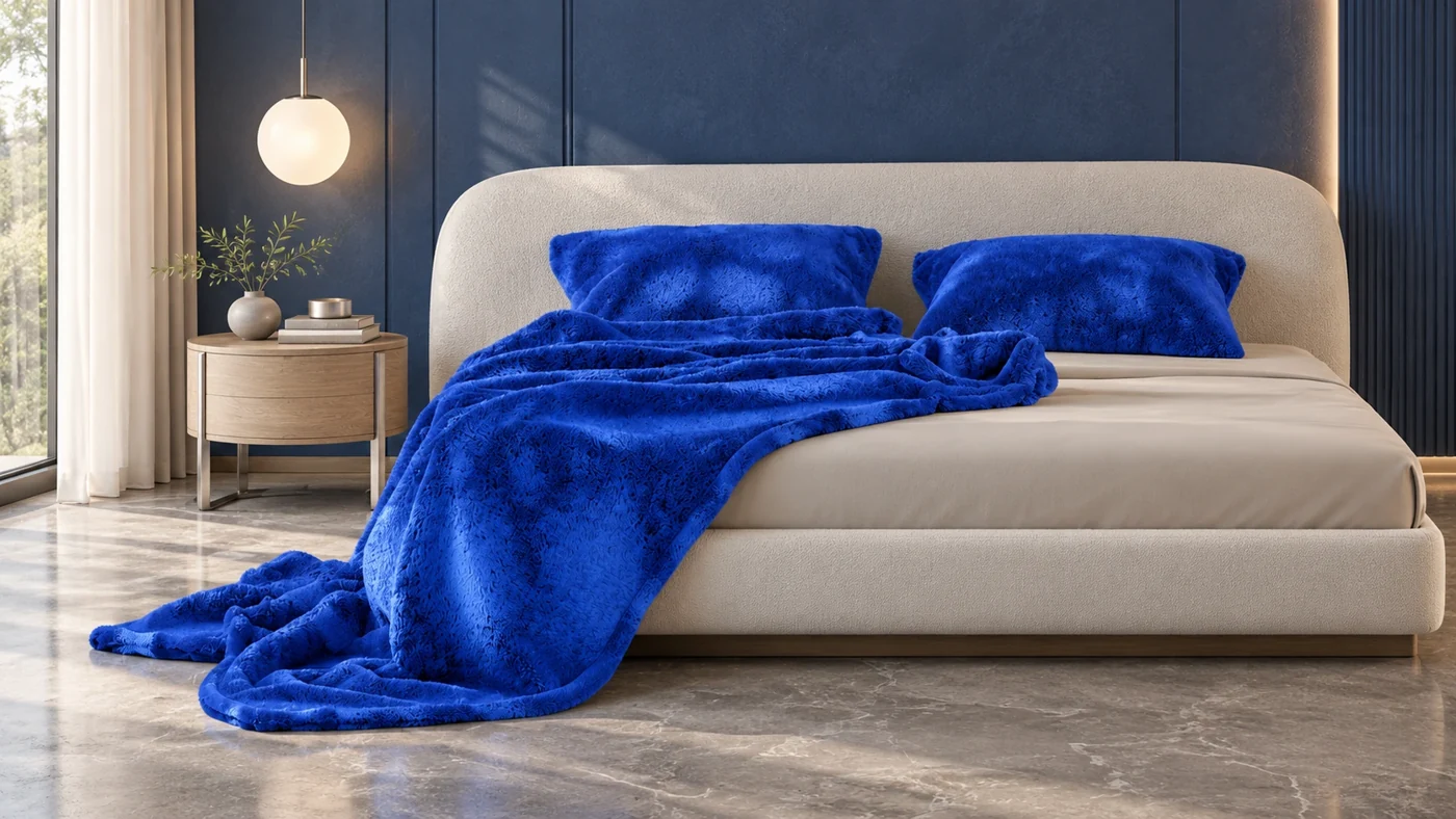
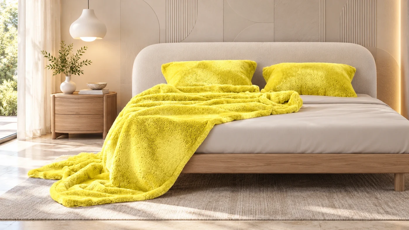
A blanket colour becomes a room.
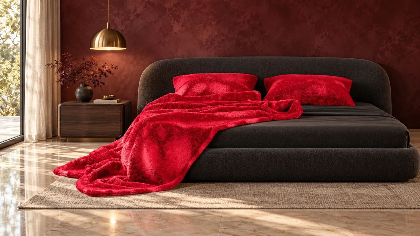
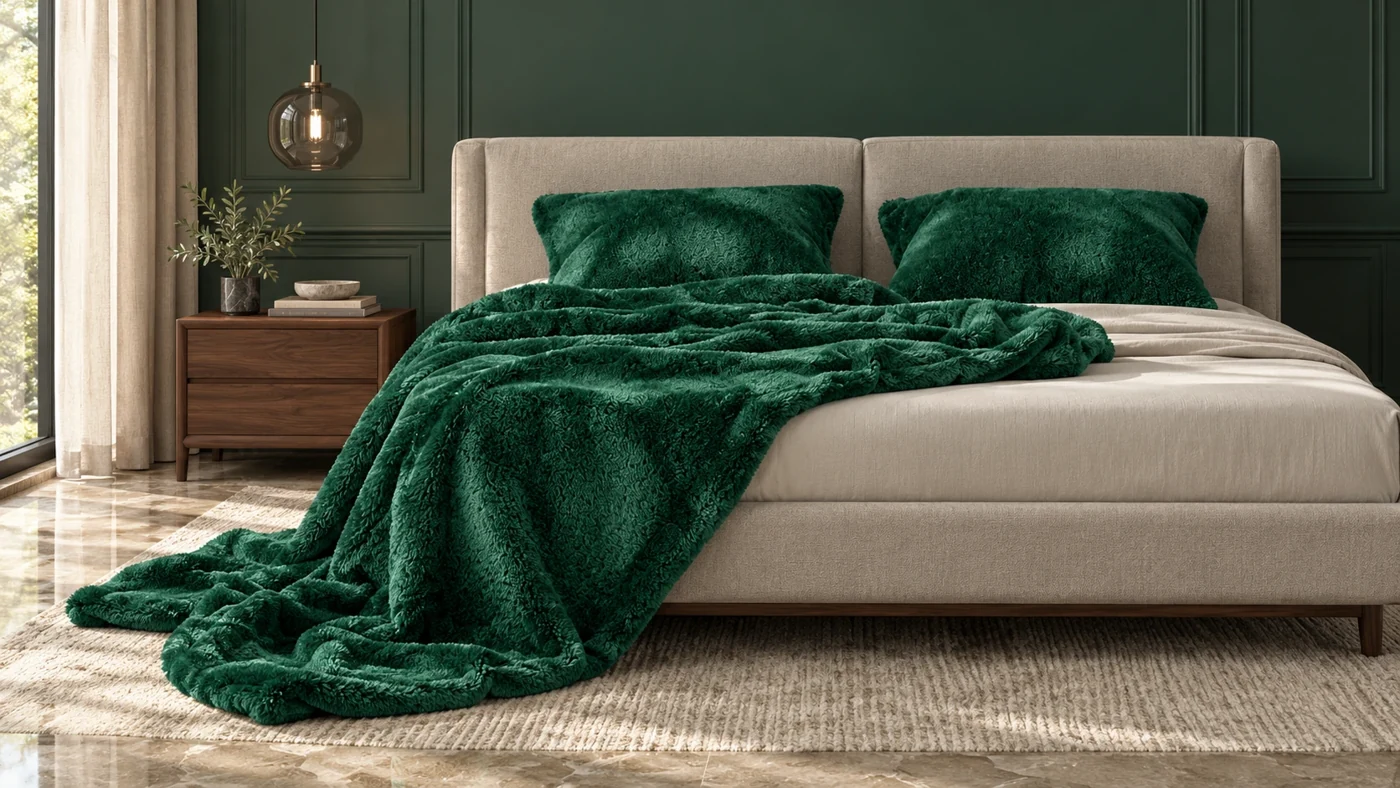
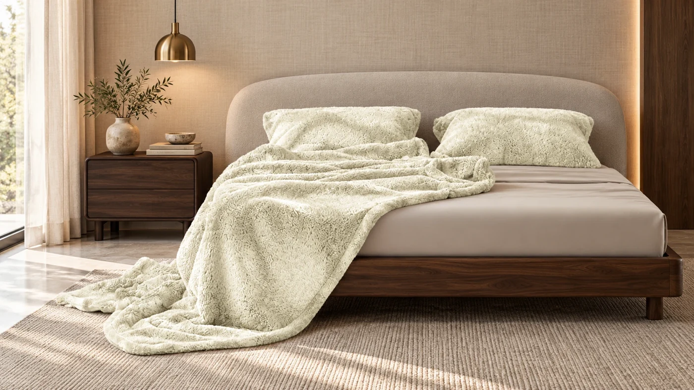
For the four-season blankets, the colour story extends beyond the textile. Wall treatment, bed styling, furniture, objects and lighting are coordinated around the selected shade.
Keeping the product prominent while changing the environment makes the range easier to explore as a collection of moods. It is one application of the wider content system, rather than a decorative colour filter applied over the same photograph.
08 · Playful discovery
Familiar products. A fresh first impression.
A returning visit should still have something to discover. Without a selected colour preference, the current homepage chooses from curated colour harmonies and varies its product and lifestyle selections.
The distinction matters: inspiration can change, while a deliberate preference stays consistent. Someone who chooses a favourite colour can keep browsing that world; someone arriving without a plan gets a newly composed starting point. The design seeks a fresh feeling, not random changes to the shopping controls.
09 · Videography · moving image
Let the atmosphere move.
Motion extends the same product-led direction into a brand film. Colour, softness and an everyday moment can establish a feeling before the viewer studies an individual product.
Photography, 3D and moving image serve the same story across the website and social presence: a broad colour range, presented with a consistent sense of comfort.
10 · The website in context
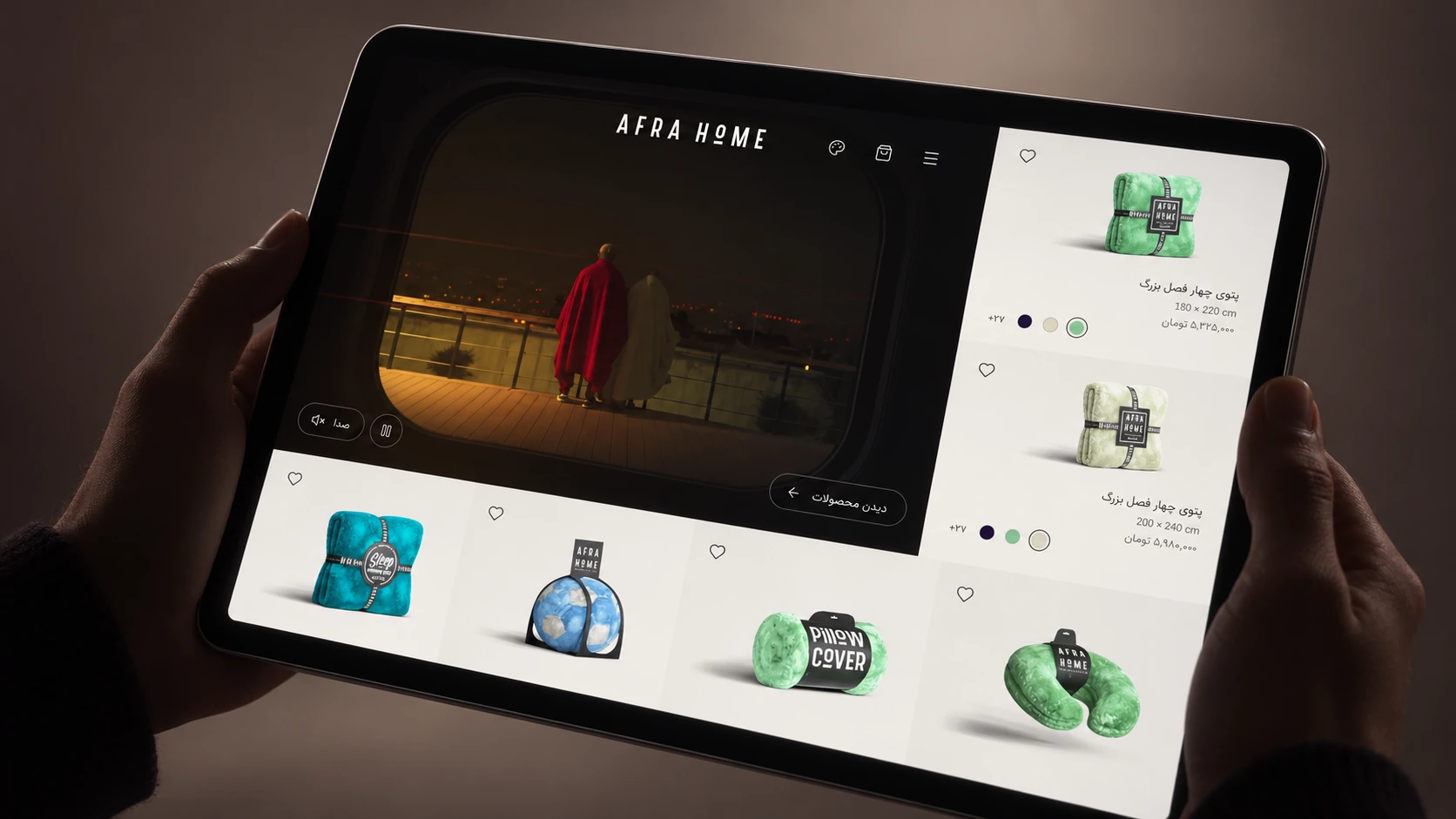
A quiet frame for a colourful collection.
An intimate view of the digital experience: precise product imagery, a quiet interface and colour as the point of focus. Minimal device presentations give the collection room to speak.

11 · Explore the real experience
Try your own favourite colour.
Open the live AfraHome website to browse the collection, choose a colour, move between products and explore the Persian and English experience. The colour study above is a small illustration; the website is the full shopping experience.
12 · The connected result
One strength, across every touchpoint.
The result brings website design, content creation, 3D, photography direction and videography around one distinctive product strength. A neutral identity lets the range speak; colour connects how the products are found, presented and imagined in use.
This case study describes the design decisions and the implemented experience. Faster discovery and stronger preference are design intentions; no conversion uplift or usability result is claimed without supporting research.