01 · Brand strategy
An identity you can step into.
My Cinema brings the intimacy of a private screening into a modular cinema experience. The project combines a visual identity, a family of auditorium formats and a language for communicating the experience before a guest even takes their seat.
My role covered brand strategy, art direction and graphic design, working with graphic designer Ali Kazemi. Architecture and interior design were developed by Zomorodi Associations. This case study focuses on the brand: how its geometry, graphics and communication connect with the architectural experience.
The central challenge was to create one recognizable identity that could feel appropriate in very different settings: a bright lobby, a dark auditorium, a premium lounge, a ticket, a directional sign or a cinema campaign. The system needed enough range to express those settings while keeping My Cinema recognizable.
Personal
Communicate choice, intimacy and a cinema experience shaped around the occasion.
Modular
Use a repeatable visual language that can expand across auditorium types and physical touchpoints.
Distinct
Make the identity recognizable through its geometry, even when the full name is absent.
02 · Visual foundations
One grid. Several meanings.
The original guidelines describe the sign as a combination of screen proportions, the letters M and C, and cinema as the seventh art. Seven filled modules sit within a three-row, five-column rectangular construction, creating a compact mark with a clear relationship to the screen.
That geometry gives the identity a useful foundation: it is simple enough for a small ticket or directional sign, but strong enough to become an architectural motif. The wordmark and sign have a defined relationship, with construction, alignment and clear-space rules documented in the brandbook.
Consistency starts with protecting those proportions. The guidelines define a 10-step scaling rule, a 20-pixel minimum for the standalone sign and a 40-pixel minimum for the full signature. Contrast, spacing and an undistorted mark matter just as much as the graphic itself.
03 · The identity system
A cinema language, built from the mark.
The mark becomes the starting point for a larger family of supergraphics. Its grid is stretched into bands and reassembled into familiar cinema objects: a clapperboard, film roll, television, ticket, drinks, a director’s chair and popcorn. These are different expressions of the same visual logic.
Black and white provide the primary foundation in the guidelines. Electric blue, red, green and yellow create expressive accents. Blue has a strong presence in the spatial visualizations, while other accents let campaigns and everyday items have their own energy.
The result supports two complementary modes. Restrained monochrome compositions can sit comfortably in premium environments; larger graphic fields and vivid color can communicate the excitement of cinema. Typography stays direct and legible, giving the patterned surfaces room to work.
04 · Spatial brand identity
The logo becomes light.
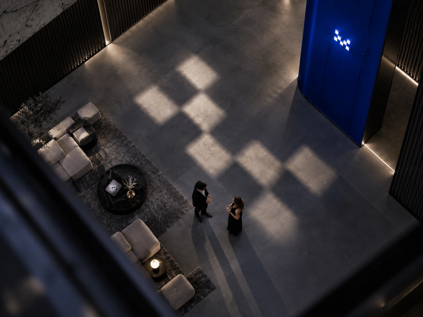
The strongest spatial expression takes the geometry off the printed surface. In the supplied visualizations, openings and light patterns echo the modular sign, casting its rhythm across the floor, furniture and circulation spaces. The guest encounters the brand as part of the atmosphere.
This is environmental branding expressed through light and shadow. Solid and empty modules become illuminated and shaded areas; the same graphic relationship that makes the sign recognizable becomes a moment inside the space. It is a connection between visual identity and architecture.
The visualizations suggest two different lighting roles. In the arrival and lounge areas, patterned light can create a memorable first impression. Around the auditorium, restrained light and clear signs support orientation, while the film remains the focus. The brand can be present without competing with the screen.
05 · The experience family
Different occasions. One cinema brand.
The supplied architectural diagrams identify Bronze, Silver, Gold, Extra Gold and Platinum formats. The plans vary in seating, social arrangements and amenities, while retaining a common cinema structure. The brand’s job is to help people understand those differences without making every format feel like a separate business.
The audience profiles below are proposed interpretations for this case study, based on the supplied layouts and experience positioning. They describe needs and occasions, rather than findings from audience interviews. The architectural layouts remain the work of Zomorodi Associations.
Proposed audience lens
The film-first guest
A focused screening with straightforward seating and clear information.
- Communication challenge
- Make the entry experience feel part of the same brand without adding unnecessary visual complexity.
- Brand response
- Use the shared mark, legible hall names and concise communication. Let the screen and the collective viewing arrangement lead the experience.
The supplied Bronze plan shows compact, forward-facing cinema seating within the common screen-and-entrance structure.
Proposed audience lens
The relaxed regular
Comfort, a familiar arrival sequence and an easy choice for repeat visits.
- Communication challenge
- Communicate a step in comfort while keeping the relationship to the wider cinema family clear.
- Brand response
- Keep the visual foundations consistent and make the seating arrangement and experience differences easy to compare.
The Silver diagrams retain a forward-facing arrangement, with individual seating and amenities identified in the isometric view.
Proposed audience lens
The occasion planner
A more personal experience for a date, a celebration or a considered night out.
- Communication challenge
- Signal a premium occasion through the quality of the presentation and the clarity of the offer.
- Brand response
- Use restrained identity placement and a more considered material expression. Explain the experience through the layout and service touchpoints.
The Gold diagrams describe a luxury cinematic experience, with deluxe chairs and a bar area called out in the plan.
Proposed audience lens
The privacy-and-comfort seeker
Space to settle in, premium seating and an experience that feels attentive.
- Communication challenge
- Express the most intimate cinema positioning without making the communication feel exclusive or difficult to understand.
- Brand response
- Keep the language calm, the identity placement deliberate and the experience description specific. Use atmosphere and detail to carry the premium feeling.
The supplied Extra Gold isometric identifies deluxe chairs, a bar, bar stools, vending and a luxury cinematic experience.
Proposed audience lens
The social host
A flexible setting for groups, shared viewing and occasions beyond a conventional screening.
- Communication challenge
- Explain different seating configurations while keeping the experience recognizable as My Cinema.
- Brand response
- Use the same diagram language and identity system across configurations. Explain how the room supports an occasion, rather than relying on the tier name alone.
The Platinum references include two alternatives: a sofa-led arrangement and a round single-sofa configuration. The second alternative is described as a multipurpose space.
06 · Communication in space
From the street to the seat.
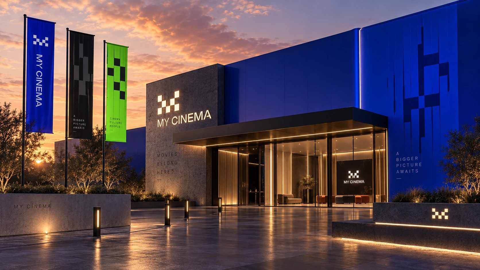
The exterior establishes recognition through the mark, large graphic surfaces and cinema campaigns. At arrival, the identity becomes more functional: directories, hall numbers, reception signage and directional information help a guest make the next decision.
At each scale, the communication changes its emphasis. A facade can be expressive; a hall number must be immediate. In the lobby, graphics introduce the experience. Inside the auditorium, the signature can recede into quieter materials and small details.
The supplied visualizations connect these touchpoints into a coherent journey. Repeated geometry and a consistent typographic hierarchy make the transition from public arrival to a more personal screening feel like one experience.
07 · Art direction
Luxury through restraint and detail.
The premium expression comes from the relationship between identity and material. Dark surfaces, warm metallic details and carefully placed light give the mark a quieter presence. Larger blue graphic fields introduce a more contemporary energy without requiring another logo.
The design approach treats luxury as a sequence of considered details: a readable hall sign, a restrained printed item, a consistent service touchpoint and an environment that lets the guest settle into the experience. The communication can feel confident without becoming visually crowded.
The architectural and interior work belongs to Zomorodi Associations. The brand contribution is the visual thread that connects these spaces with the cinema’s name, graphic language and communication.
08 · Brand communication
The experience continues in the details.
Tickets, stationery, staff identification, flags, packaging and drinks carry the identity into everyday interactions. The original brandbook extends the system across administrative materials as well as guest-facing communication, giving teams a shared reference for consistent application.
The small objects matter because they make the brand tangible. A ticket can carry the same supergraphic as a campaign. A drink or popcorn pack can use the sign’s geometry at another scale. Recognition comes from the relationship between these items, rather than repeating the full logo everywhere.
The supplied communication visualizations show how that system can reach reception, concessions, branded materials and exterior campaigns. Each touchpoint shares a foundation while allowing the occasion and material to shape its expression.
09 · Connecting brand and architecture
A system that can grow.
The architectural explainer material presents puzzle-like modules that can be combined for larger groups. Wall-component and acoustic diagrams explain how the cinema environment supports the screening experience. These are architectural ideas, developed by the collaborating team.
For brand communication, the opportunity is to make that modular idea understandable. Isometric illustrations, plans, labels and a repeatable blue visual language translate spatial information into something guests and stakeholders can read. The diagrams explain the experience; the identity gives that explanation a recognizable voice.
The visual system is similarly expandable. A protected mark, a documented grid, a family of supergraphics and clear application rules let new materials belong to My Cinema without requiring a new design language each time.
10 · The complete source
The whole identity, in one place.
The final body of work connects a recognizable sign with a flexible graphic language, communication materials and spatial brand visualizations. Its value is the continuity between touchpoints: from the first campaign impression to the atmosphere around a screening.
All 52 pages of the supplied brandbook and all 59 supplied visuals are retained below. The spatial images are presented as visualizations; the plans and technical diagrams are presented as architectural reference material.
Brandbook All 52 pages
Spatial & communication visualizations 44 images
Auditoriums & architectural explainers 15 diagrams
- Brand strategy, art direction & graphic design
- Alireza Jelodar
- Graphic design
- Ali Kazemi
- Architecture & interior design
- Zomorodi Associations