01 · The opportunity
Less like search. More like an assistant.
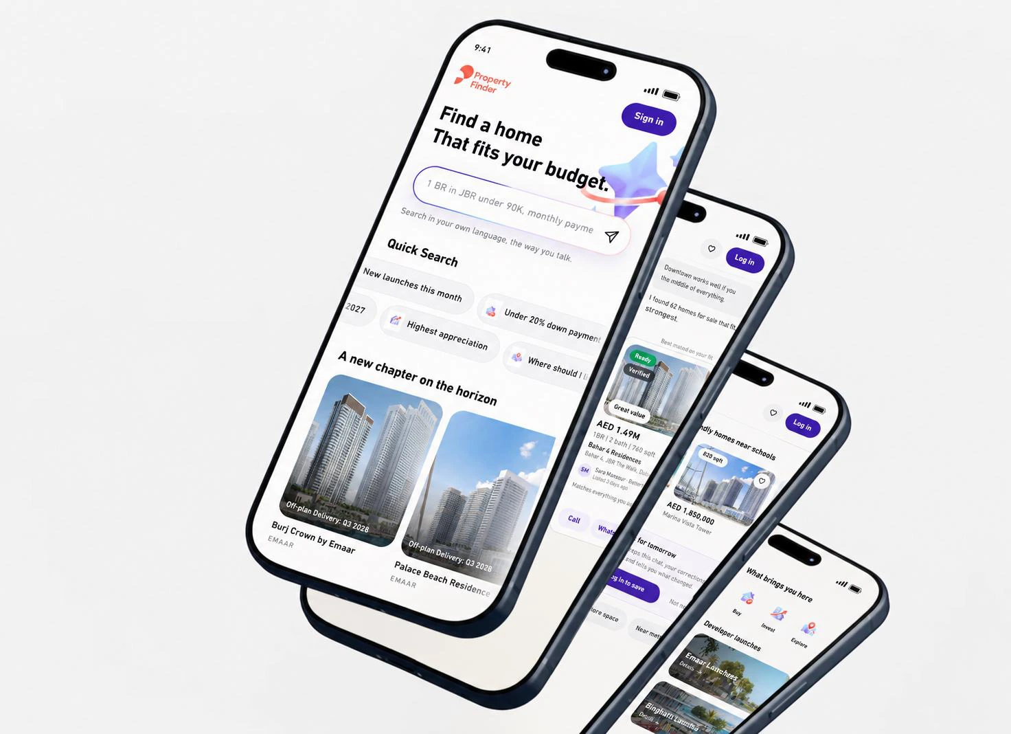
I looked at Scout from the user’s point of view. Not only as a chat interface, but as a real estate journey: understanding intent, asking the right questions, showing better results, and helping users continue without starting over.
The opportunity is simple: make Scout smarter, clearer, more visual, and more useful for real decisions.
Understand
Find out what the person is trying to do before generating results.
Help them decide
Show relevant homes, useful comparisons and clear trade-offs.
Keep moving
Remember searches and actions so the journey can continue.
A first prototype, with a clear direction.
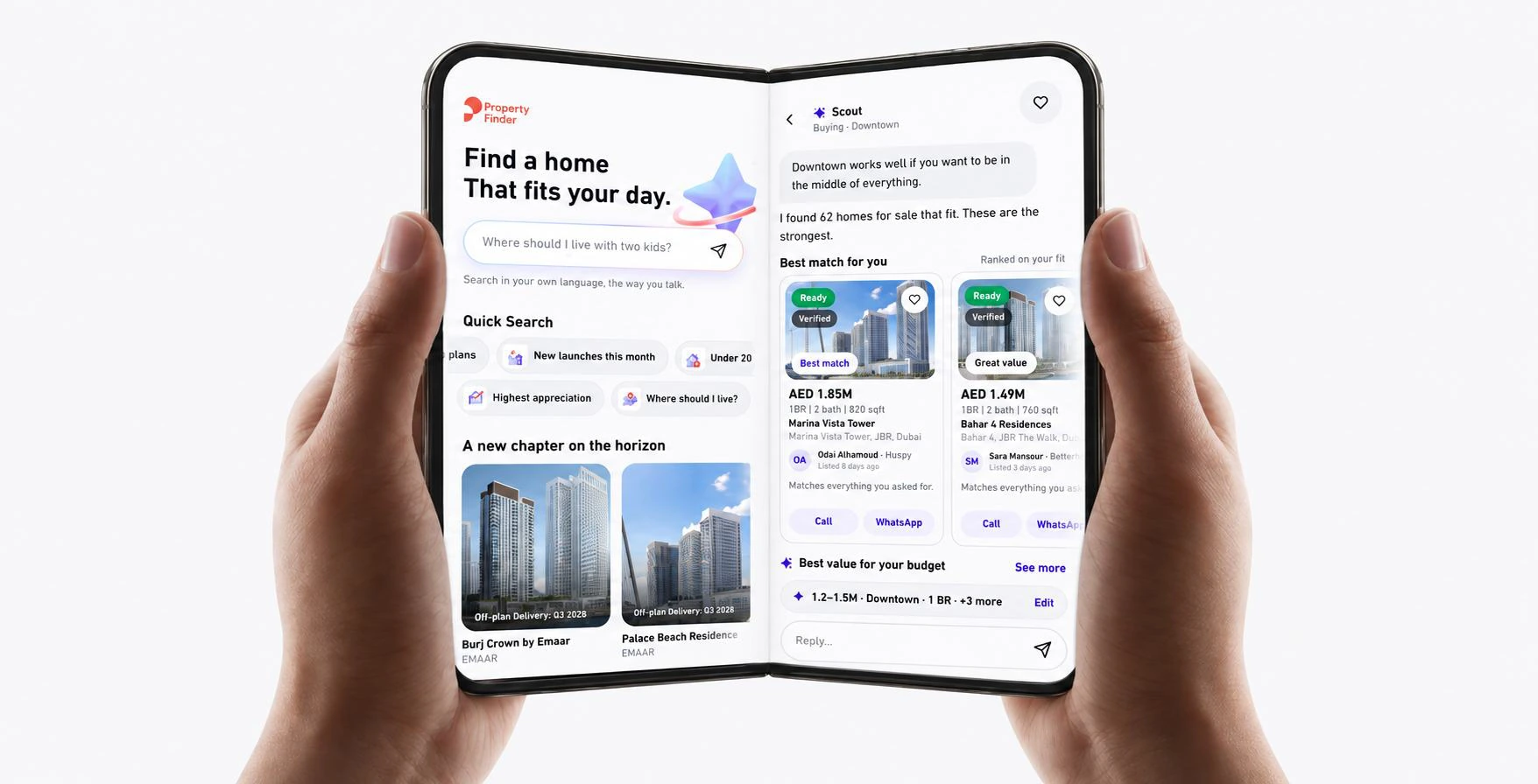
I designed a first version of how this experience could feel in product. The goal was to show the direction: cleaner hierarchy, a stronger mobile experience, more visual results, and smarter conversation flow.
This case study documents product strategy, UX ideation and prototype design. The prototype is an early direction, rather than a final production UI.
Try a search, choose Rent, Buy or Invest, and explore the journey.
02 · The design objective
One hand. One finger. The whole journey.
My focus was to make Scout easy to navigate while holding a phone in one hand. A person should be able to move from their first question to a useful shortlist, contact an agent and pick up where they left off using one finger.
That goal shaped the direction: quick choices instead of repeated typing, visual decisions instead of long answers, and a continuous journey instead of separate searches.
- Set intent
- Clarify needs
- Explore homes
- Compare & save
- Contact
- Continue
Less effort
Use quick chips, clear choices and progressive questions to reduce typing.
More control
Keep the reading position stable and let the user decide when to move on.
No reset
Carry the same priorities, saved searches and previous actions forward.
03 · A clearer start
Make the first step obvious.
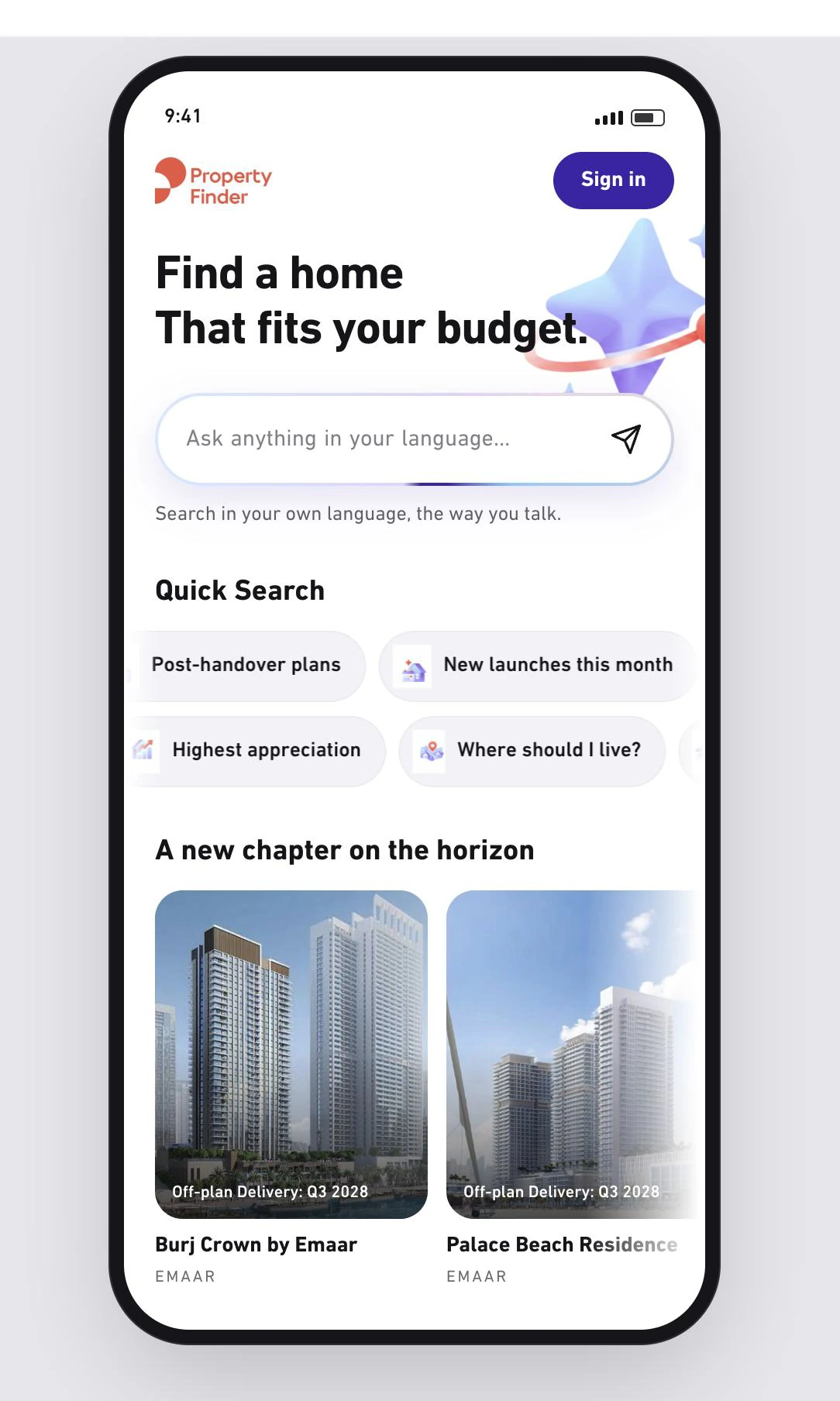
One thing that works well is support for different languages. That already makes the experience feel more accessible.
The main issue is hierarchy. I should instantly understand the main section, where to focus first, and what actually matters. When everything feels almost at the same level, the page does not guide me.
Quick Search is the one part that already feels clear and useful. The main page needs a stronger primary action, clearer secondary content, and an obvious place to start.
04 · Conversation design
The first answer is not always the best answer.
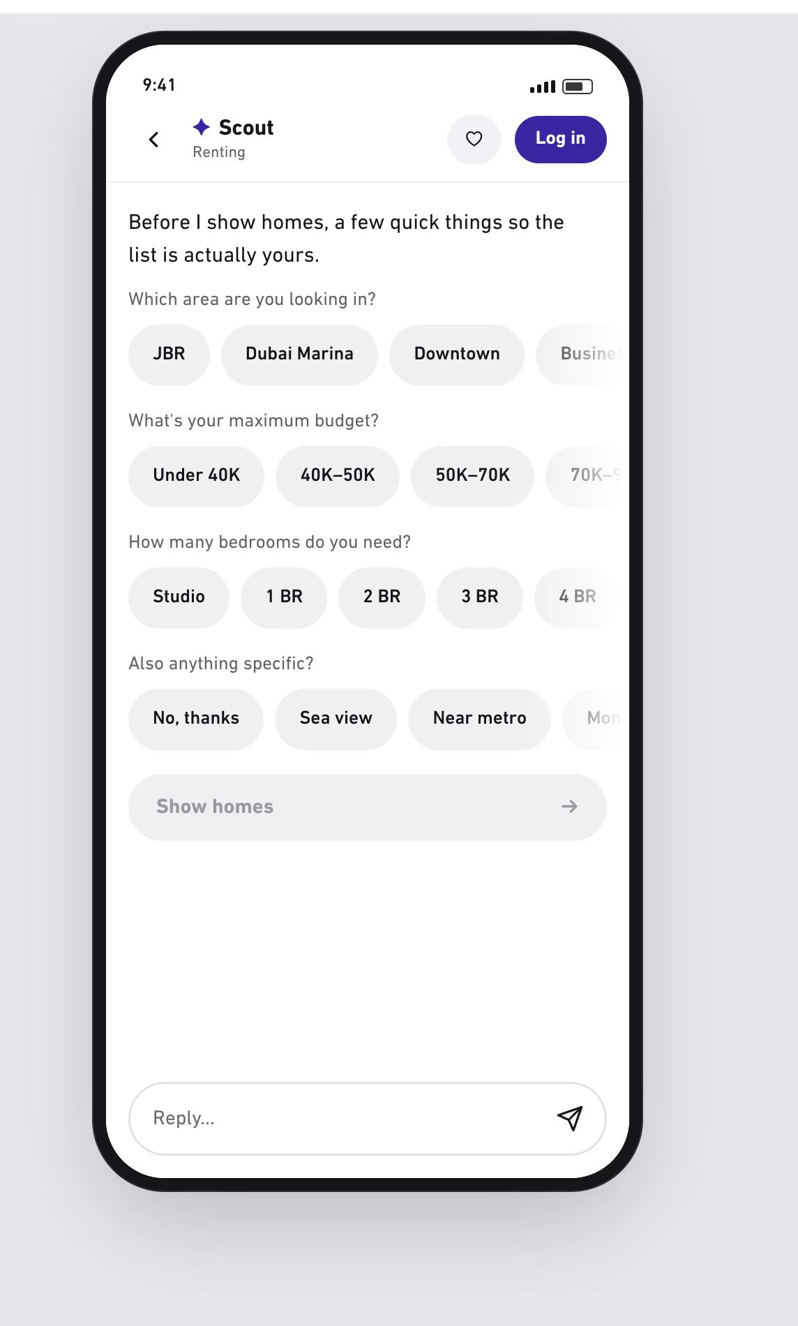
When a request is incomplete, Scout should not immediately show results. Showing every apartment in JBR is not really an AI experience when we still do not know enough.
Instead, it should ask the most important questions first. The goal is a more personalized result with the fewest and easiest steps possible.
The requestI want to rent an apartment in JBR.
The useful next questionWhat’s your budget? How many bedrooms do you need?
05 · A smarter search model
Learn from how people actually search.
We should examine real conversations and identify repeated patterns. People might begin with “I need a place in Downtown” or “I’m looking for a one-bedroom in JBR” and forget to mention their budget.
If that pattern appears in the data, the first response when price is missing should probably ask for a price range, instead of generating results immediately. This could also use fewer tokens and avoid spending resources on results the user probably does not want.
The search model should be built around what we learn from those conversations: which information people provide first, what they usually forget, and which follow-up question gets them closer to the right property fastest. The flow should be justified by behavior, rather than feel random.
06 · Intent before interface
Different intent. Different experience.
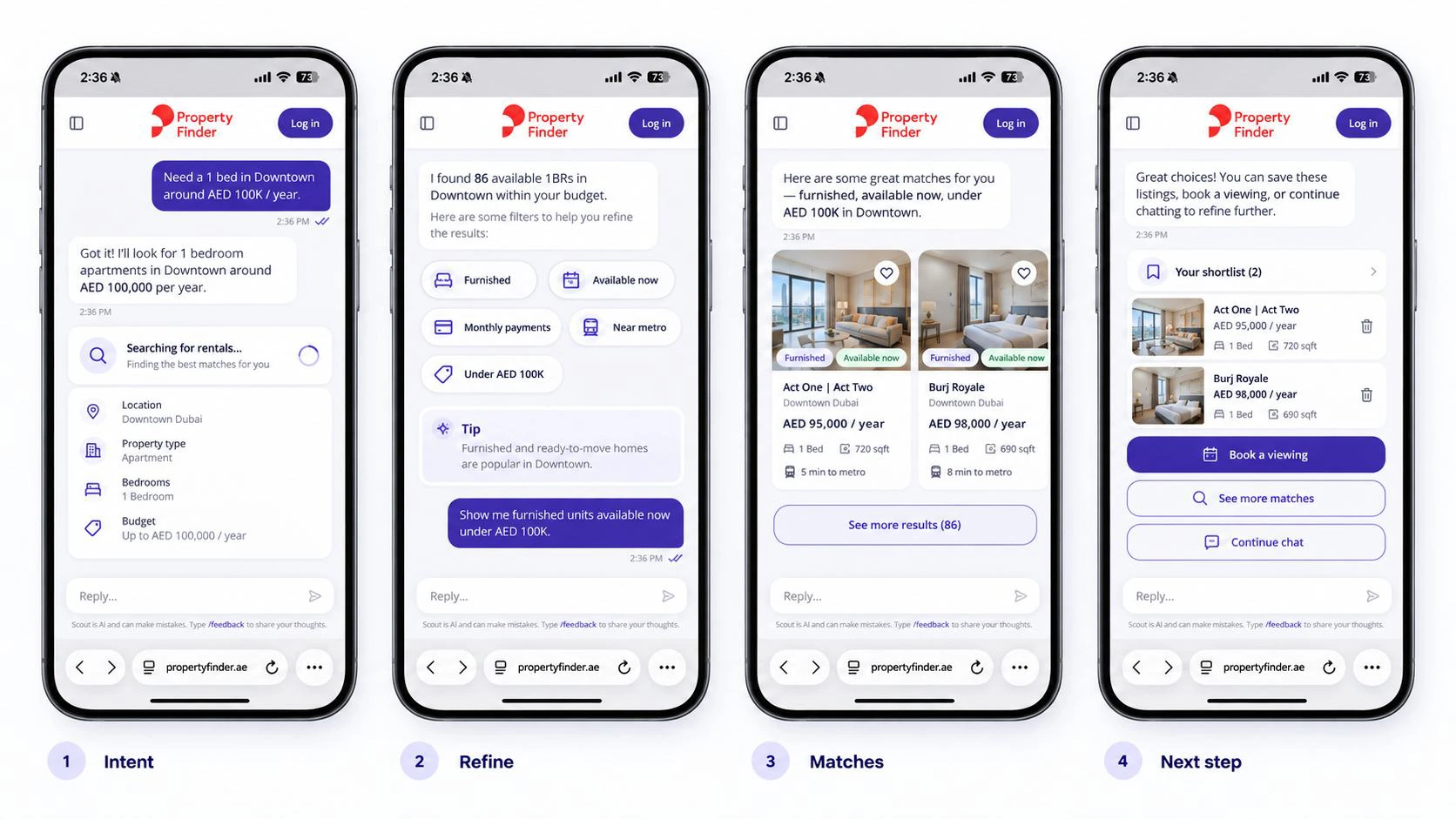
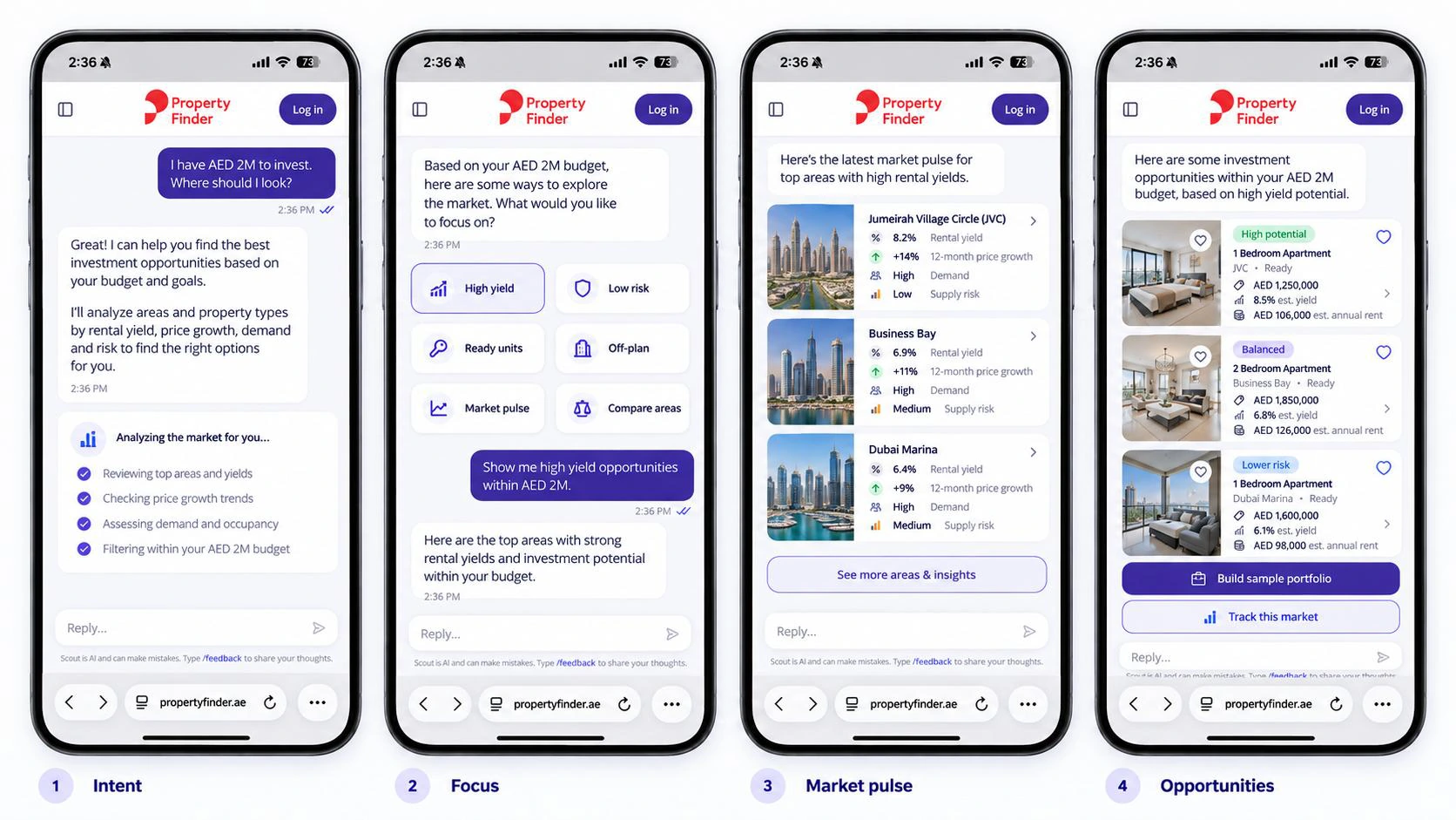
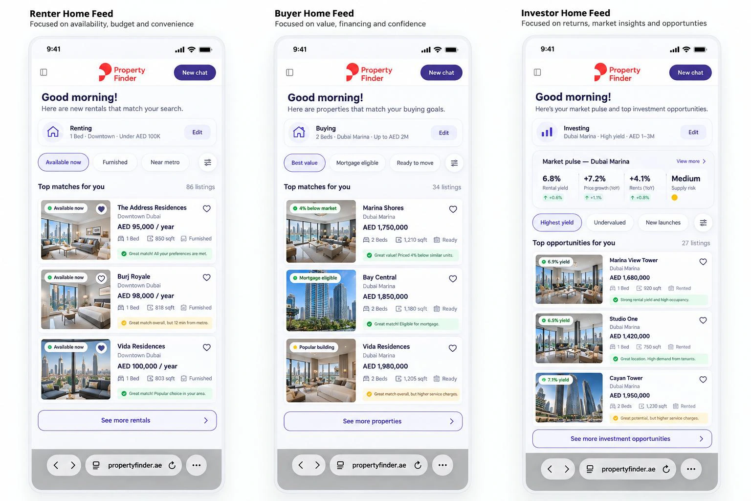
A renter, buyer and investor should not see the same product. Scout should first understand what the person is trying to do, then adapt the UI, metrics, shortcuts and results around that intent.
The flow should be: intent → relevant metrics → smart shortcuts → results. The key is to design around the user’s current job-to-be-done, rather than a fixed persona.
Rent
Availability, budget, commute, furnishing and payment flexibility.
Buy
Value, mortgage, market confidence, service charge and resale potential.
Invest
Yield, market trend, risk, supply and portfolio opportunities.
07 · Visual discovery
Make decisions possible at a glance.
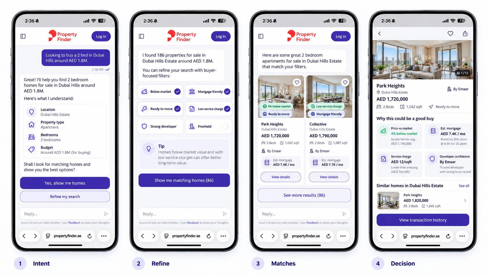
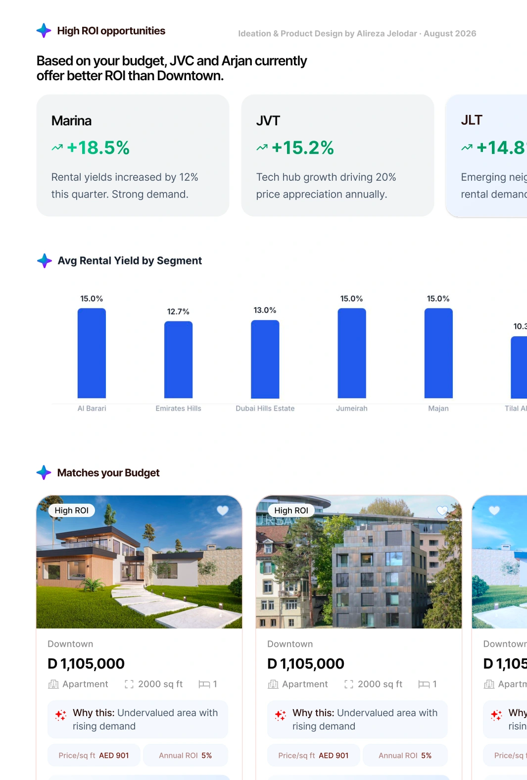
We should engage people through different visual experiences, rather than long blocks of text: property cards, images, maps, quick chips, comparisons, sliders and market snapshots.
The goal is to help people understand and decide at a glance. For property search, heavy text should be the exception, not the default.
08 · Results, not an essay
Let the home do the talking.
When I am looking for a home, I do not want a long explanation about why a property is good for me. Use a clear title for the first listing — “Best match for you” — then present the rest as “Other options matching your search.”
At first glance, what matters most is the feeling from the photos, the price range, and the payment plan or payment model. People usually react to a home visually first, so images deserve more priority than descriptive text.
The experience should feel like browsing homes, rather than reading an AI answer.
09 · Discovery around real life
Homes that fit a life. Not just a filter.
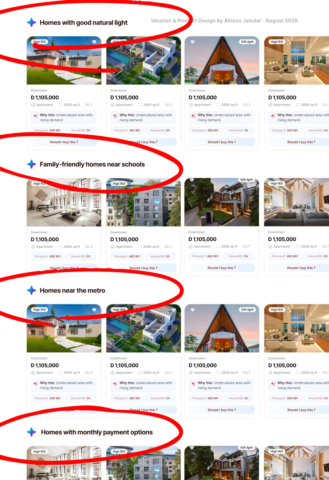
We can organize results into categories around what people actually care about when choosing a home, with a “See more” action for each one.
These categories are easier to connect with than normal property filters. Sometimes people have not thought about these needs when they start searching; showing them helps reveal what matters.
What people click and explore can also help us learn more about their priorities and rank more relevant homes higher.
- If you like community living
- Homes with monthly payment options
- Homes with good natural light
- Family-friendly homes near schools
- Homes near the metro
10 · Search continuity
The same search. Fresh possibilities.
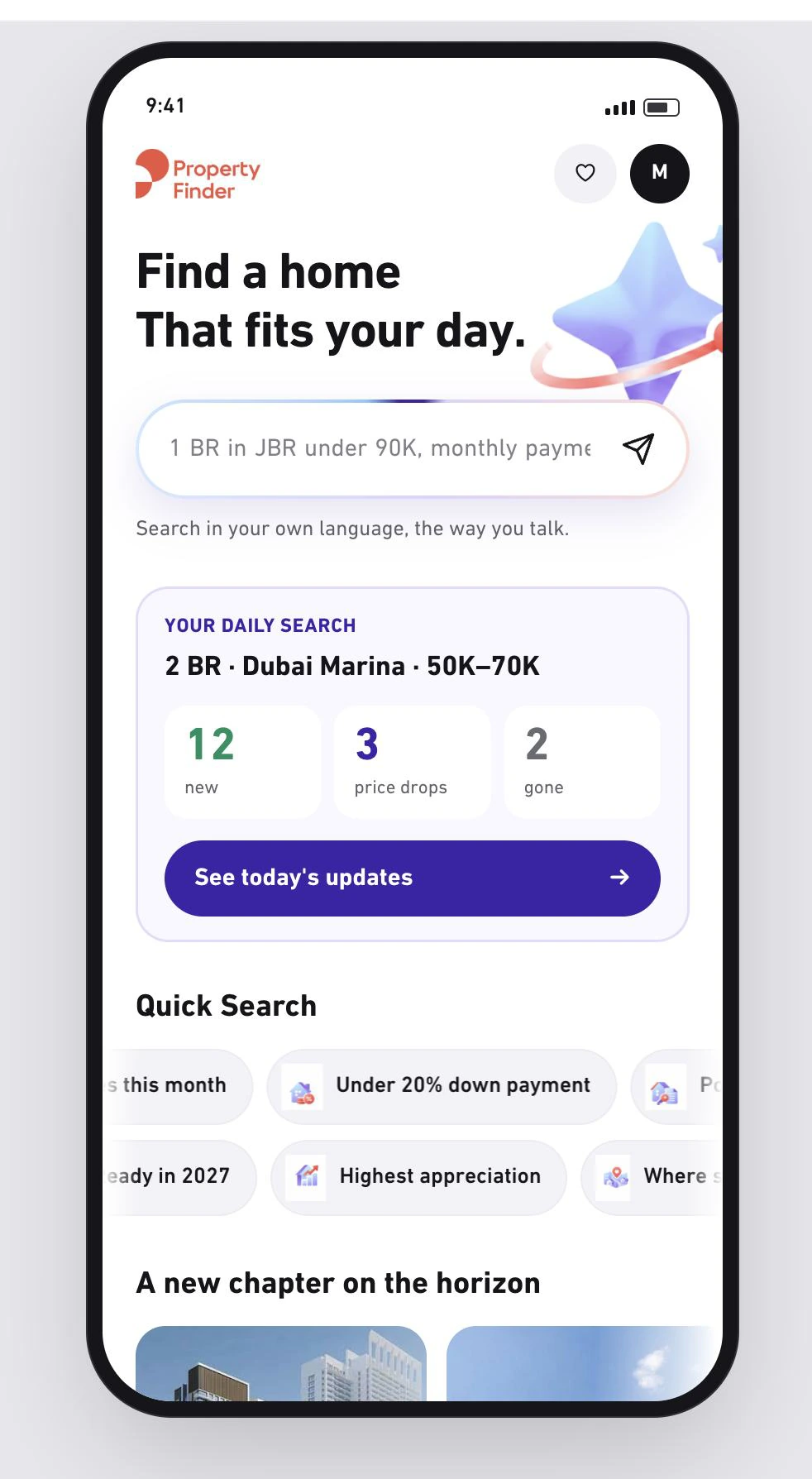
If I already have a search that works for me, I should be able to come back every morning with the same criteria, without restarting the conversation.
I do not want the search itself to change. I want to see what is new today, right now. For chats where someone is actively looking for a home, Scout should offer a way to save or follow that search.
Each return should show the same result set, refreshed with the latest availability, prices and new listings.
11 · Useful personalization
Remember priorities. Explain the trade-offs.
After sign-up or sign-in, Scout should use what a person has already shared to build a personalized home feed. The system should remember what matters to them and keep searching with the same priorities.
This is especially useful for investors, but it also works for renters and buyers. If a home meets most needs but misses one, it should still appear with that gap clearly stated.
That transparency makes the assistant more trustworthy and helps people decide faster.
An honest recommendationGreat match overall, but this one is not near the metro.
12 · Beyond discovery
An assistant should remember what happened next.
Scout should not stop at discovery. If I open a listing, contact an agent on WhatsApp or show interest in a property, I should be able to come back and continue from there.
A simple follow-up space could show the actions I have already taken and help me move forward. Scout becomes an assistant that remembers the journey, rather than just a search tool.
- You contacted this agent
- You shortlisted this property
- Waiting for reply
- Follow up today
Help me avoid repeating the same actions.
Scout should remember what I already did and tell me when I am about to repeat something unnecessarily: “You already contacted this agent earlier.” That saves time and makes the assistant feel aware of my journey.
After I leave for WhatsApp and return, the CTA should change. Instead of “Contact agent” again, it could become “Rate this agent.” I can quickly say whether the agent was helpful, responsive or misleading, or whether the listing was unavailable.
This gives the user a better follow-up experience and Property Finder better signals about agent quality and listing trust.
13 · Marketplace trust
Make it easy to report what is no longer real.
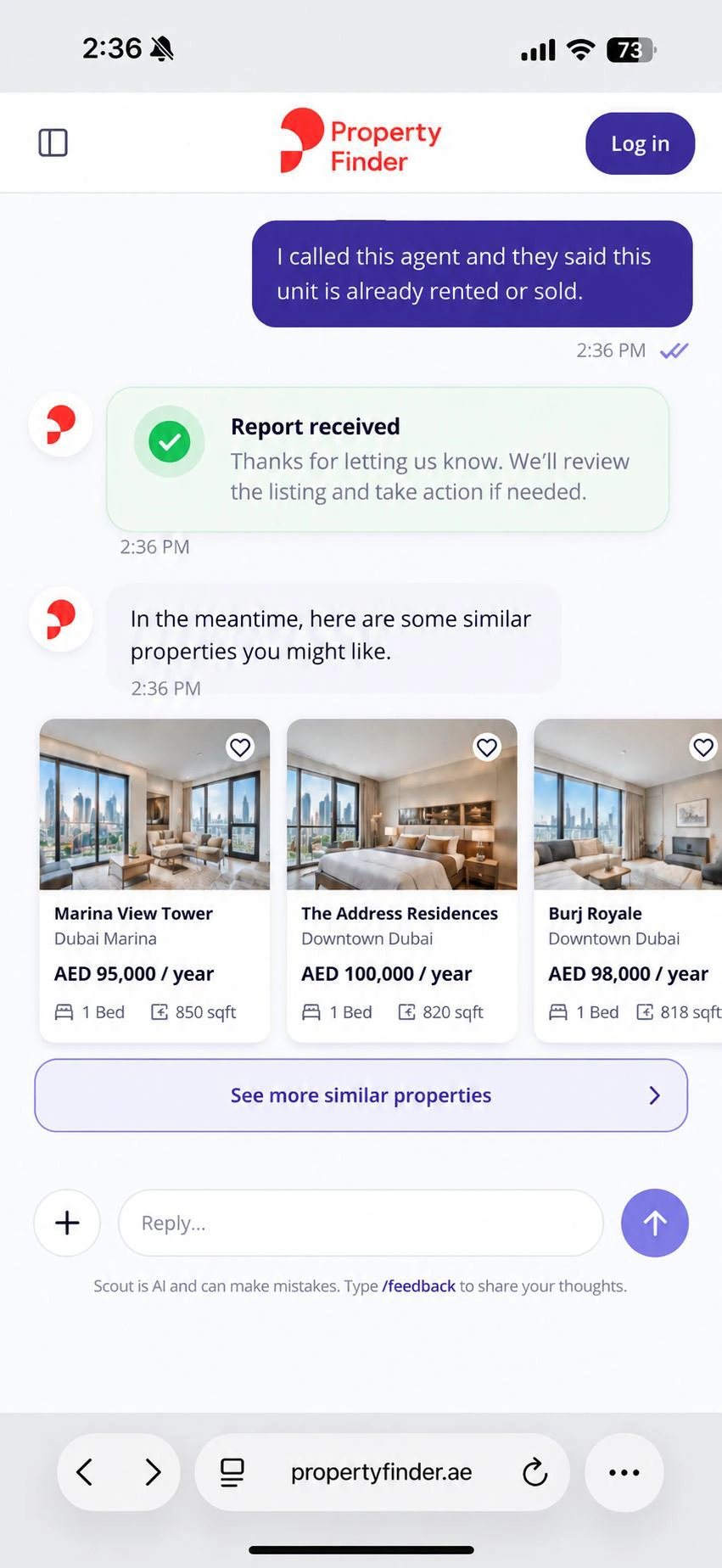
If a user calls an agent and learns that a property is already rented, sold or unavailable, they should be able to report that directly inside the chat.
Property Finder can then follow up with the agent and verify the listing. If it is outdated, fake or misleading, it should be removed immediately after verification.
This could address a major trust problem: properties that look available but are not. Chat can become a simple way for people to help keep the marketplace clean and trustworthy.
A report in the conversationI called this agent and they said this unit is already rented or sold.
14 · A focused interface
Keep what helps people make a decision.
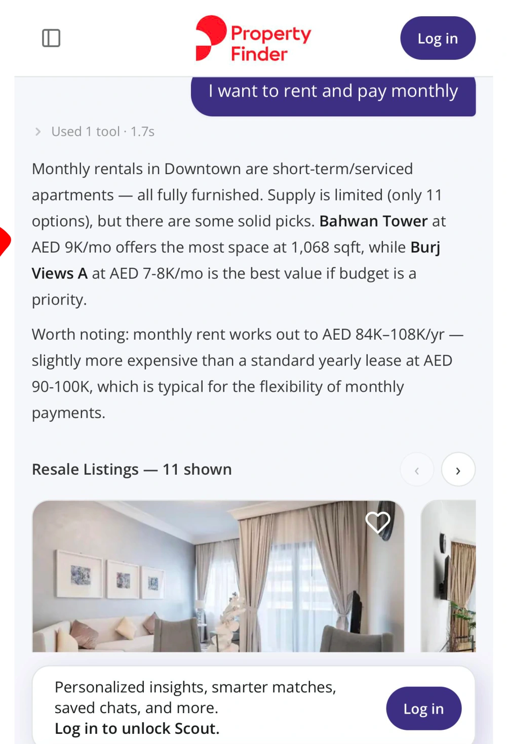
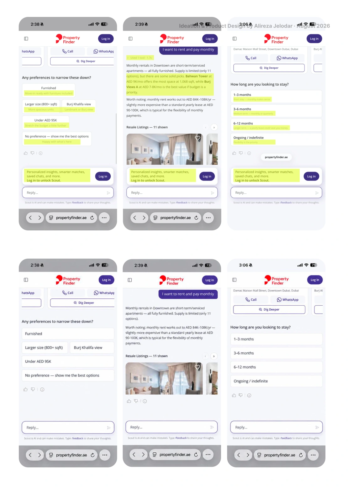
Inside the chat, the main focus should stay on the conversation. Anything unnecessary should be removed: “Used 1 tool,” technical information icons, system details users do not understand, and unnecessary explainers.
If something is mainly useful for developers, it probably should not be visible to the user. Keep what helps someone make a decision; remove what only explains how the system works.
The chat should feel clean, focused and easy to follow.
15 · Conversation and control
A little humanity. More user control.
The conversation should not feel like a search form with chat on top. When someone says “I want a home in JBR,” a short human response before the useful question can show that Scout understands what they are looking for.
Sometimes just seven or eight words are enough. The human layer should stay short, then lead to the next useful question.
The original exampleNice choice. JBR is great if you like an active neighborhood and being close to the beach.
Do not auto-scroll me to the end.
When I run a search, the interface should not automatically jump to the bottom of the answer. The response should start at the top, and I should scroll through it myself.
Jumping to the end makes me scroll back to understand where the answer began. Scout should preserve the beginning of the new response and let me control the reading flow.
16 · Neighborhood guidance
Before “Which home?” comes “Where should I live?”
An AI that can talk about neighborhoods, rather than only search listings, is a valuable opportunity. For an expat or someone new to Dubai, that guidance can make a real difference.
This path should be easy to find. Scout should help people understand the lifestyle, commute, people, family fit and trade-offs of each area before showing them homes.
A starting point worth making visibleWhere should I live?

17 · Next validation
Turn the direction into something measurable.
The next step would be to test the one-hand journey with renters, buyers and investors, then refine the experience around observed behavior. The checks below are proposed validation work; this case study does not claim measured results.
- Keep touch targets comfortably sized and primary choices within easy reach.
- Test English and Arabic layouts, screen readers, text scaling and keyboard access.
- Give loading, no-results and error states a clear next action without losing the conversation.
- Let people inspect, edit or reset the priorities the assistant remembers.
- Validate listing verification, report feedback and agent ratings before using them as trust signals.
One-hand usability
Test reachable controls, tap accuracy and task completion with one finger, on different phone sizes and with either hand.
Search quality
Track clarification drop-off, time to a useful shortlist and whether the first recommendations match the stated priorities.
Continuity & trust
Check whether people can resume a saved search, understand trade-offs and correctly confirm agent-contact or report states.
18 · The bigger opportunity
More than a feature. A better way to find home.
Scout should not just answer property questions. It should help people understand what they want, compare better options, continue their search, avoid repeated actions and trust the marketplace more.
If we get this right, Scout can become more than a feature. It can become the main way people search for homes on Property Finder.
The complete source
Every idea. Every original slide.
The full 18-slide presentation is preserved here, in its original order. Open any slide to read the original content, annotations and interface details at full size.