01 / Product first
A valuable asset. A familiar experience.
Zarpin brings gold and silver into a digital experience. The design challenge was to make a financially significant decision feel clear: what am I buying, how much does it cost, and where can I find what I own afterwards?
My scope connected the complete app journey design with brand identity, interior design and packaging. The app was the centre of that work. The surrounding brand needed to reinforce the same sense of trust, precision and control at every touchpoint.
I designed around behaviours familiar to Iranian users: Persian language, right-to-left reading, prices in toman, quantities in grams and recognisable navigation patterns. The aim was an easy, accessible journey that people could understand without first learning a new financial language.
- App & user journeys
- Brand identity
- Interior design
- Packaging
02 / Product decisions
Clarity at each decision.
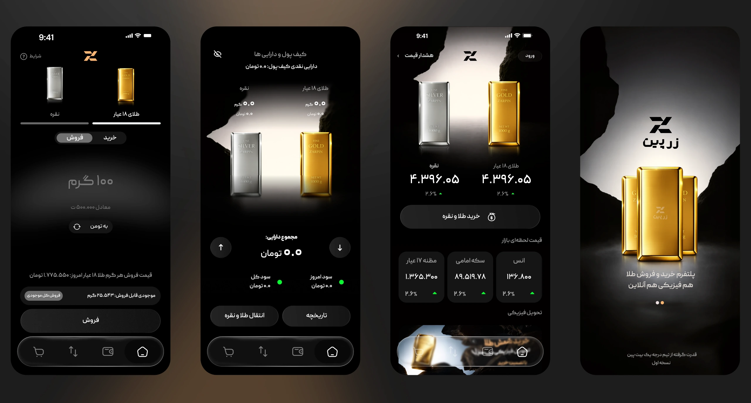
The journey connects introduction, market context, trading and ownership. Each part answers a different question, while the repeated metal imagery and navigation help people recognise where they are.
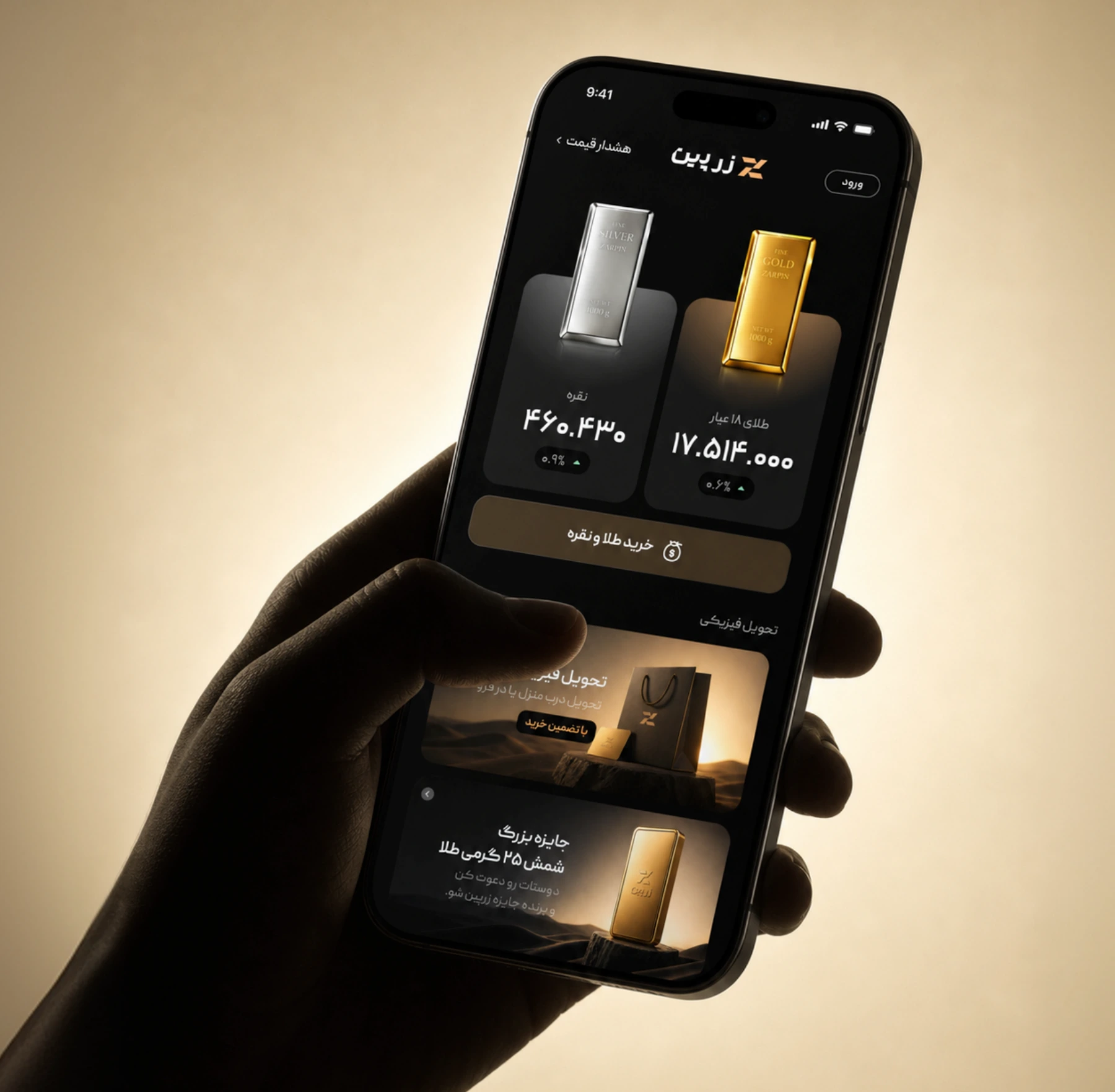
The home screen brings gold and silver prices together with a prominent trading action. On the trade screen, metal selection and the buy/sell control sit above the amount. The price information and time-sensitive quote remain close to the action, keeping the value being exchanged in view.
The wallet closes that loop by separating gold and silver holdings from the overall balance. Transfer and history provide routes back into ownership and previous activity. Rather than treating the transaction as the whole product, I considered what people need before deciding and after acquiring an asset.
Understand
Introduce the service and establish what gold and silver ownership means in the app.
Choose
See the market context and select the metal to buy or sell.
Trade
Enter a quantity, read the price and act on the current quote.
Manage
Return to balances, holdings, transfer and transaction history.
The interface gallery below shows the selected introduction, home, trade and wallet states included in the supplied brandbook.
03 / Interface design
One product. Two visual environments.
Dark and light directions keep the product’s main structures recognisable: gold and silver, the primary task, balances and persistent navigation. The visual treatment changes, while the product language remains familiar.
Bottom navigation places the main destinations within the lower part of the screen. Persian labels, local units and a clear hierarchy reduce the interpretation needed before an action. The accessibility goal was to make the next step understandable and practical to reach, rather than relying on decoration to explain the interface.
Switch between the original visual directions and open any screen to inspect it. These are source interface designs, presented as a gallery.
04 / Brand foundations
Trust, expressed consistently.
The identity carries continuity from the parent brand, BitPin. Its logo structure, geometry and proportions provide recognition, while a refined expression gives Zarpin its own character. The result is strong and structured, with a warmer, more human tone.
The brandbook defines white, black and Zarpin Gold as a restrained palette: 60% white, 30% black and 10% gold as the recommended balance. Gold marks value and emphasis; space and contrast do the rest. It is a brand composition guideline, not a rule that every app screen must reproduce literally.
Peyda is the Persian type family and SF Pro the Latin family. Their role is to keep information legible and hierarchy consistent across product and communication. Clear-space rules, approved logo forms and minimum sizes protect that consistency at small scales: 120 px / 30 mm for the full mark and 32 px / 8 mm for the symbol.
- White · 60%
- #FFFFFF
- Black · 30%
- #000000
- Zarpin Gold · 10%
- #FFB570
05 / Visual direction & website
Make ownership tangible.
The visual language turns an abstract digital asset into a meaningful human interaction. Hands, gold, silver and carefully placed objects communicate ownership and control. Soft directional light, warm neutral backgrounds and generous negative space keep the image focused.
The illustration direction follows the same discipline: simple geometry, rounded forms, soft depth and selective gold accents. It is intended to make complex financial ideas easier to read while preserving the character of the brand.
The website extends this language into larger compositions and mobile layouts. Product imagery, clear information and restrained materials connect the marketing experience with the app, rather than introducing a separate visual identity.
06 / Interior & retail design
The same confidence, in a physical space.
My interior design work extends the product’s visual principles into a physical environment. The retail concepts use textured stone, warm light, clear display areas and an illuminated identity. The aim is quiet confidence: a place where the asset is the focus and the brand is easy to recognise.
Lighting gives the logo a spatial presence and draws attention to the displays. Material, contrast and placement connect the digital gold accent with a warmer, tangible environment. The exhibition concept also brings a large app display into the space, linking the physical and digital sides of the experience.
Staff styling belongs to the same system. Tailored silhouettes, warm neutral tones and minimal accessories communicate precision and professionalism. These retail, exhibition and wardrobe visuals are presented as the concepts and inspiration documented in the brandbook.
07 / Physical touchpoints
A product you can hold.
Packaging connects the clarity of the app with the value of the physical asset. Presentation boxes, individual bar packaging and collection formats extend the mark and restrained material language into objects people can hold.
I approached these touchpoints as part of the same bundle: the brand sets an expectation, the app makes the journey understandable, and the physical design carries that identity into the hand. The supplied packaging visuals document this direction and its applications.
08 / Complete source collection
One system, across the whole experience.
This project brings product design, brand, interiors and packaging together. The product leads the story, but the value of the work is in how those parts reinforce each other: familiar interactions, a consistent identity and a recognisable physical experience.
For the product’s next validation step, I would focus on Persian text and number readability in both themes, touch-target comfort, quote-expiry comprehension and recovery when a trade cannot continue. Those are validation priorities, rather than measured results claimed by this case study.
All 34 original pages are preserved below in their supplied order. Expand a part to browse it horizontally, or open a page at full size.
Brandbook · Part 19 original pages +
Brandbook · Part 28 original pages +
Brandbook · Part 312 original pages +
Brandbook · Part 45 original pages +
- Product design & app journeys
- Alireza Jelodar
- Brand identity & packaging
- Alireza Jelodar
- Interior design
- Alireza Jelodar