

02
What we built
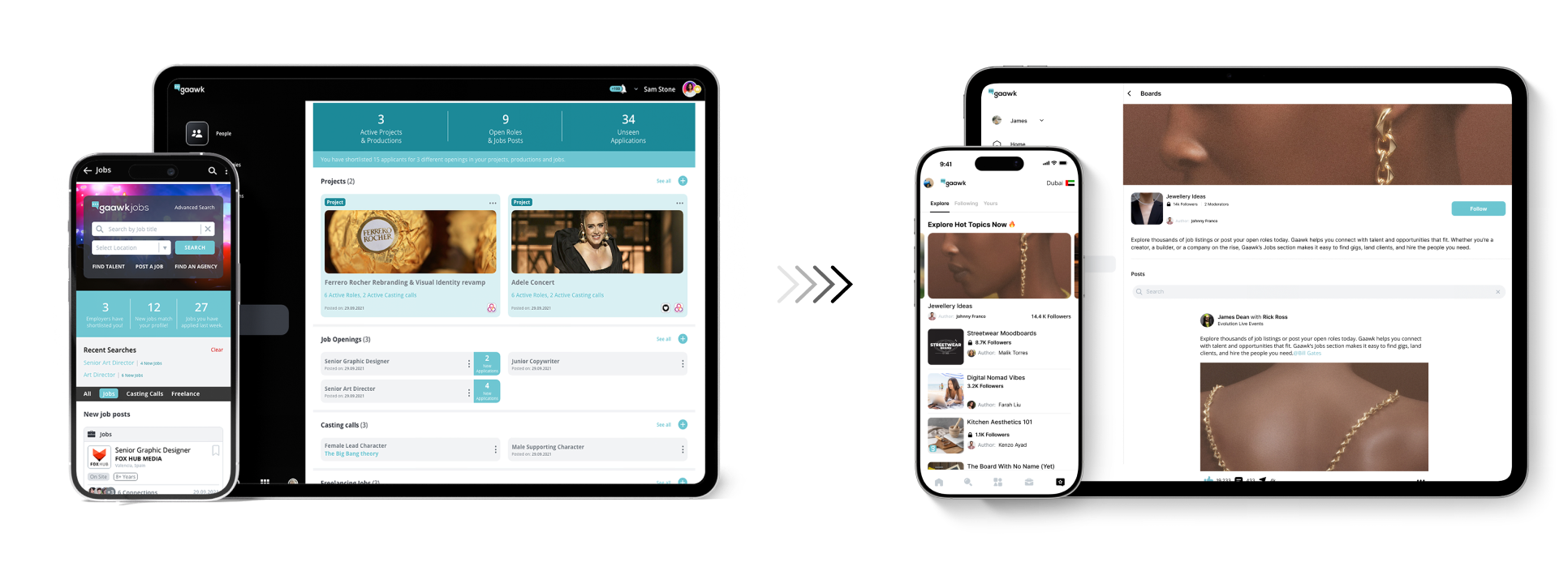
This is the collection of four core products I delivered for Gaawk. I’m proud to see how these came together as a cohesive system, and in this case study, I share how we shaped the strategy and built it as a team:
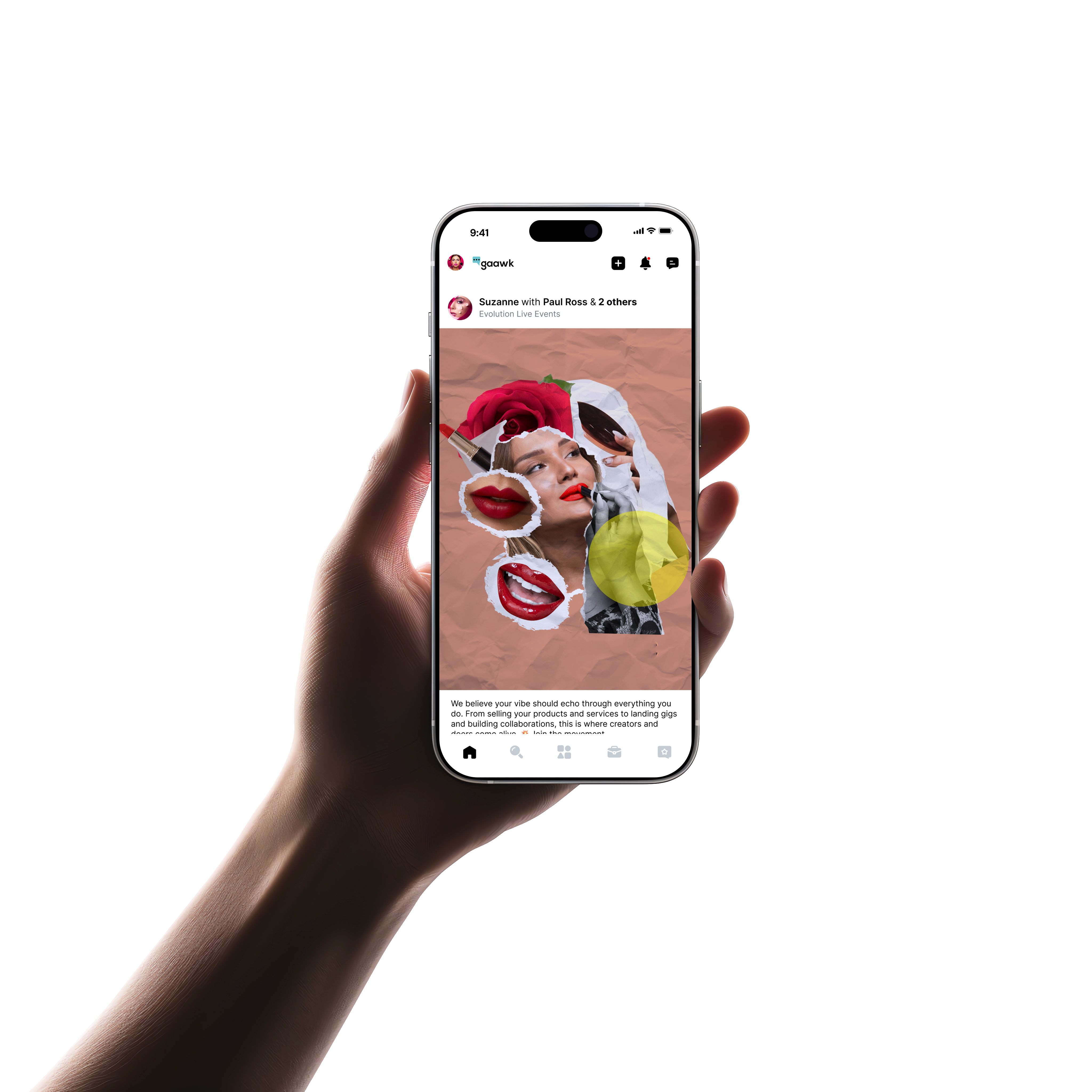
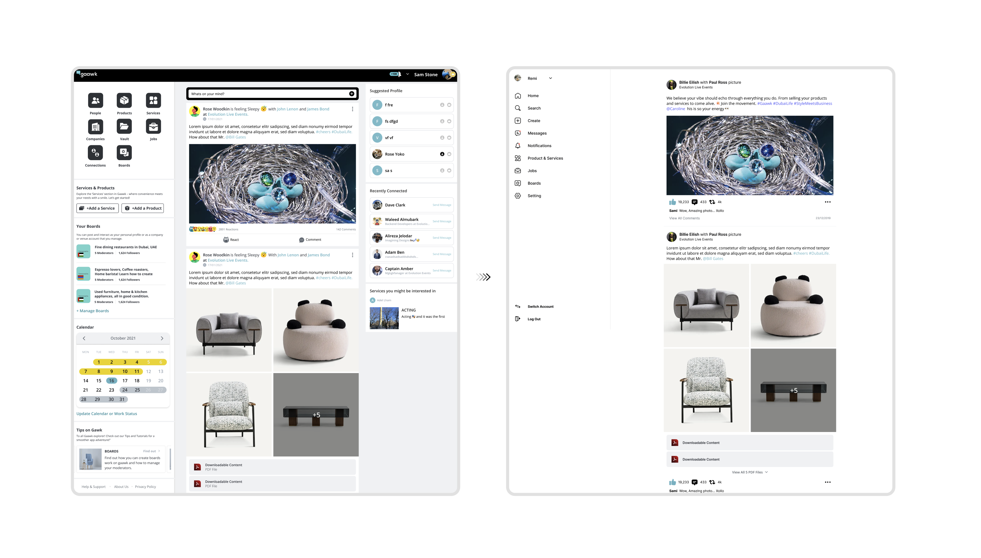
The main app experience
Simplified an overloaded app into an intuitive, focused experience, clear, fast, and empowering for creators.
A modern, focused website & web app
Transformed the online presence into a minimal, premium website, building trust and guiding users seamlessly to the app.
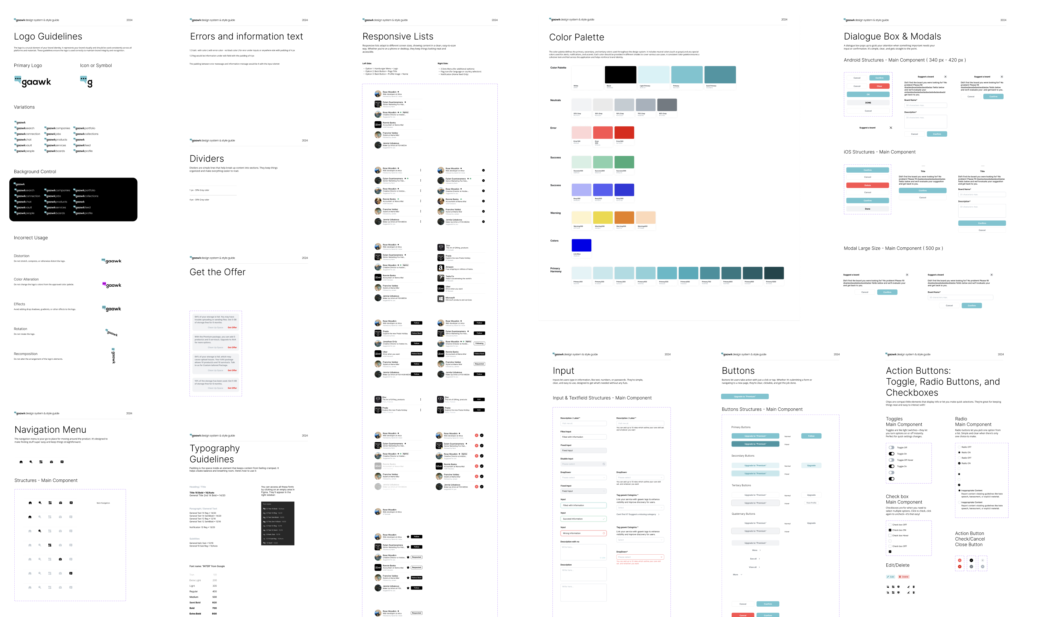
A flexible, minimal design system
Created a clean, unified design system from scratch, enabling fast development and consistent visual language.
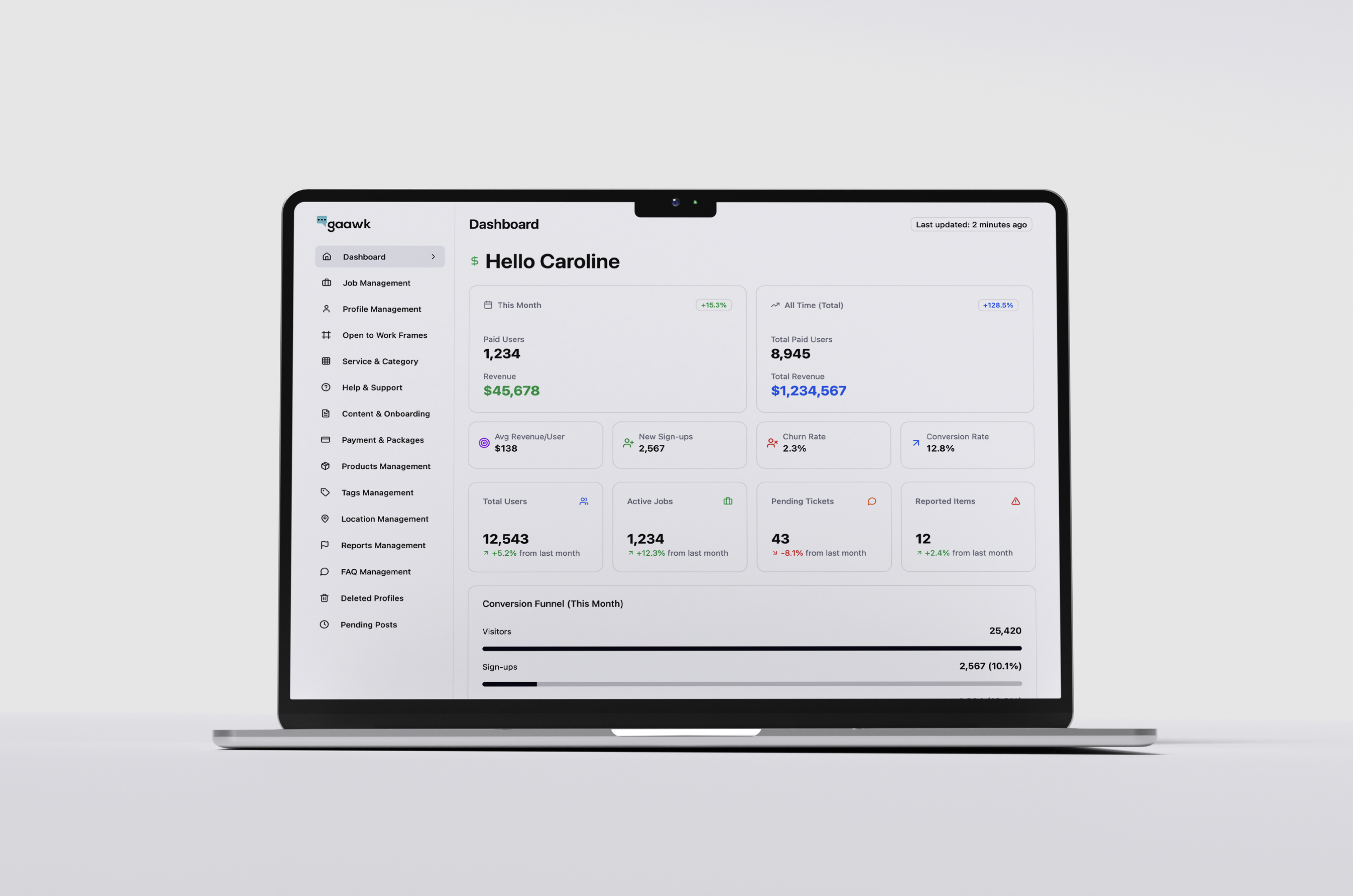
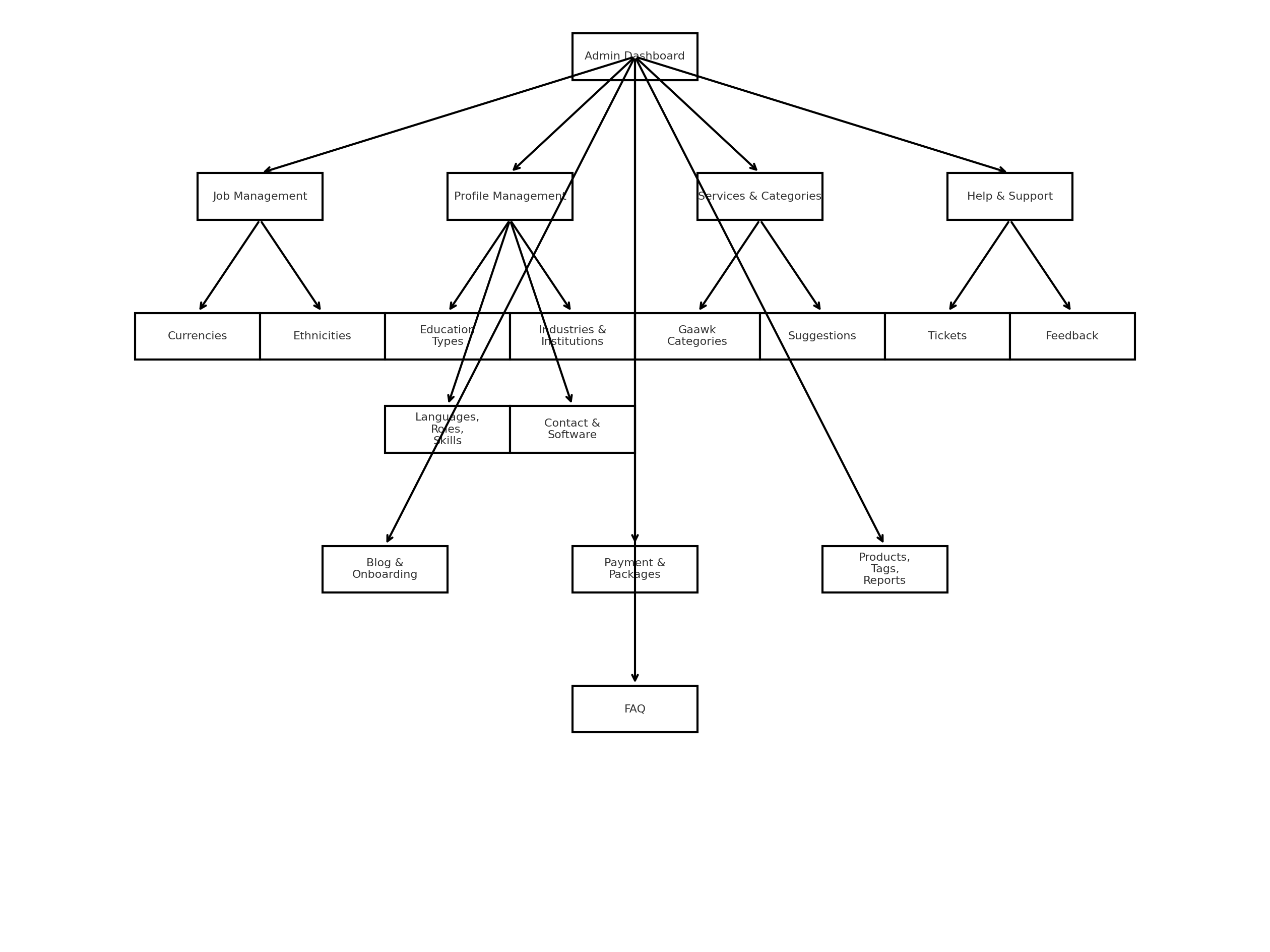
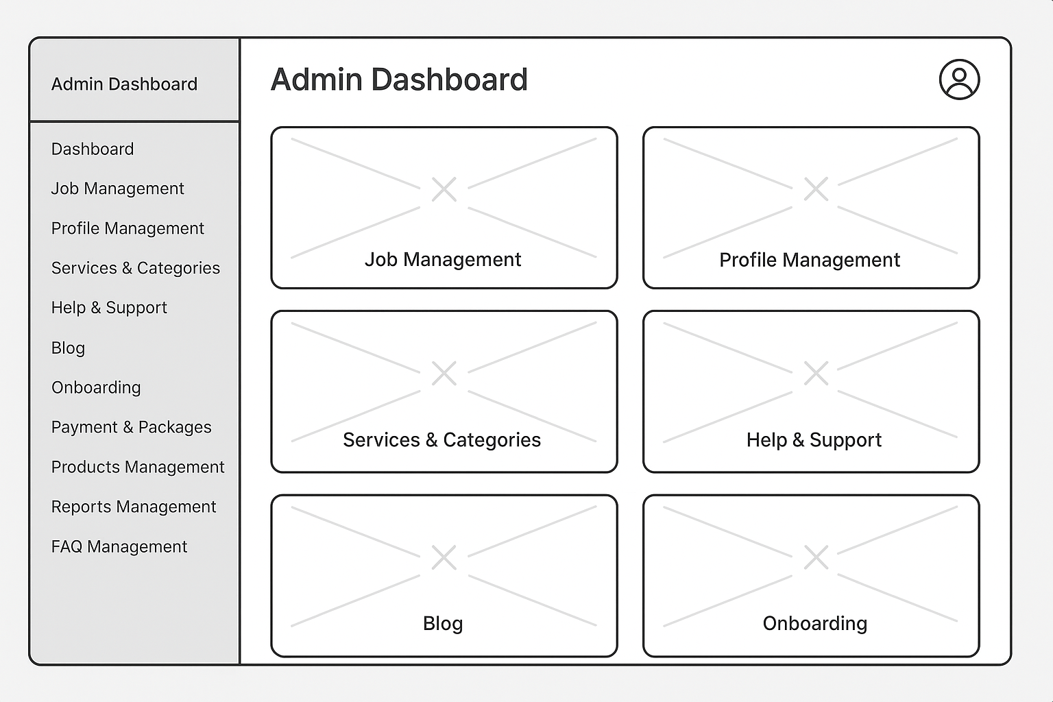
A powerful admin and back-office dashboard
Designed an easy-to-use, data-driven control panel, empowering the team to monitor, manage, and scale operations confidently.
08
Extending the story
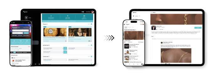
Website & Content:
We brought the same simplicity and even better clarity to the web with a modern design so it leads and prepare users for next phase of the new design of the app.
Landing pages were focused, messaging stayed sharp, and trust was front and center — making the leap from website to app seamless.Redo’s typography balances clarity and professionalism with a modern yet timeless type pairing, reinforcing our commitment to accuracy, efficiency, and financial stability.
09
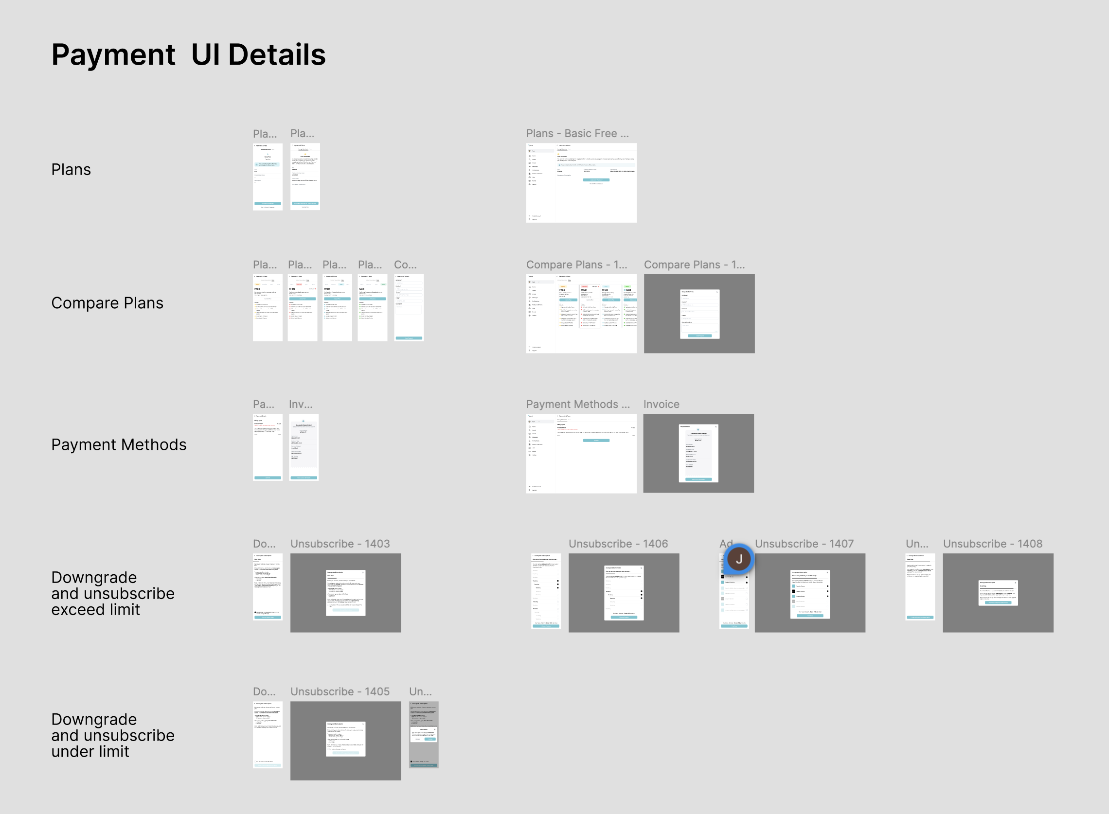
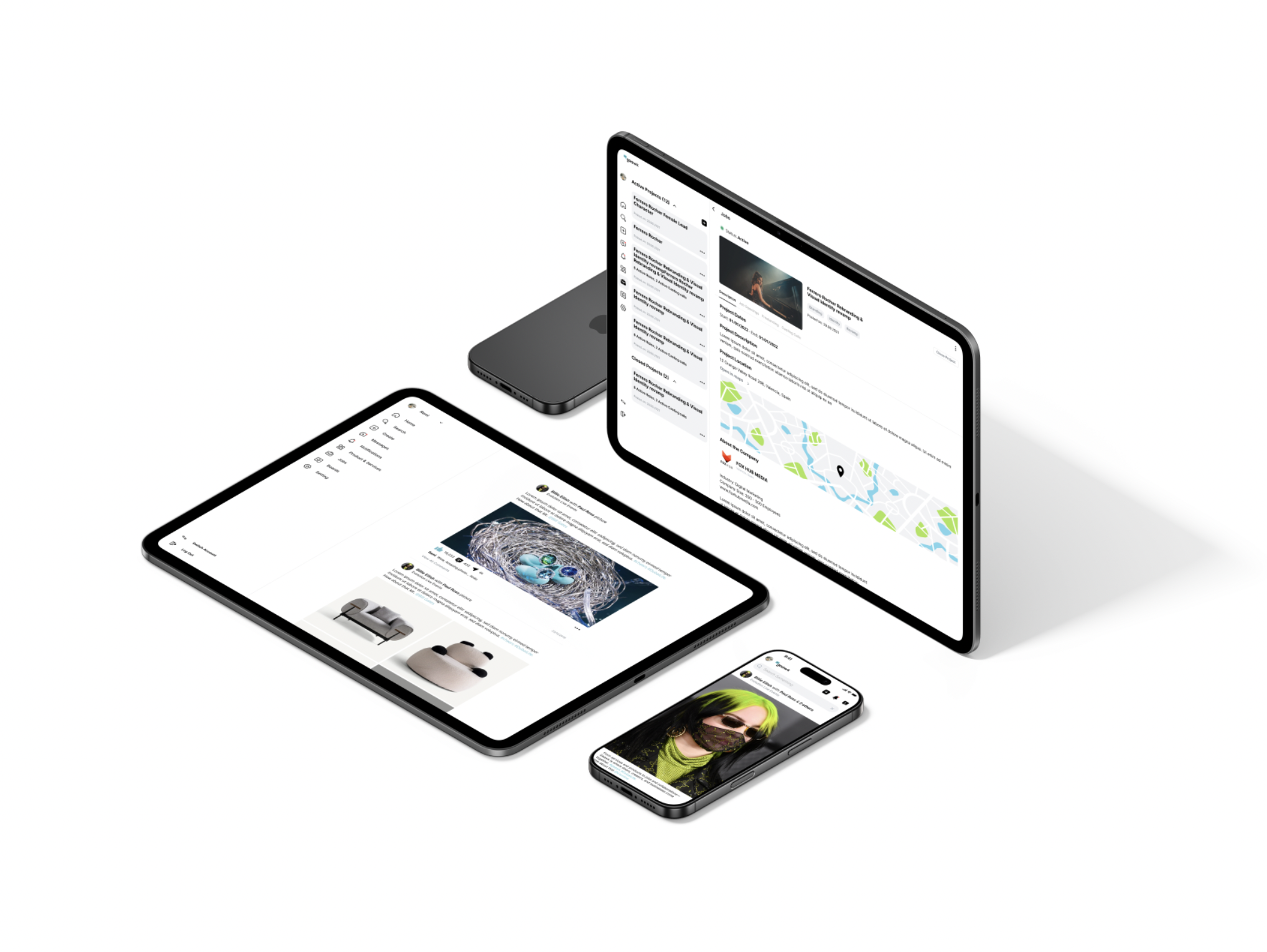
Control Room
Backoffice & Control Panel:
A clear, intuitive admin panel designed for smooth management.
Stakeholders and internal teams can easily monitor app performance, control operations, and see exactly what's happening in real time.

© 2025
All Rights Reserved

Creative Marketplace Platform
Gaawk is a multi-purpose creative marketplace empowering freelancers, agencies, brands, and artists to showcase, sell, and collaborate seamlessly.
Role: UX/UI Lead, Brand Strategist, Art Directorwww.gaawk.com
01
The Challenge
When I joined Gaawk, the team had been working on this ambitious creative marketplace for over a year. The product was overloaded with features and stuck.
Design felt outdated, user journeys were fragmented, and it simply wasn’t ready to launch.
We needed to untangle the complexity and bring Gaawk to life — fast.
02
What we built
This is the collection of four core products I delivered for Gaawk. I’m proud to see how these came together as a cohesive system, and in this case study, I share how we shaped the strategy and built it as a team:
The main app experience
Simplified an overloaded app into an intuitive, focused experience, clear, fast, and empowering for creators.
A modern, focused website & web app
Transformed the online presence into a minimal, premium website, building trust and guiding users seamlessly to the app.
A flexible, minimal design system
Created a clean, unified design system from scratch, enabling fast development and consistent visual language.
A powerful admin and back-office dashboard
Designed an easy-to-use, data-driven control panel, empowering the team to monitor, manage, and scale operations confidently.
03
Understanding the landscape
Research & Benchmarking:
We started by looking outwards. I analyzed top apps in social media, messaging, recruiting, forums, and content creation.
This helped us see what worked, what didn’t, and where Gaawk could stand out.
04
Focus over everything
Defining the Vision:
Gaawk tried to do it all: services, products, jobs, collaborations,storage,gallery, portfolio, etc. This ambition blurred the core value and confused users.
I worked with the team to define clear phases, cut distractions, and put focus back on what really mattered.
05
Working within limits
Redesigning User Journeys:
We didn’t have the luxury to start from scratch.
APIs were fixed, and technical resources were tight.
I redesigned journeys around these constraints, keeping flows intuitive and the experience feeling standard.

06
Try, fail, learn
Prototyping & Iteration:
We moved fast.
I built new prototypes, ran A/B tests internally with NDA-bound team members, and learned quickly.
This helped us refine ideas before locking anything into code.
07
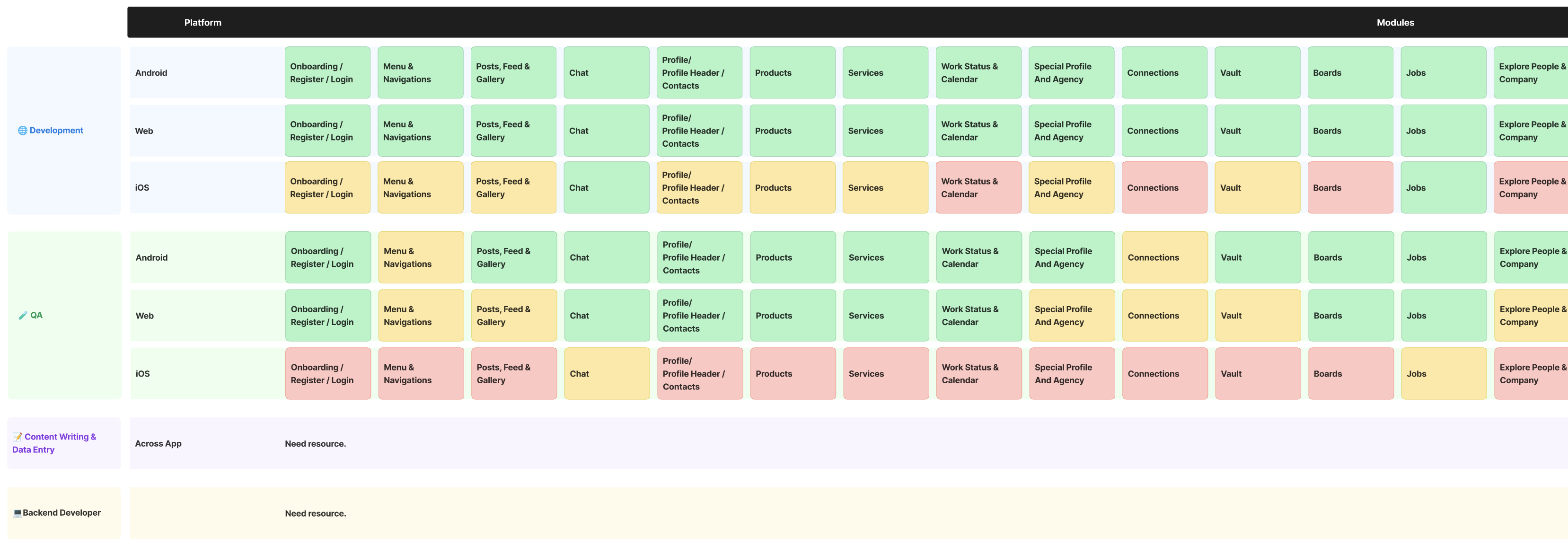
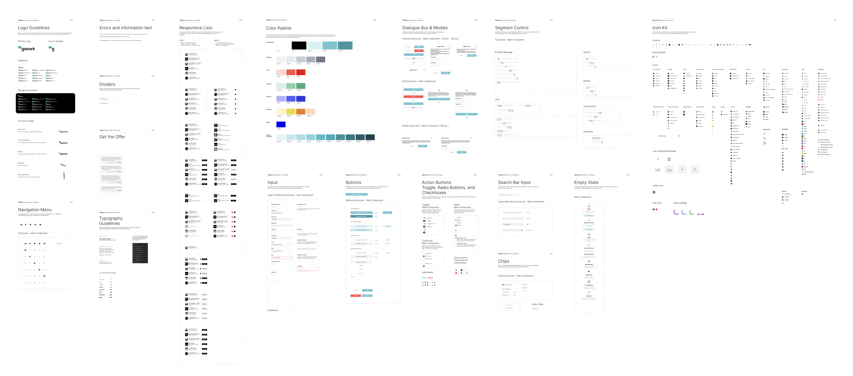
A strong backbone
Building a New Design System in Parallel:
The old design system was heavy and messy.
I introduced a unified, reusable system to simplify everything and bring visual consistency.
This sped up development by ~60% and gave us a solid foundation for the future.
08
Extending the story
Website & Content:
We brought the same simplicity and even better clarity to the web with a modern design so it leads and prepare users for next phase of the new design of the app.
Landing pages were focused, messaging stayed sharp, and trust was front and center — making the leap from website to app seamless.Redo’s typography balances clarity and professionalism with a modern yet timeless type pairing, reinforcing our commitment to accuracy, efficiency, and financial stability.
09
Control Room
Backoffice & Control Panel:
A clear, intuitive admin panel designed for smooth management.
Stakeholders and internal teams can easily monitor app performance, control operations, and see exactly what's happening in real time.
10
From lost to confident
Simplified Onboarding:
Onboarding took 15 minutes and left people confused.
After redesign, we cut it down to under 5 minutes, clear entry points, strong hierarchy, no tutorials needed.Testing & QA:
We ran continuous QA cycles on iOS, Android, and web.
Feedback loops helped us fix issues fast and improve reliability across all platforms.
11
Results &
Learning
Gaawk taught me to balance bold visions with technical realities and user needs.
Design isn’t just visuals — it’s focus, clarity, and building trust
Results:
- Delivered a launch-ready MVP after years of delays.
- Positive feedback from agencies and freelancers.
- Stronger brand trust and market positioning.
- A foundation ready to support future growth.
© 2025
All Rights Reserved

Creative Marketplace Platform
Gaawk is a multi-purpose creative marketplace empowering freelancers, agencies, brands, and artists to showcase, sell, and collaborate seamlessly.
Role: UX/UI Lead, Brand Strategist, Art Directorwww.gaawk.com
02
What we built
This is the collection of four core products I delivered for Gaawk. I’m proud to see how these came together as a cohesive system, and in this case study, I share how we shaped the strategy and built it as a team:
The main app experience
Simplified an overloaded app into an intuitive, focused experience, clear, fast, and empowering for creators.
A modern, focused website & web app
Transformed the online presence into a minimal, premium website, building trust and guiding users seamlessly to the app.
A flexible, minimal design system
Created a clean, unified design system from scratch, enabling fast development and consistent visual language.
A powerful admin and back-office dashboard
Designed an easy-to-use, data-driven control panel, empowering the team to monitor, manage, and scale operations confidently.
03
Understanding the landscape
Research & Benchmarking:
We started by looking outwards. I analyzed top apps in social media, messaging, recruiting, forums, and content creation.
This helped us see what worked, what didn’t, and where Gaawk could stand out.
04
Focus over everything
Defining the Vision:
Gaawk tried to do it all: services, products, jobs, collaborations,storage,gallery, portfolio, etc. This ambition blurred the core value and confused users.
I worked with the team to define clear phases, cut distractions, and put focus back on what really mattered.
05
Working within limits
Redesigning User Journeys:
We didn’t have the luxury to start from scratch.
APIs were fixed, and technical resources were tight.
I redesigned journeys around these constraints, keeping flows intuitive and the experience feeling standard.
06
Try, fail, learn
Prototyping & Iteration:
We moved fast.
I built new prototypes, ran A/B tests internally with NDA-bound team members, and learned quickly.
This helped us refine ideas before locking anything into code.
07
A strong backbone
Building a New Design System in Parallel:
The old design system was heavy and messy.
I introduced a unified, reusable system to simplify everything and bring visual consistency.
This sped up development by ~60% and gave us a solid foundation for the future.
08
Extending the story
Website & Content:
We brought the same simplicity and even better clarity to the web with a modern design so it leads and prepare users for next phase of the new design of the app.
Landing pages were focused, messaging stayed sharp, and trust was front and center — making the leap from website to app seamless.Redo’s typography balances clarity and professionalism with a modern yet timeless type pairing, reinforcing our commitment to accuracy, efficiency, and financial stability.
09
Control Room
Backoffice & Control Panel:
A clear, intuitive admin panel designed for smooth management.
Stakeholders and internal teams can easily monitor app performance, control operations, and see exactly what's happening in real time.
10
From lost to confident
Simplified Onboarding:
Onboarding took 15 minutes and left people confused.
After redesign, we cut it down to under 5 minutes, clear entry points, strong hierarchy, no tutorials needed.Testing & QA:
We ran continuous QA cycles on iOS, Android, and web.
Feedback loops helped us fix issues fast and improve reliability across all platforms.

© 2025
All Rights Reserved