01 · The brief
Confidence begins before the consultation.
Hoonam is a beauty clinic working across skin, hair and clinician-led aesthetic care. Its identity needs to feel composed and welcoming while carrying the precision expected of a medical environment.
The February 2024 identity established the foundation: a flowing H, bilingual logotypes, a nature-led palette and a family of graphic applications. This case study follows that system from its original logic into a broader patient experience.
02 · Brand direction
A softer expression of precision.
The proposed experience is built around a simple idea: Care, considered. Warmth comes through natural materials, tactile paper and generous space. Precision comes through disciplined typography, clear hierarchy and consistent details.
The tone is personal and measured. Communication helps people understand the next step, without promises of perfection, pressure to change their appearance or exaggerated treatment claims.
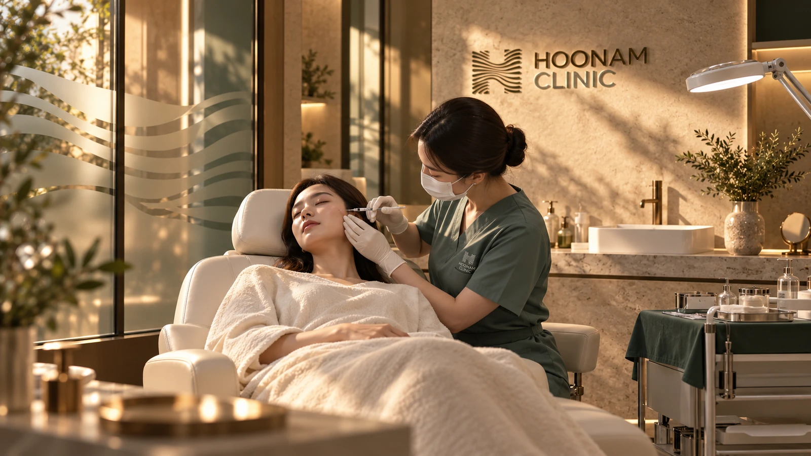
The treatment-room concept carries the same identity into a more clinical setting. The illustrated cheek-treatment scene explores how a calm material palette, practical organisation and focused task lighting can sit together.
03 · Original identity · 2024
An H with a natural rhythm.
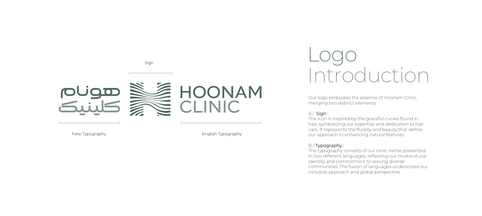
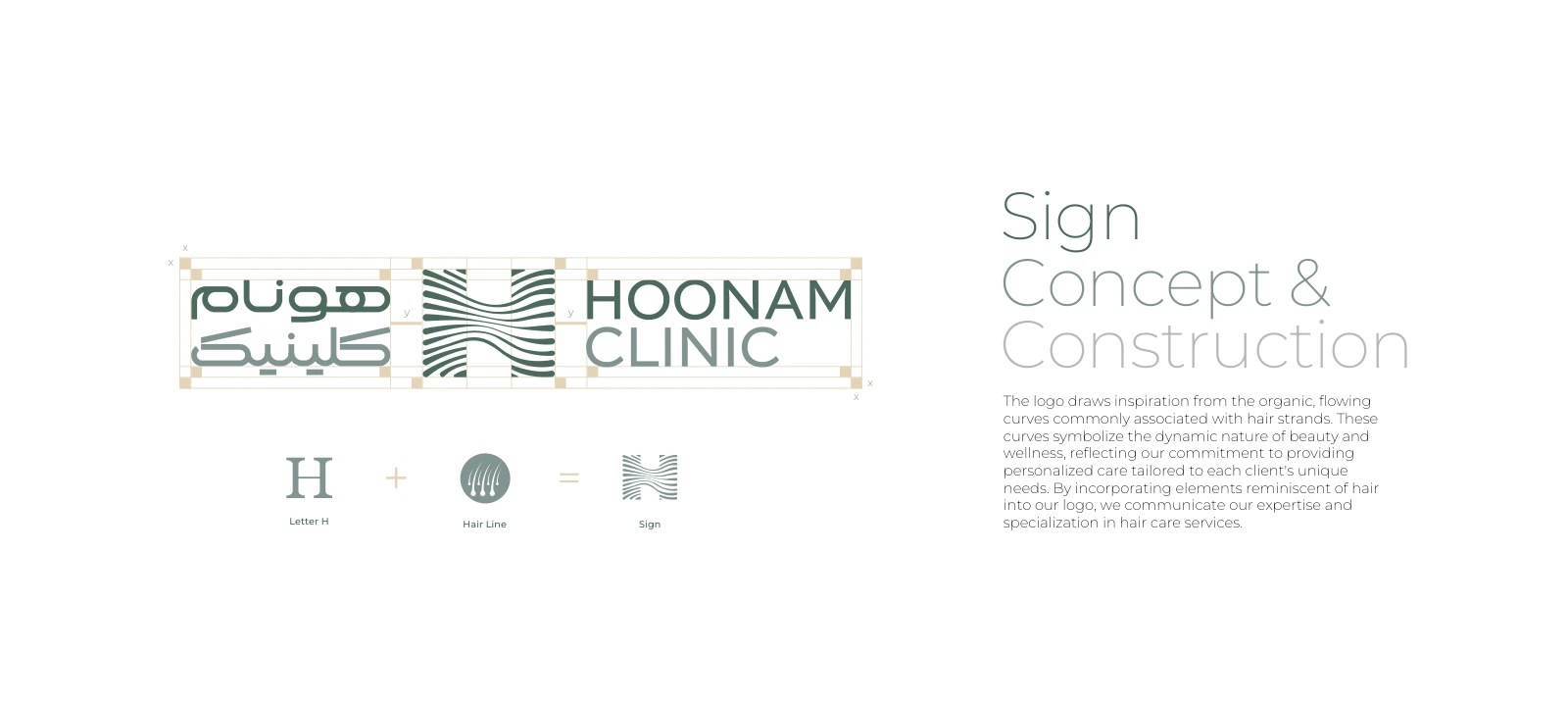
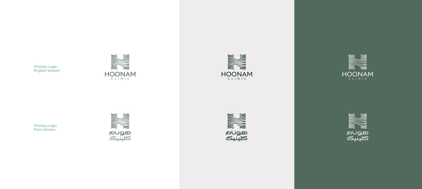
The original symbol brings the letter H together with the movement of hair. Its parallel lines bend through the centre, creating a recognisable silhouette that can hold its shape as a small mark or expand into a larger graphic language.
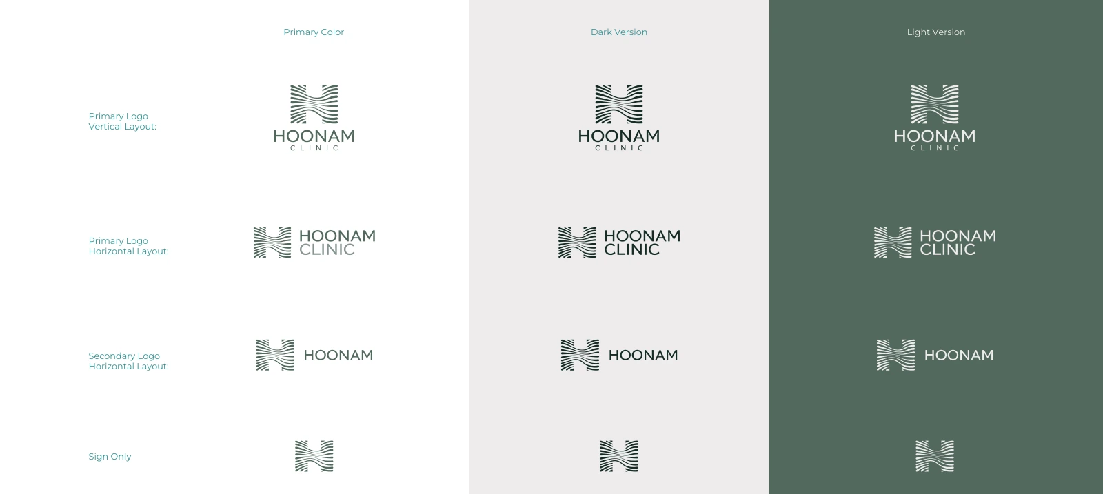
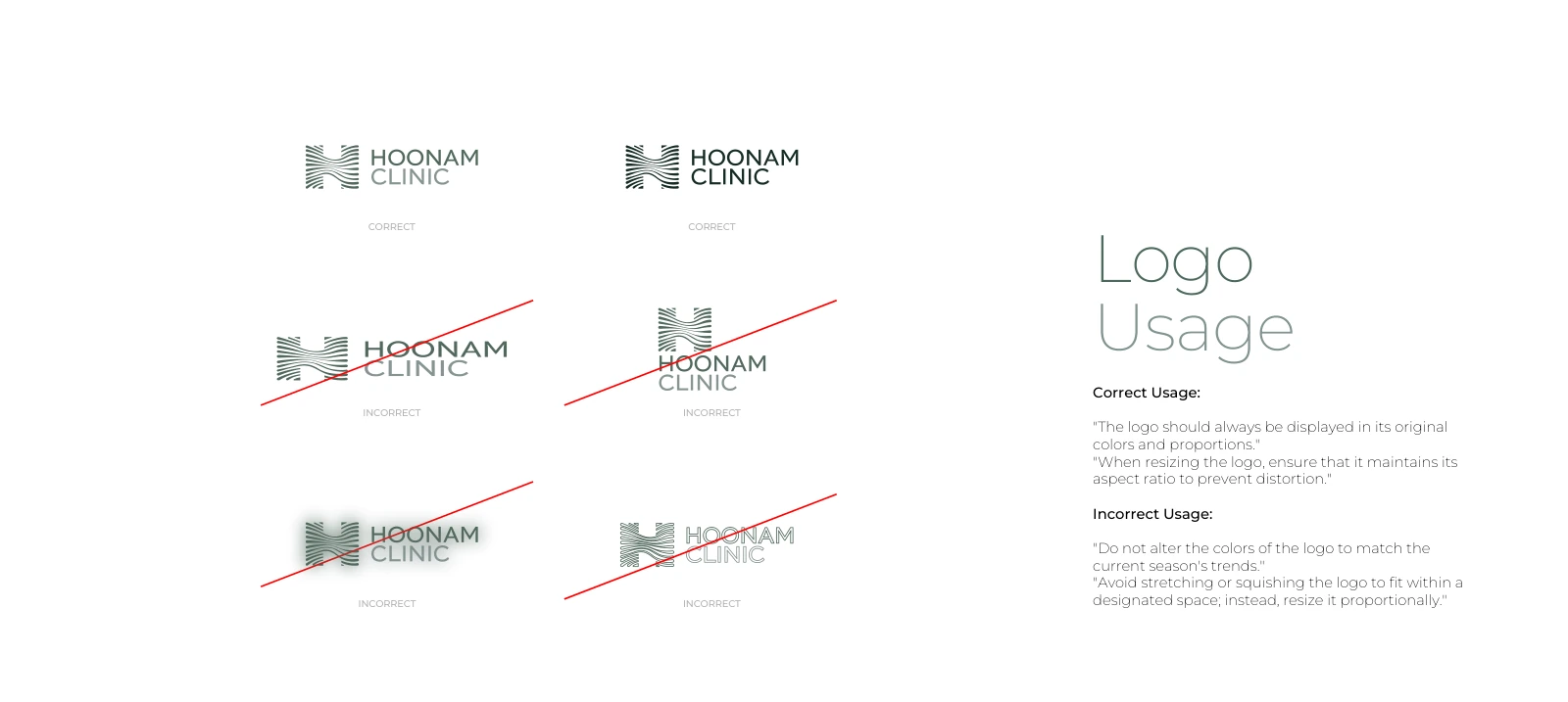
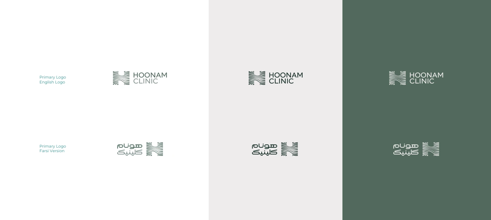
The original English and Persian logotypes remain intact. The new applications use the supplied identity rather than introducing a replacement logo.
04 · Original palette
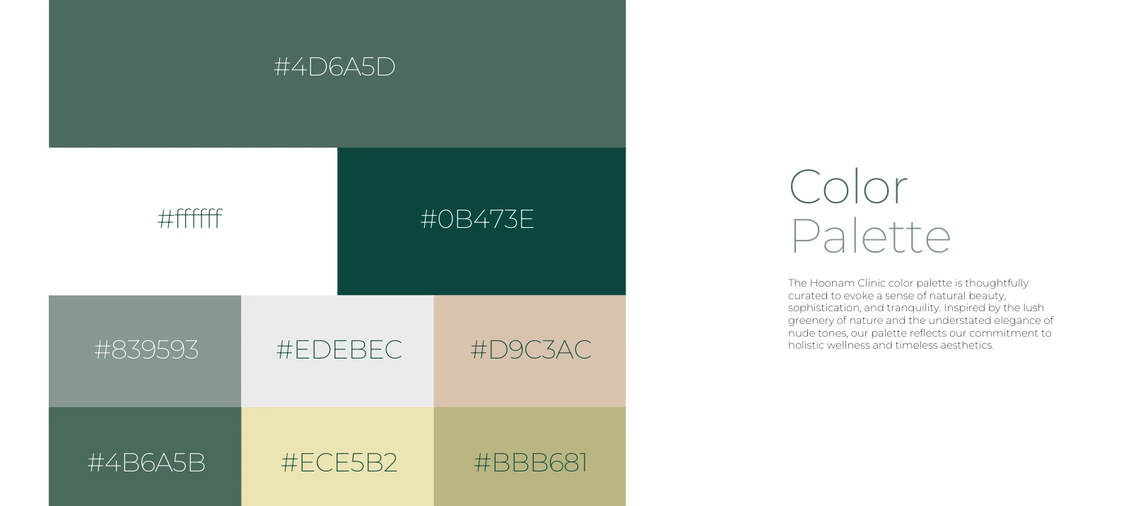
Grounded in green. Balanced by warmth.
Muted green gives the identity a calm centre; deeper forest adds contrast and structure. Ivory, nude and soft olive provide a warmer register for paper, interiors and patient-facing materials.
The extension gives each colour a job: deep green for orientation and emphasis, light neutrals for reading surfaces, and sage for secondary details. Material and light create depth without adding unrelated accent colours.
05 · Type & graphic system
One identity, in two languages.
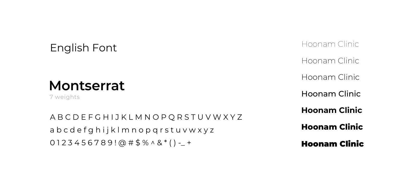
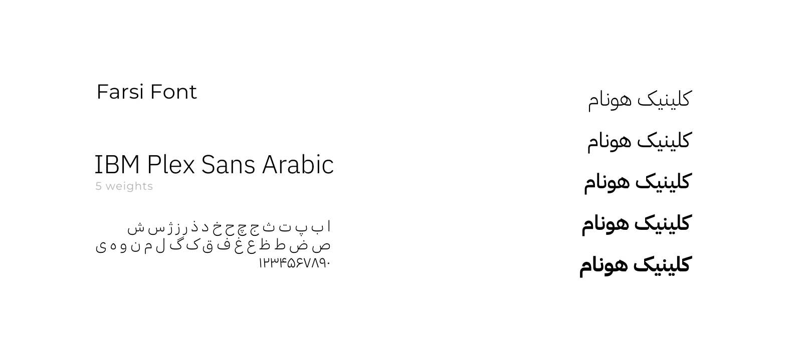
Montserrat and IBM Plex Sans Arabic are the brandbook’s English and Persian typefaces. Their roles support a shared hierarchy while allowing each script to keep its own spacing and reading rhythm.
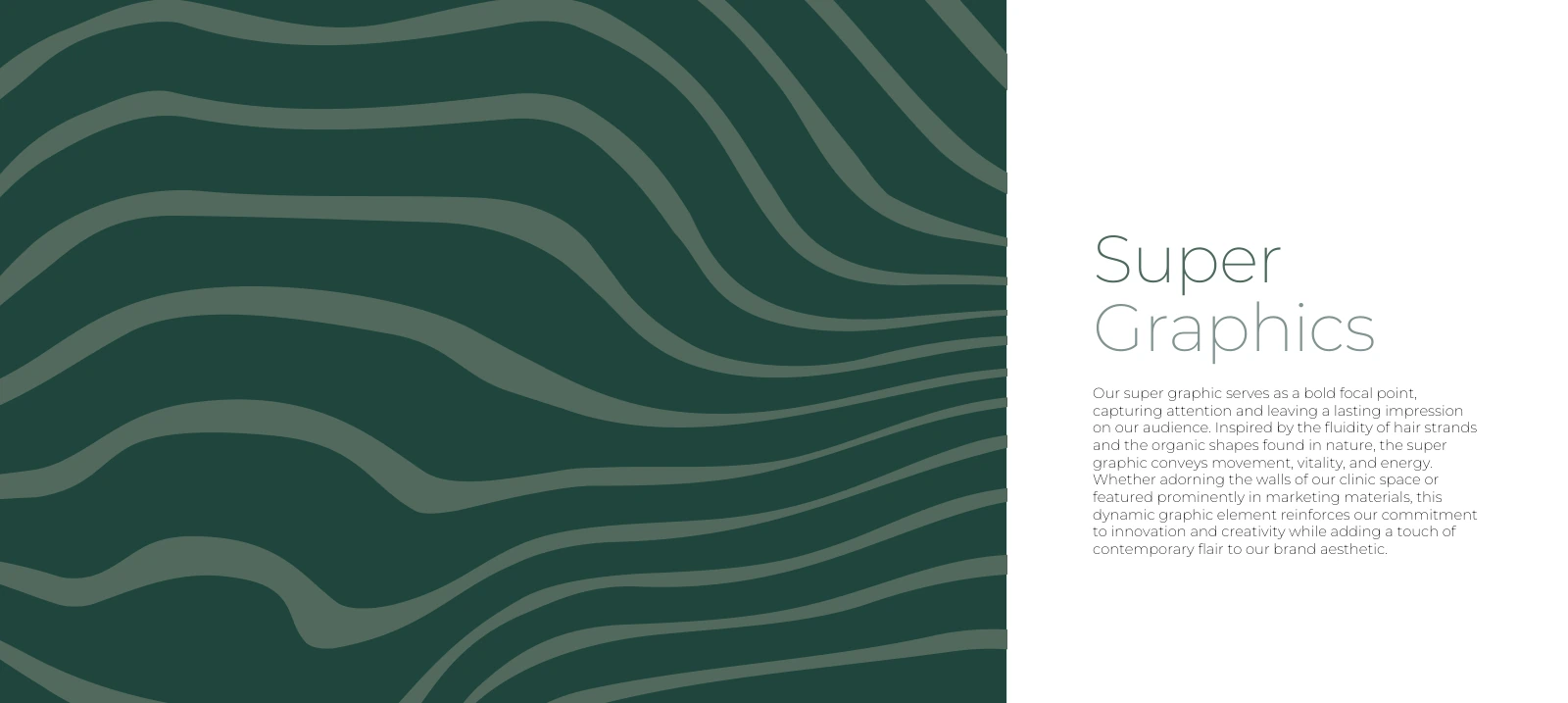
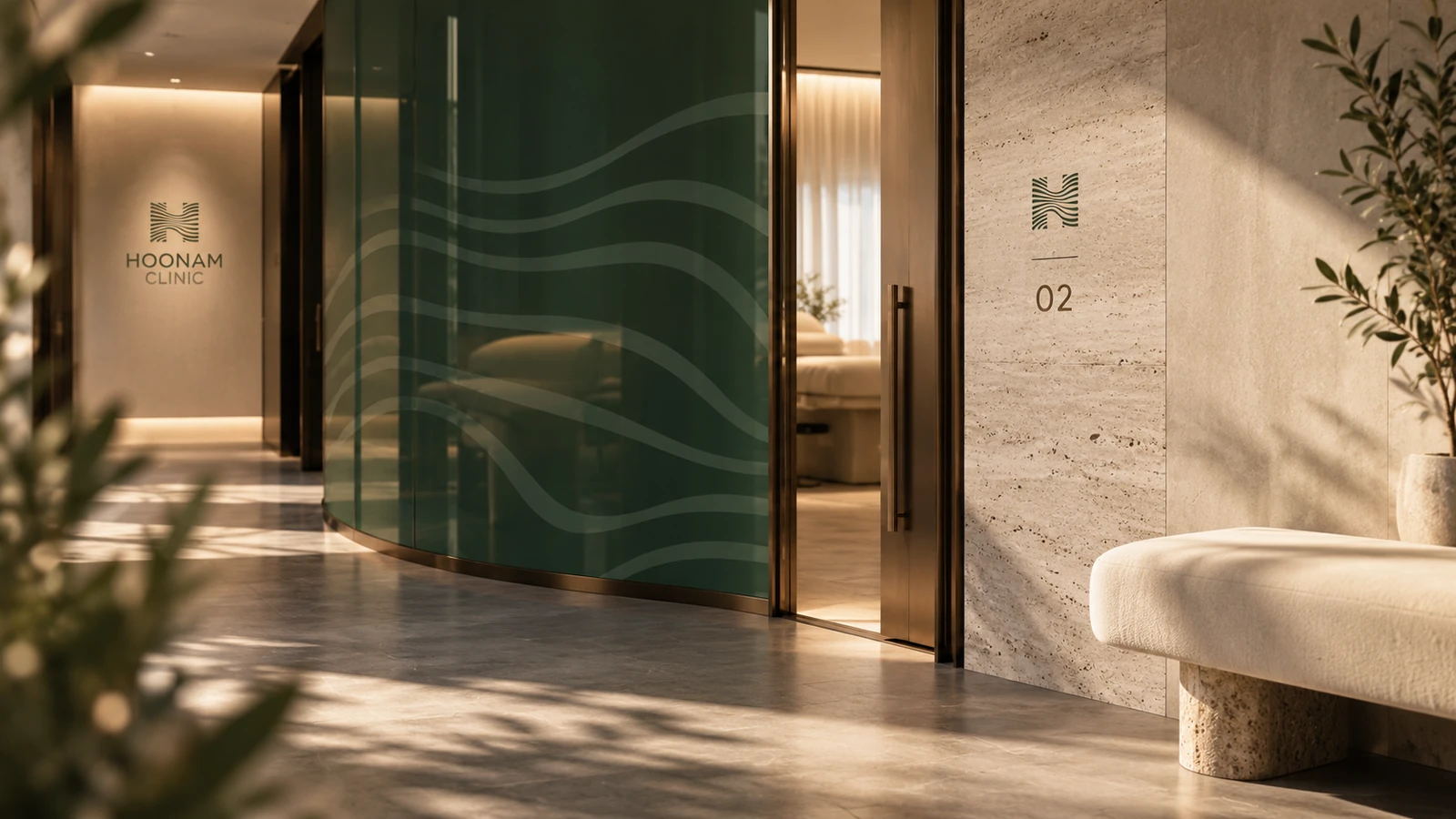
The flowing supergraphic extends the mark’s movement across larger surfaces. In the proposed clinic, it becomes a privacy treatment, a subtle emboss or a directional accent. It is quieter near practical information and more expressive on a brand surface.

06 · Concept extension · Environment
A brand you can step into.
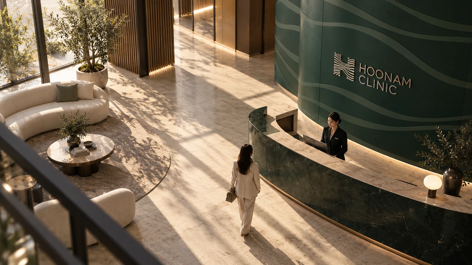
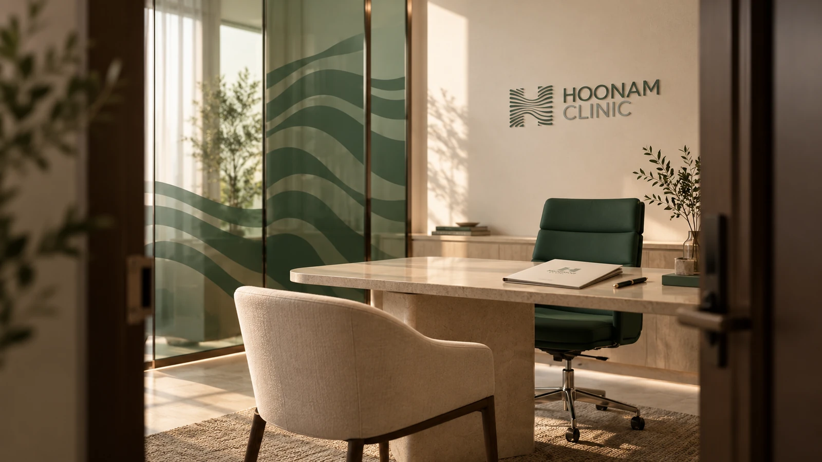
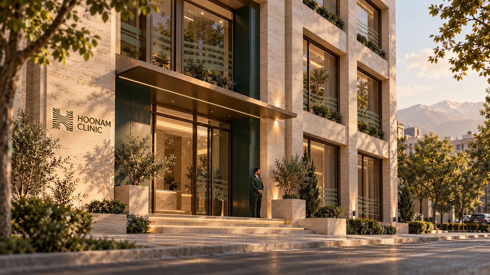
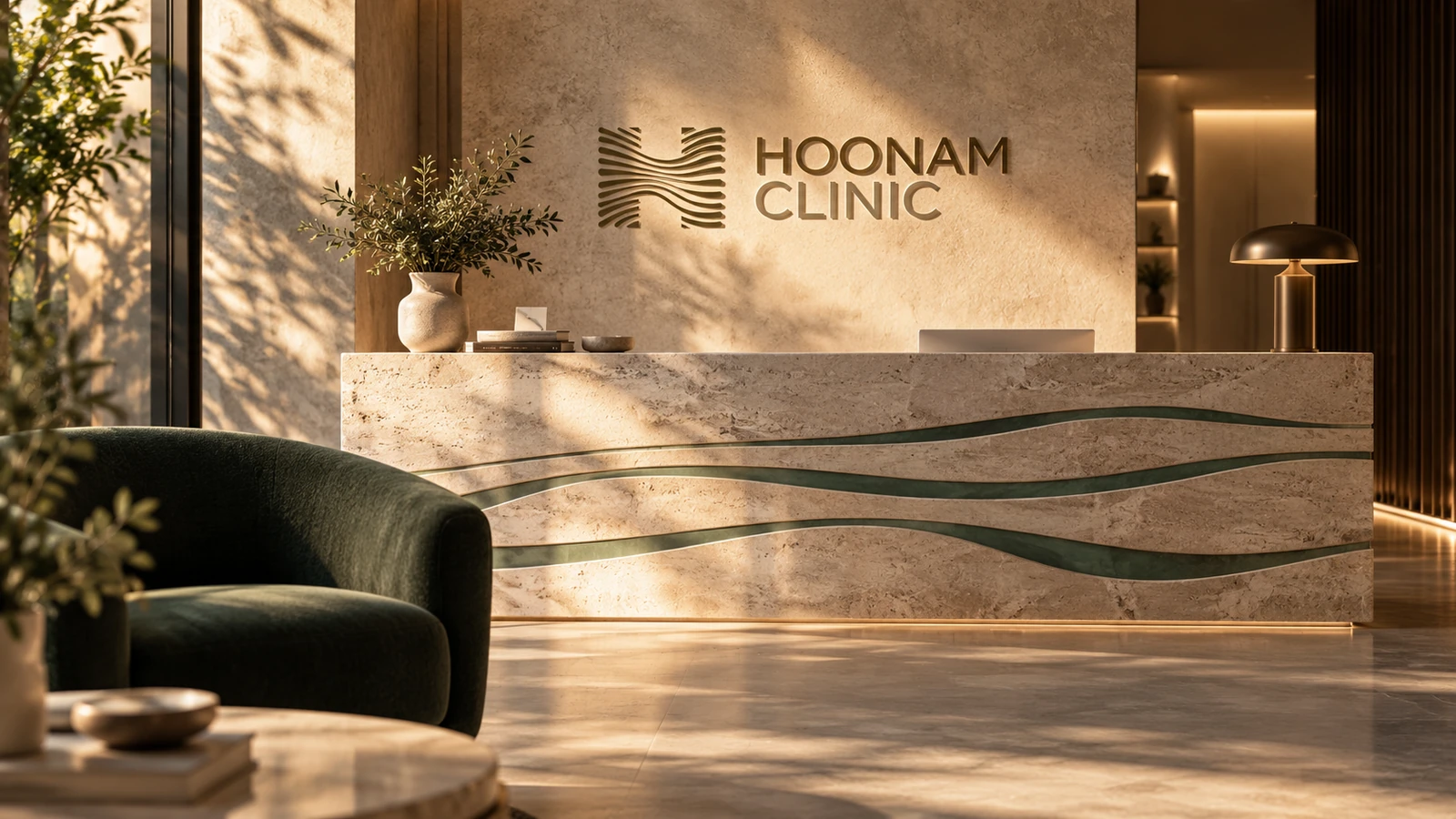
The spatial proposal translates the palette into honed stone, soft green upholstery, warm timber and restrained metal details. Daylight and long shadows give the space a lived-in quality rather than a glossy showroom finish.
Arrival, reception and wayfinding carry different levels of expression. The entrance establishes recognition; consultation spaces lower the visual volume; clear room numbers help people move without uncertainty. These are brand-environment concepts, not documentation of a built clinic.
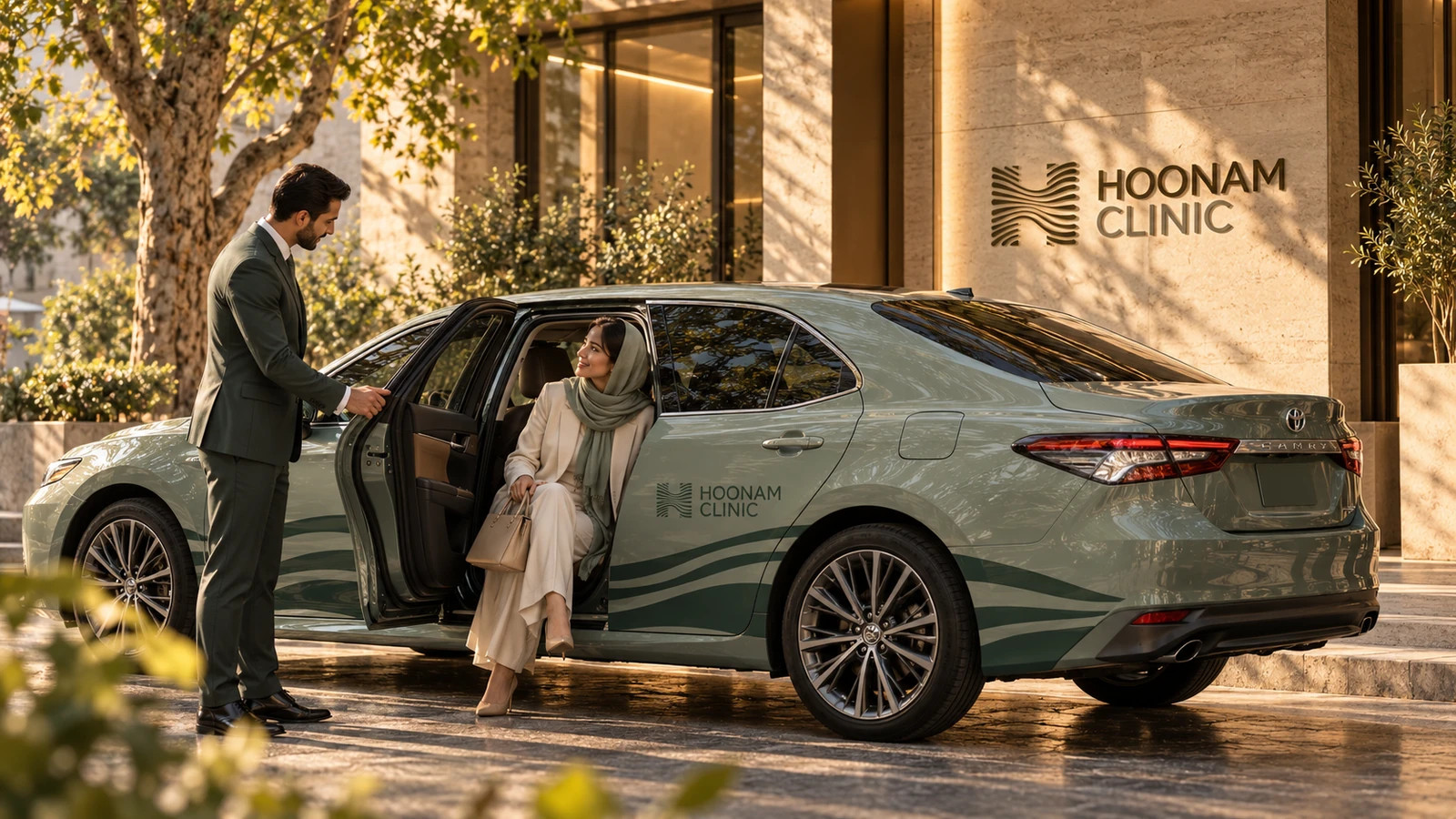
The concept also follows the arrival journey beyond the front door: a discreetly branded Toyota sedan and chauffeur explore a possible client transfer service, with the same restrained visual language as the clinic.
07 · Concept extension · Workwear
The people carry the identity.
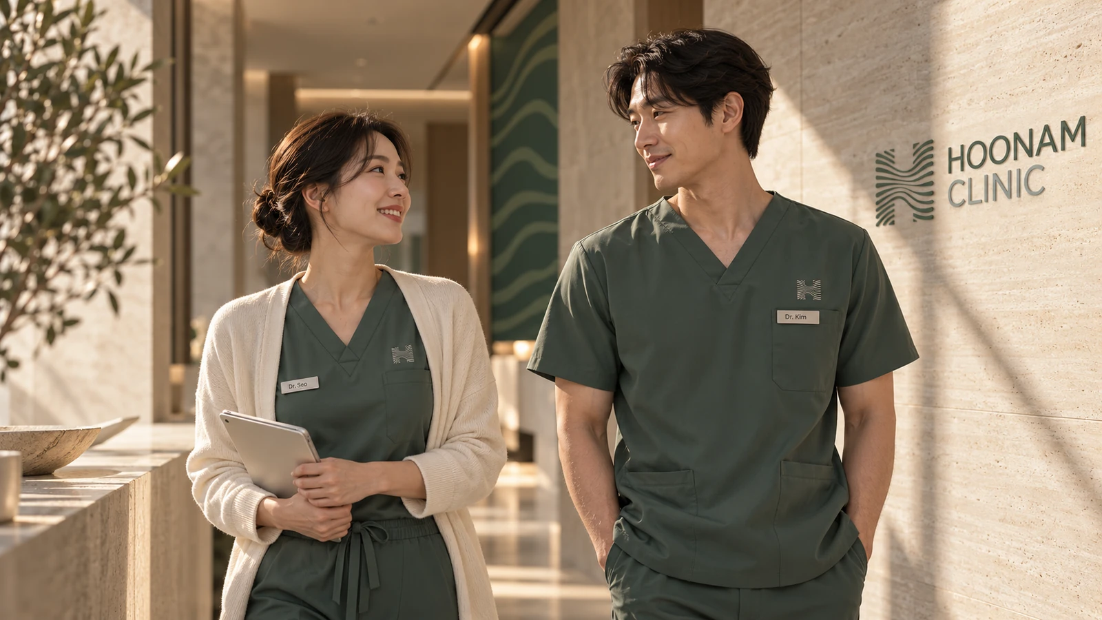
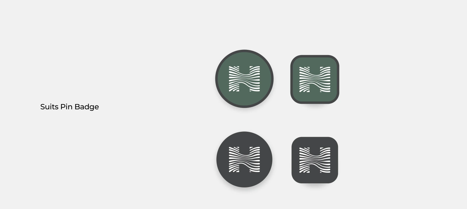
Tailored sage scrubs, small tonal embroidery and a restrained badge bring the brand into everyday contact. The proposed workwear keeps recognition close to the person without turning a clinical uniform into an advertising surface.
Fabric, fit and cleaning requirements would be resolved with the clinic team before production. The visual direction prioritises practical movement, clear identification and a reassuring first impression.
08 · Concept extension · Patient experience
The visit ends. Care continues.
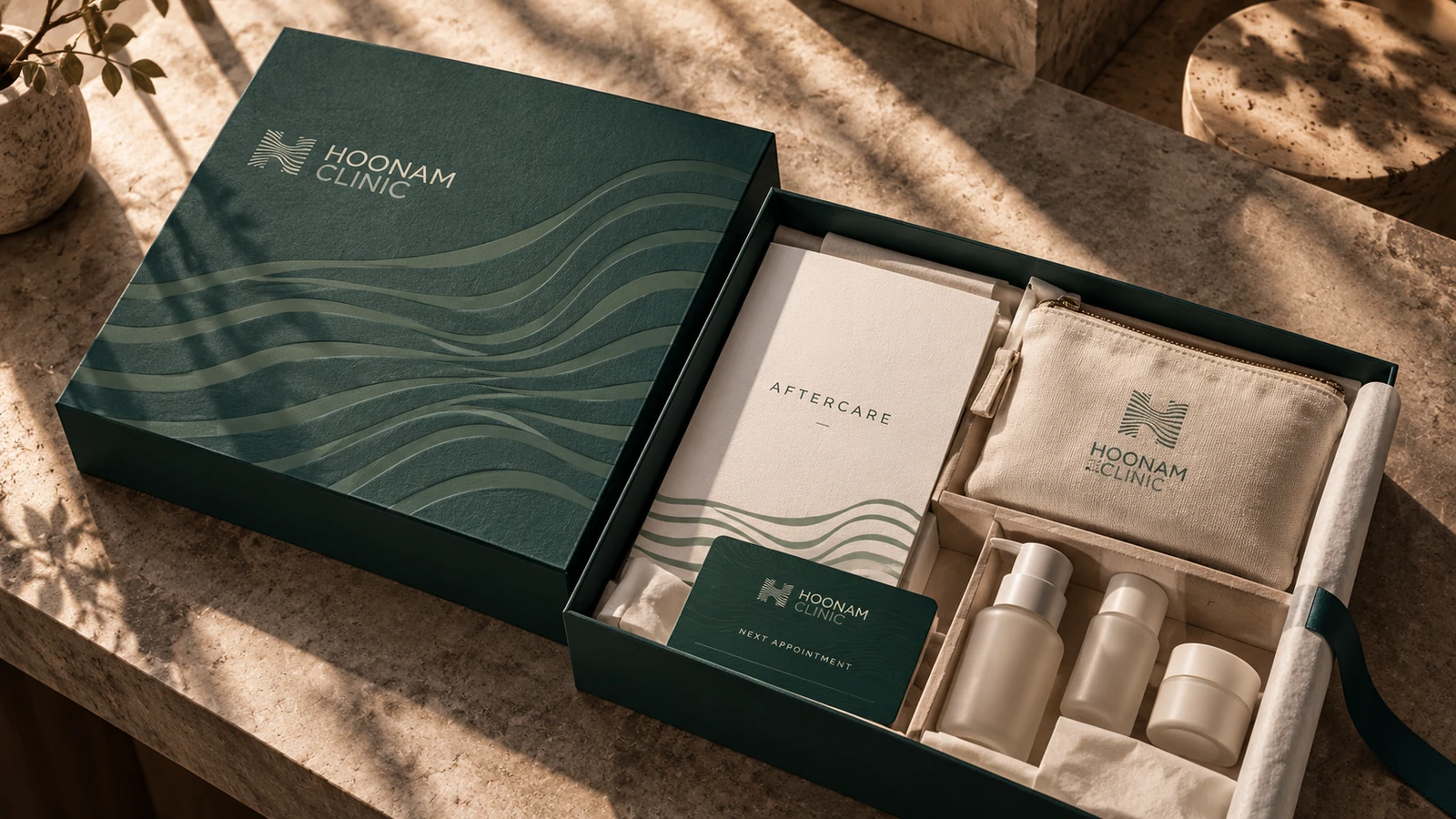
The proposed aftercare kit makes the handover feel organised and personal: a fitted pouch, a clear care booklet, a follow-up card and space for clinician-selected items. The packaging supports the conversation instead of substituting for it.
Treatment-specific instructions would be supplied and approved by the treating clinician. The concept defines the hierarchy and physical experience of the information, rather than inventing medical guidance.
09 · Concept extension · Take-home objects
Recognition in the smallest details.
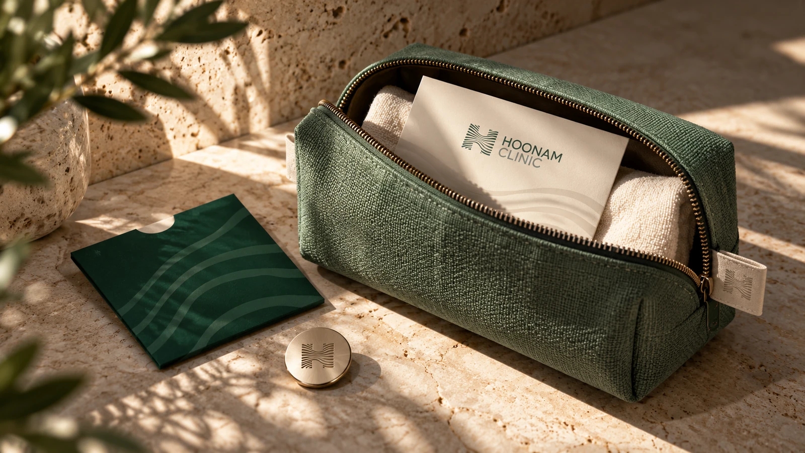
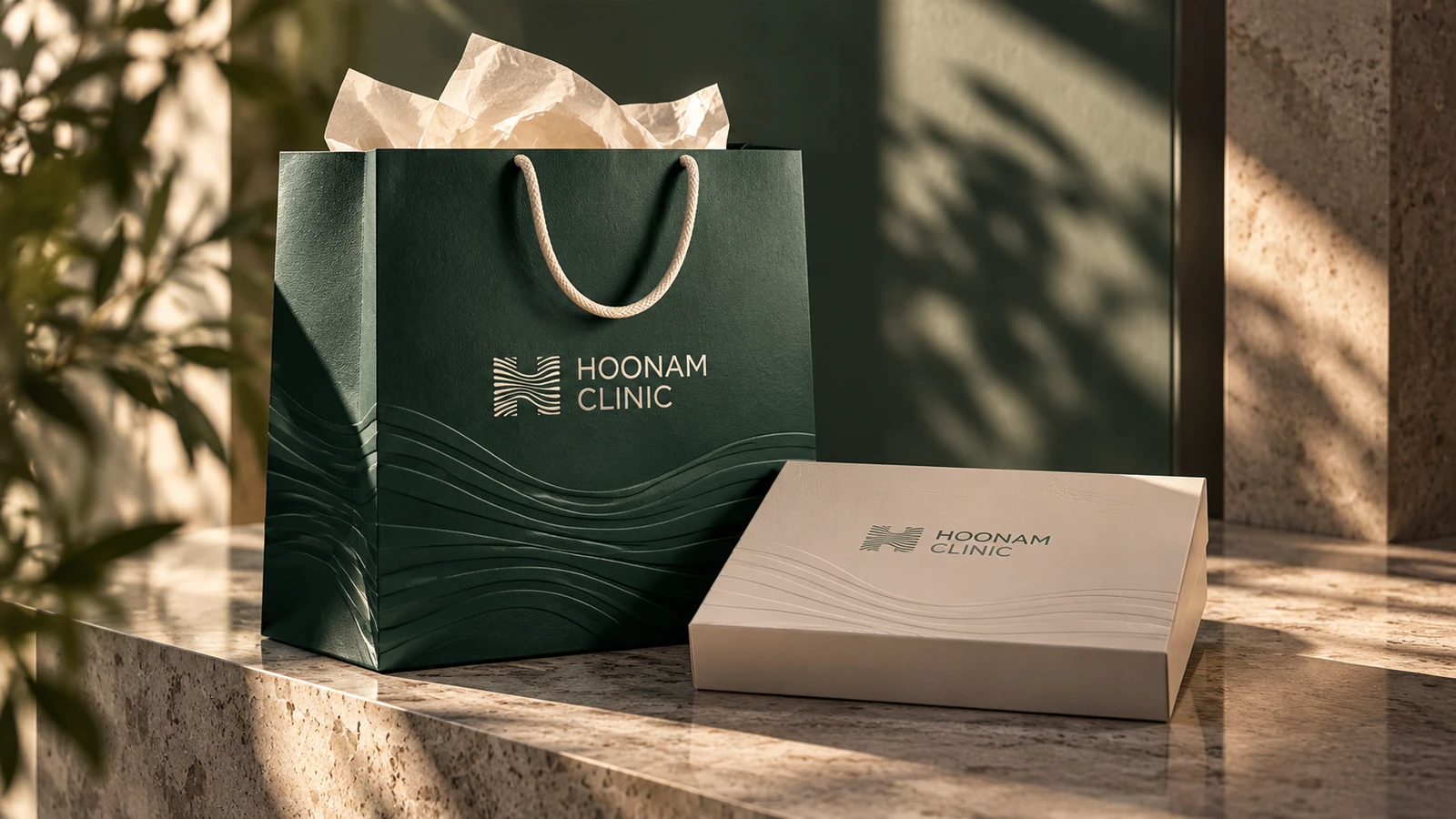
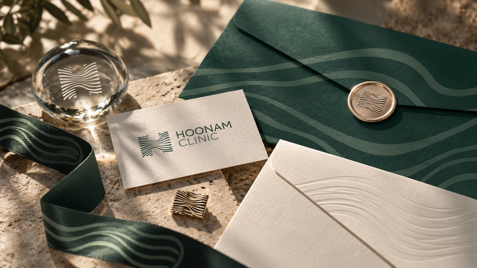
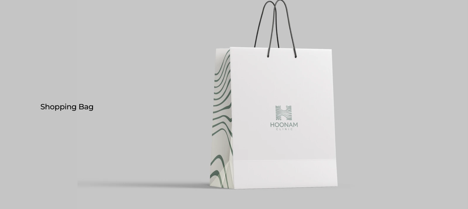
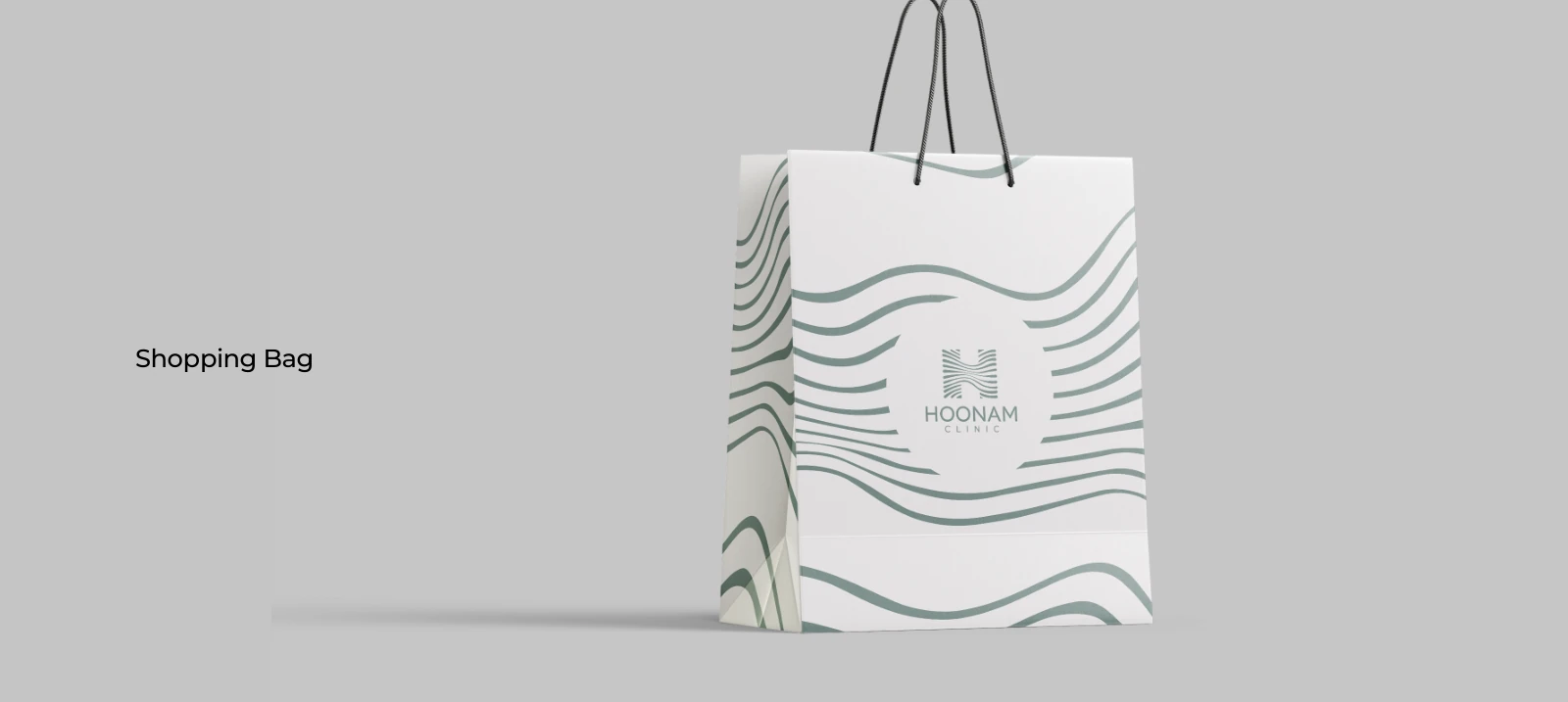
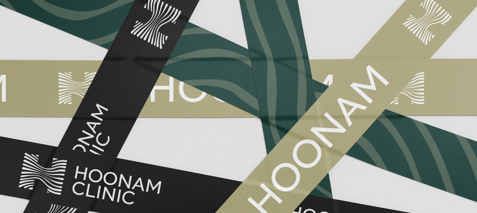
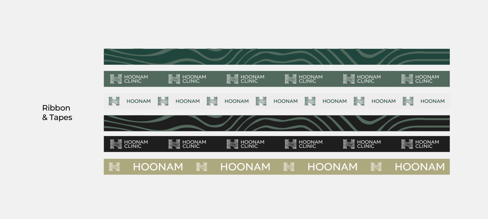
The existing shopping-bag, ribbon and stationery language becomes a coordinated take-home family. Deep green creates a recognisable exterior; lighter interiors make contents easy to see; the flowing line provides a quiet moment of discovery.
Paper weight, handles, closure and repeated use matter as much as the mark. The proposed bag and reusable pouch explore how a premium impression can come from fewer, better-resolved components.
10 · Original system & concept extension
Information deserves the same care.
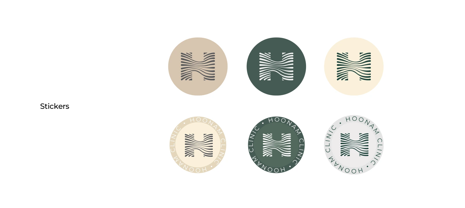
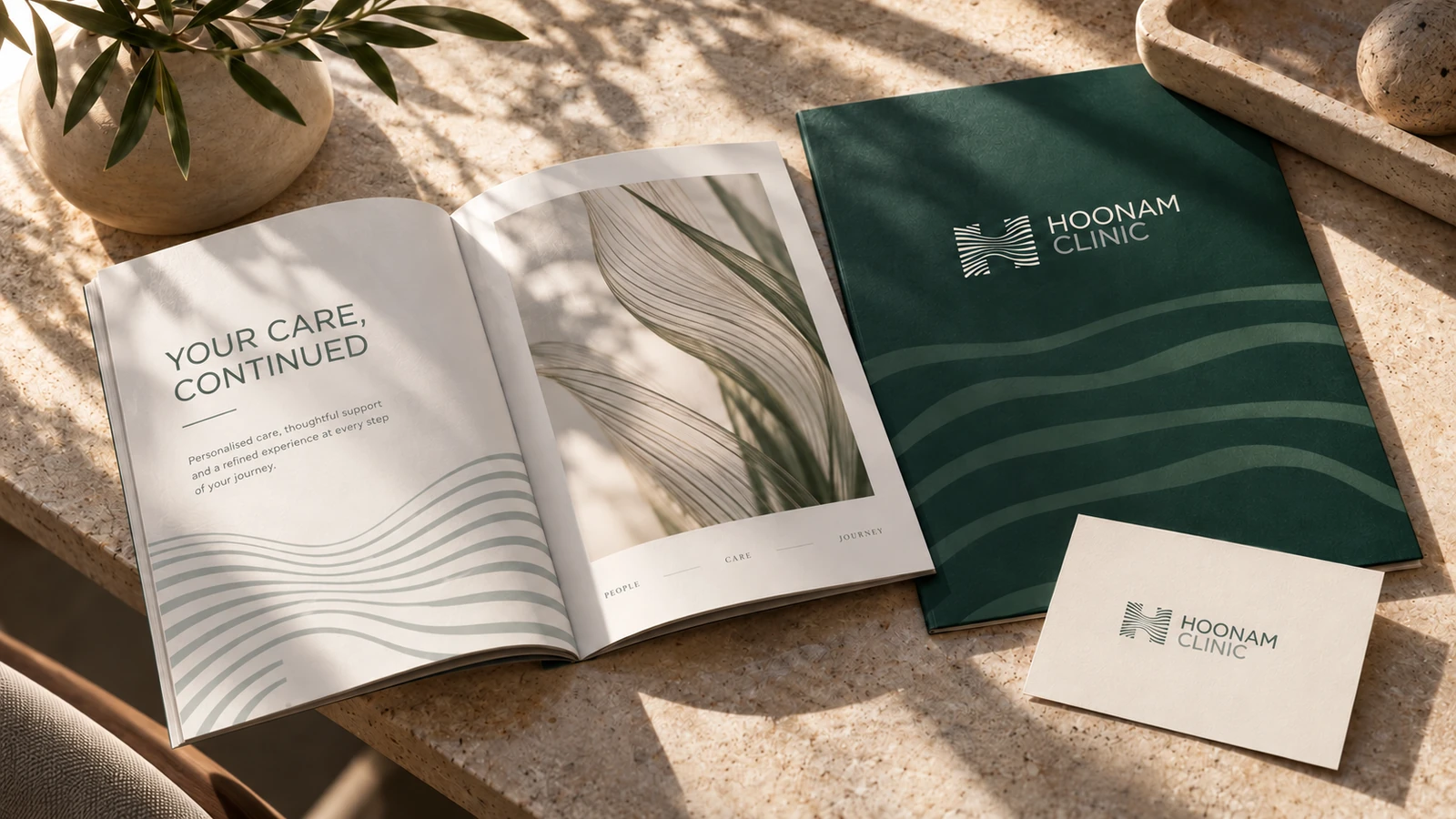
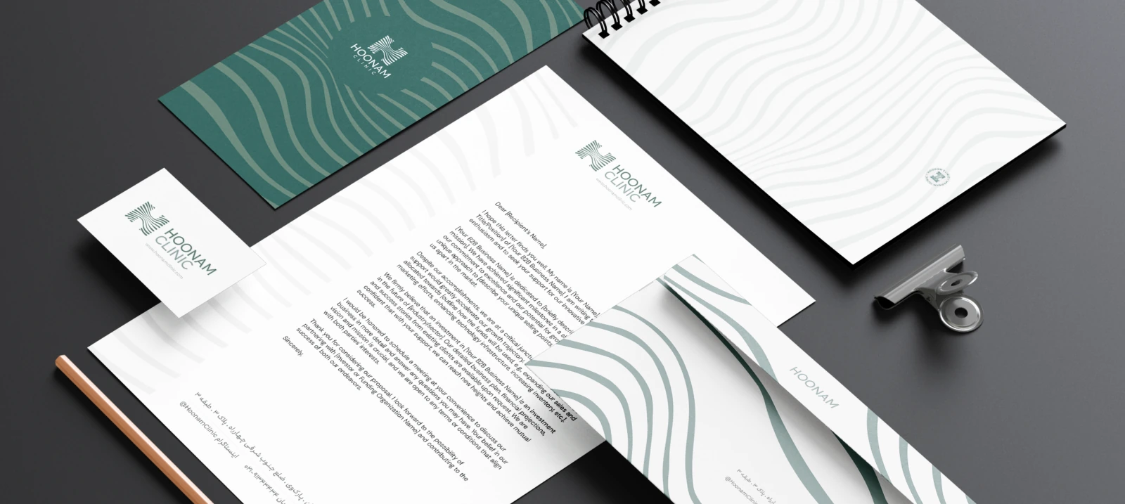
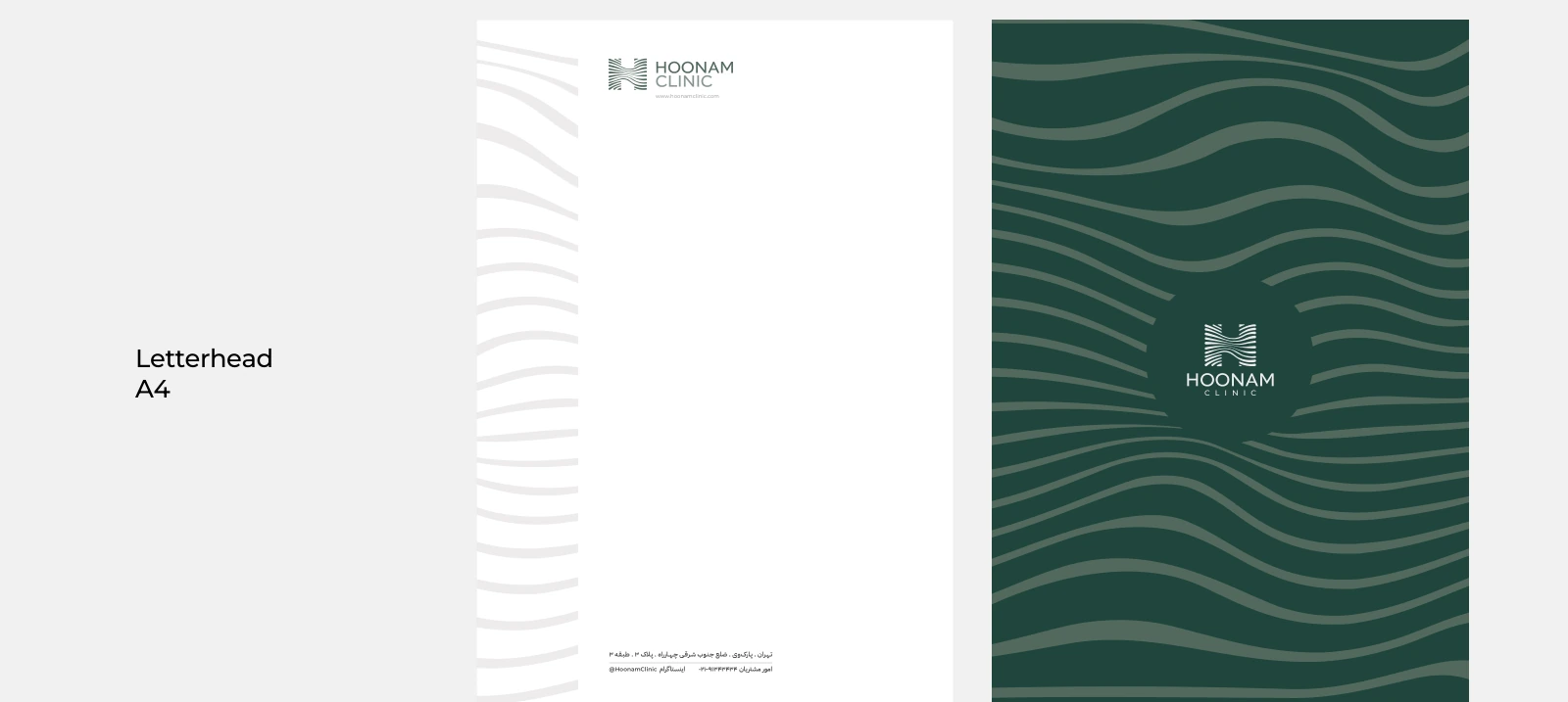
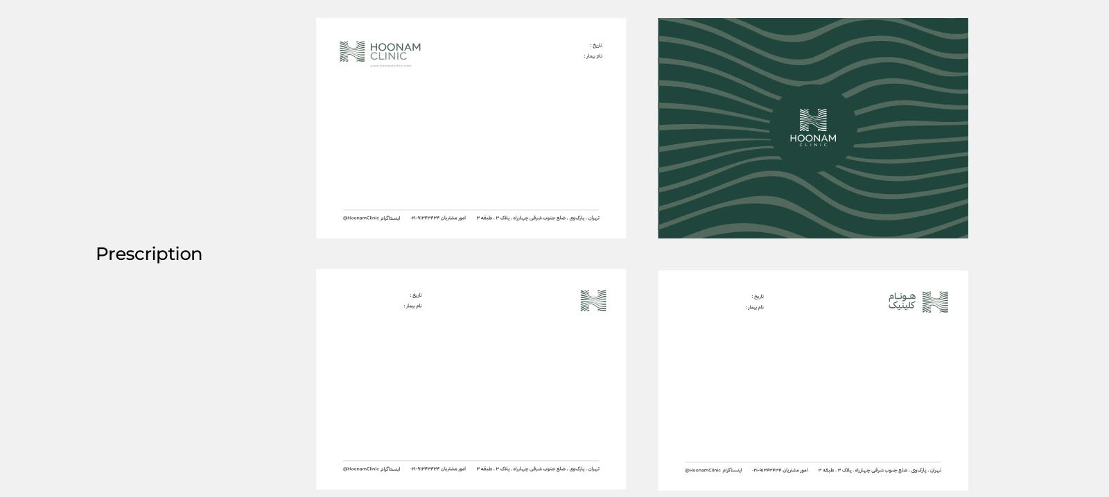
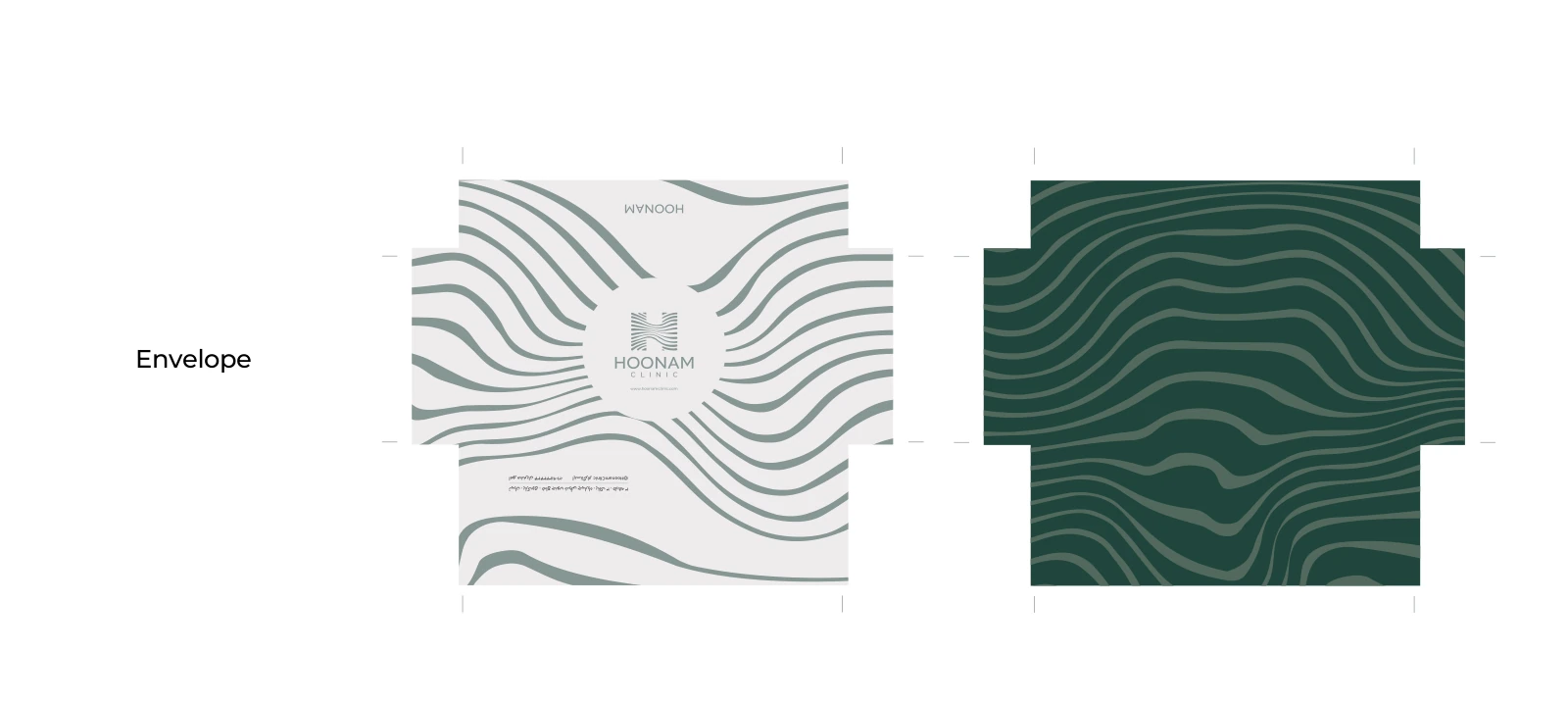
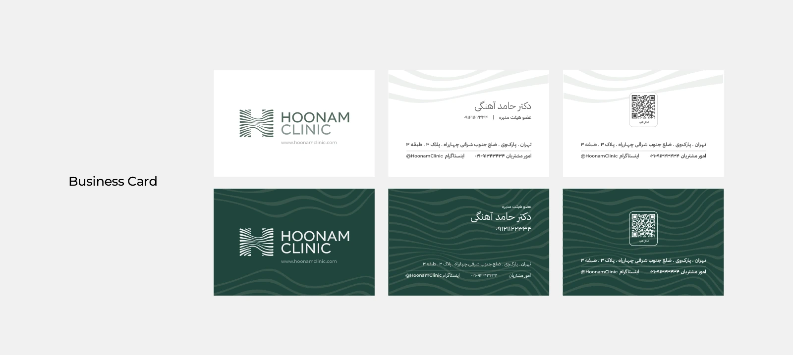
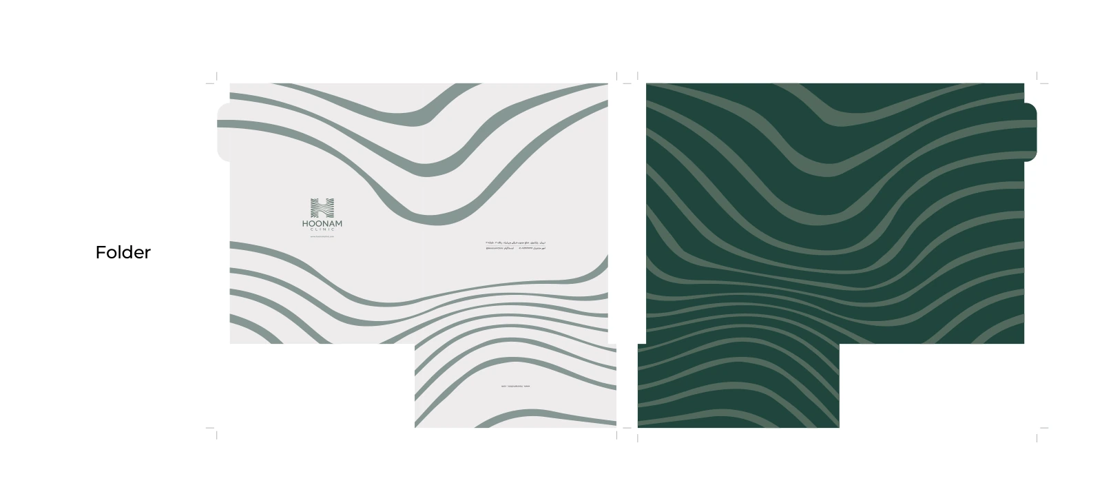
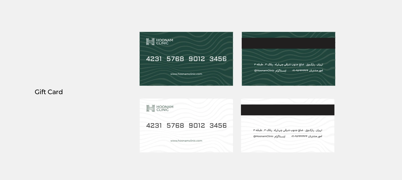
The original identity already covers letterheads, envelopes, business cards, folders, ribbons, stickers and gift cards. These establish a repeatable language for everyday communication, not just a presentation-day look.
The new patient booklet extends that discipline with more whitespace, clear sequencing and a restrained graphic rhythm. Its purpose is to help a person find and revisit important information after a consultation.
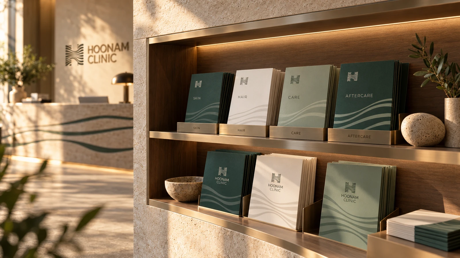
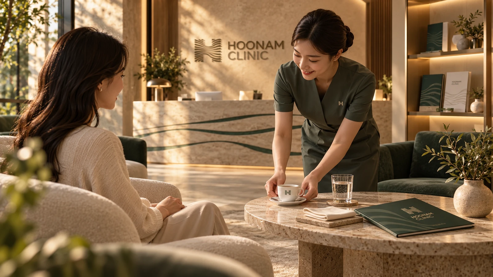
A reception library gives each care area its own brochure, organised in a built-in shelf. Nearby, a quiet coffee service extends the hospitality direction through the cup, tray and small printed details.
11 · Concept extension · Outdoor
A quiet presence at a larger scale.
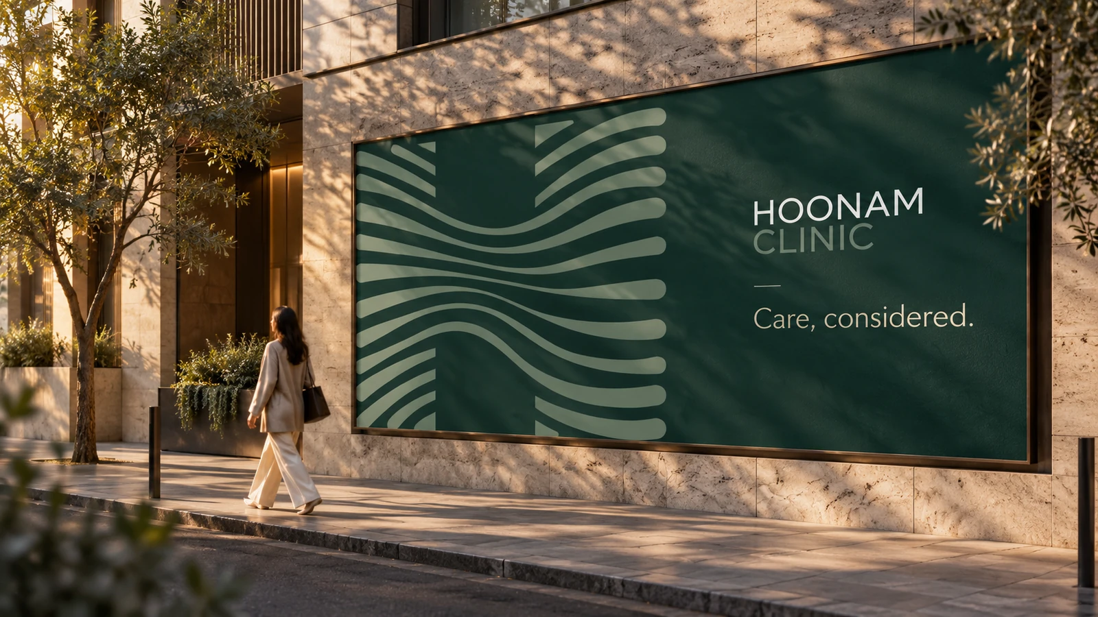
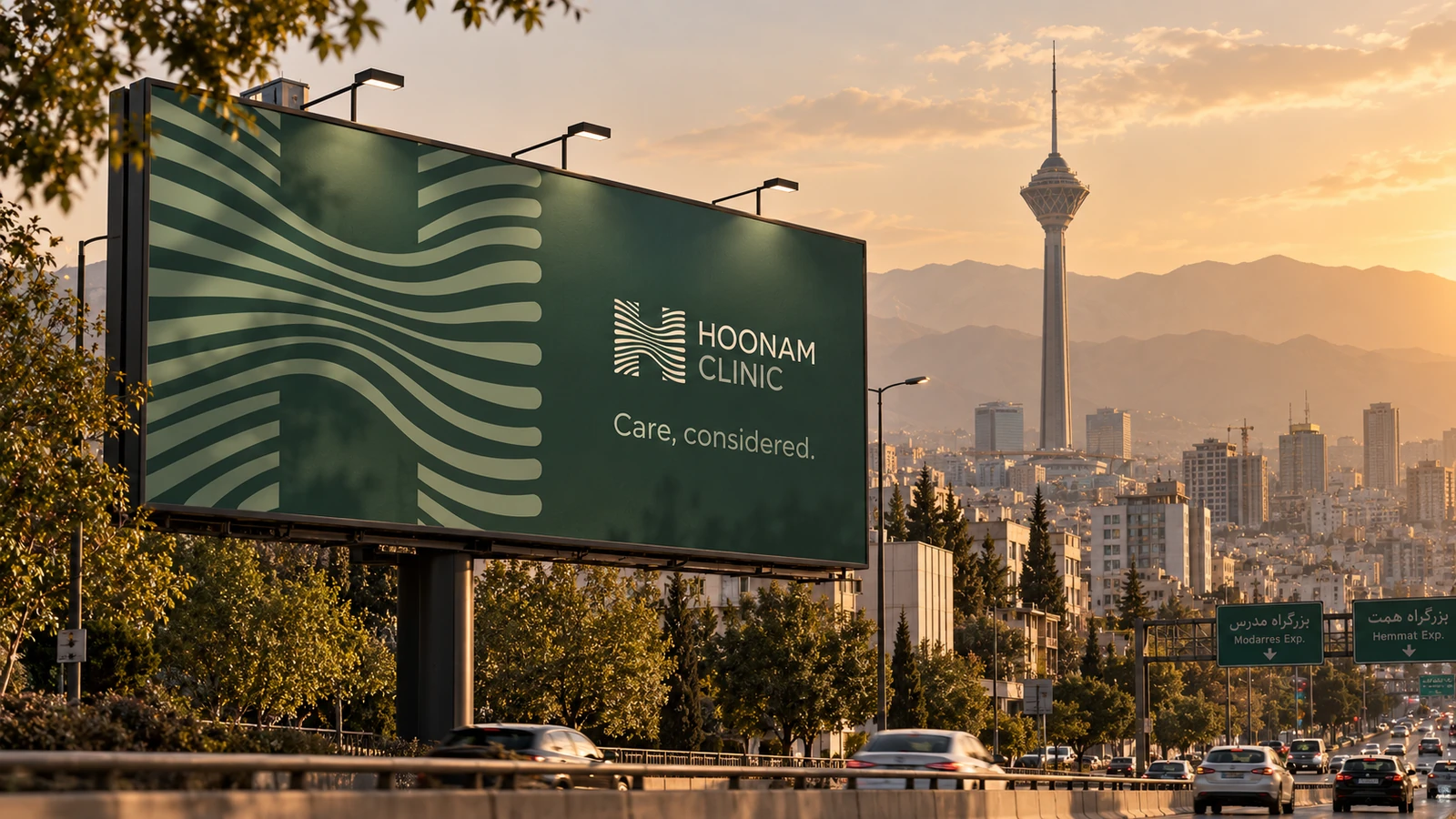
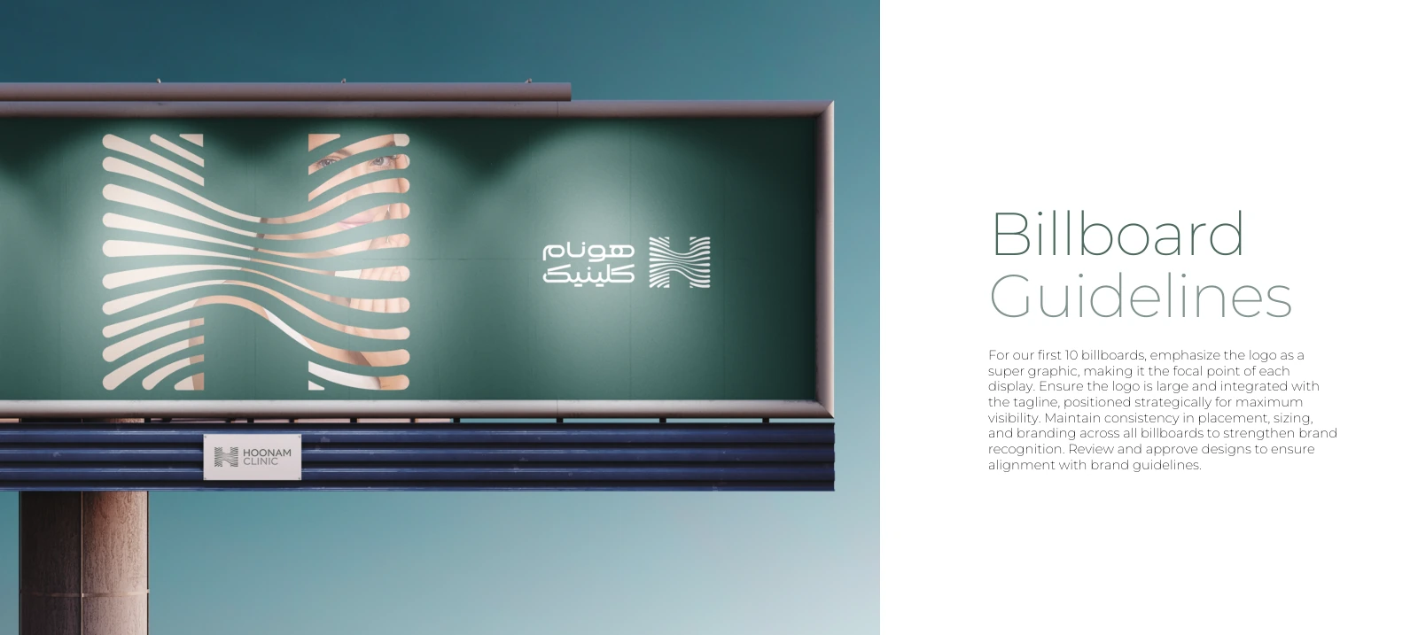
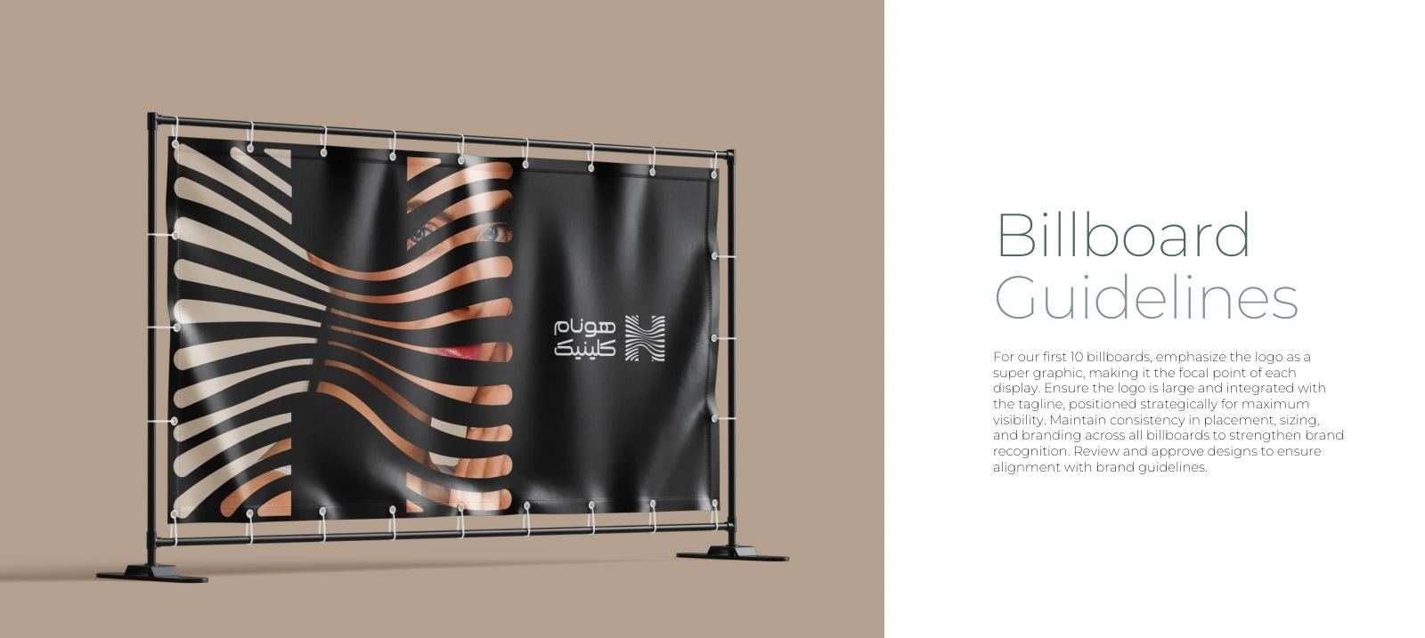
The brandbook proposes using the logo as a supergraphic in the first outdoor campaign. The new visualisation follows that principle: a recognisable field of green, a large flowing mark and very little copy.
Care, considered. introduces the proposed tone without promising a treatment outcome. Recognition comes from a consistent shape, colour and hierarchy that can be read in a passing glance.
12 · Concept extension · Interactive website
The same calm, on screen.
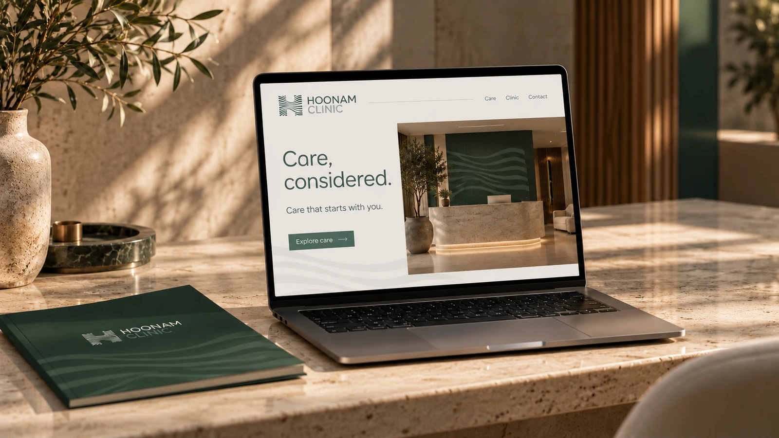
The website concept carries the identity into a clear, product-like journey: understand the care areas, meet the environment and explore the next step. English and Persian layouts preserve their own reading direction.
Try the responsive concept below. Care-category selectors, language switching, frequently asked questions and a consultation-planning preview are functional. The prototype does not send requests or make real bookings.
13 · A connected brand experience
One rhythm, across every encounter.
The original Hoonam identity provides the recognisable core. This expansion explores how that core can connect arrival, people, information, aftercare and digital discovery without making every surface look identical.
The 2024 brandbook is the source for the identity shown here. Eighteen AI-generated visualisations and the interactive website are concept extensions made for this case study. They demonstrate the proposed direction; implementation and production would require the clinic’s review.