01 · The starting point
Make the first impression catch up.
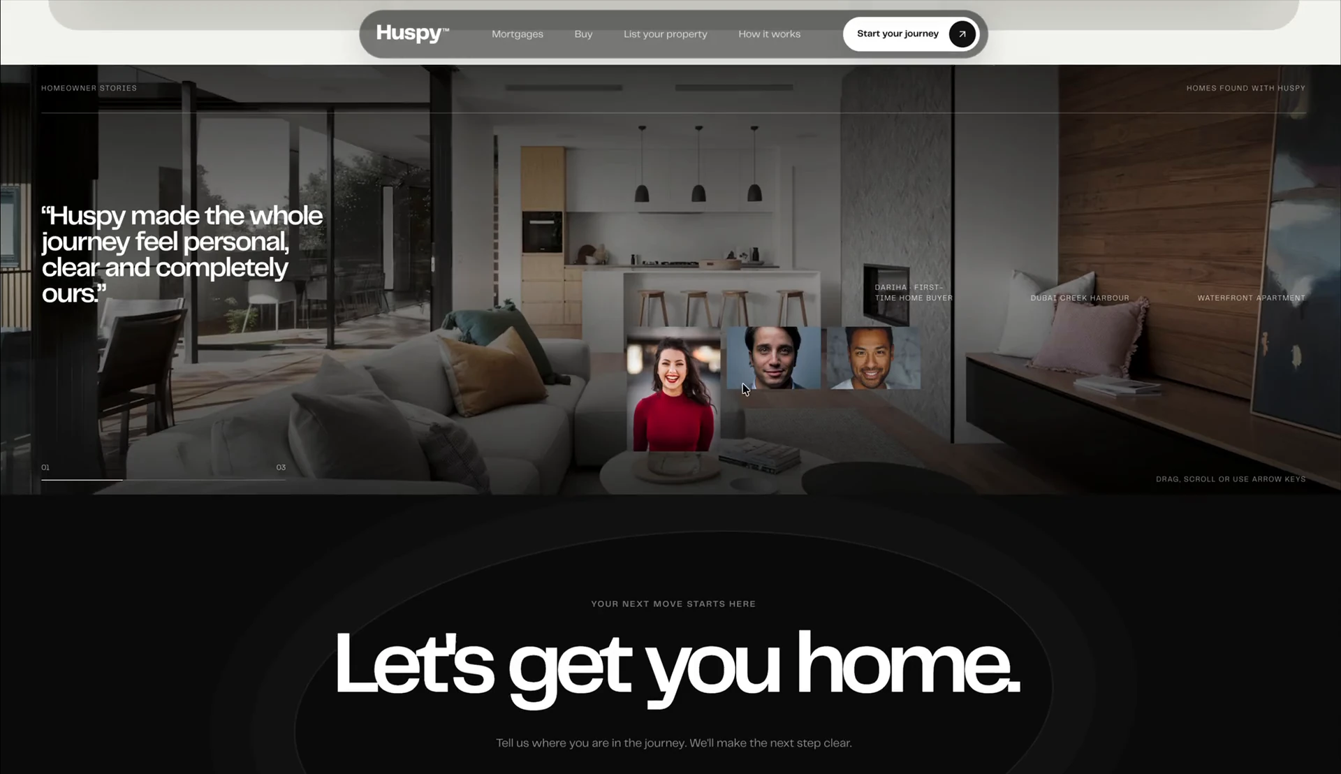
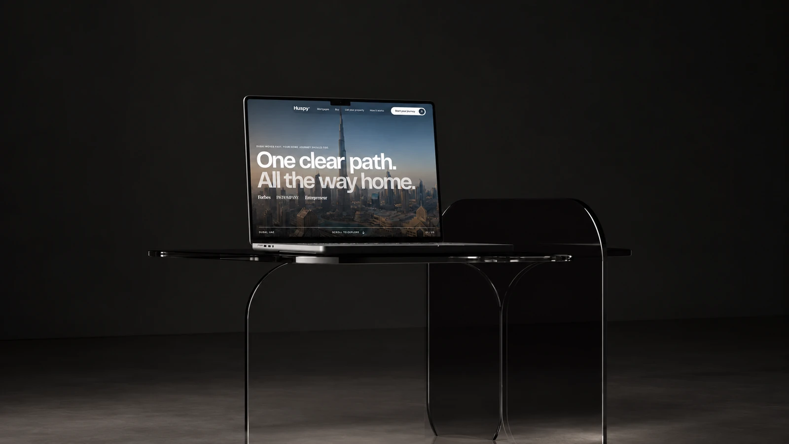
The starting observation was a gap between Huspy’s reputation and its digital presence. People knew the business and spoke well of it, but the website did not communicate the same level of scale, professionalism or confidence.
My brief was to bring that credibility into the experience itself: a contemporary website that helps visitors recognise the business behind the name, from their very first impression.
02 · Visual strategy
A more confident digital presence.
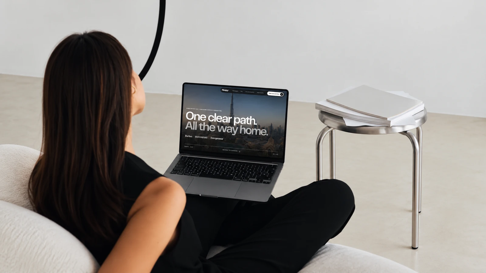
I built the direction around large, purposeful imagery, strong typography and a restrained visual frame. The website needed to feel current and premium while keeping the services easy to understand.
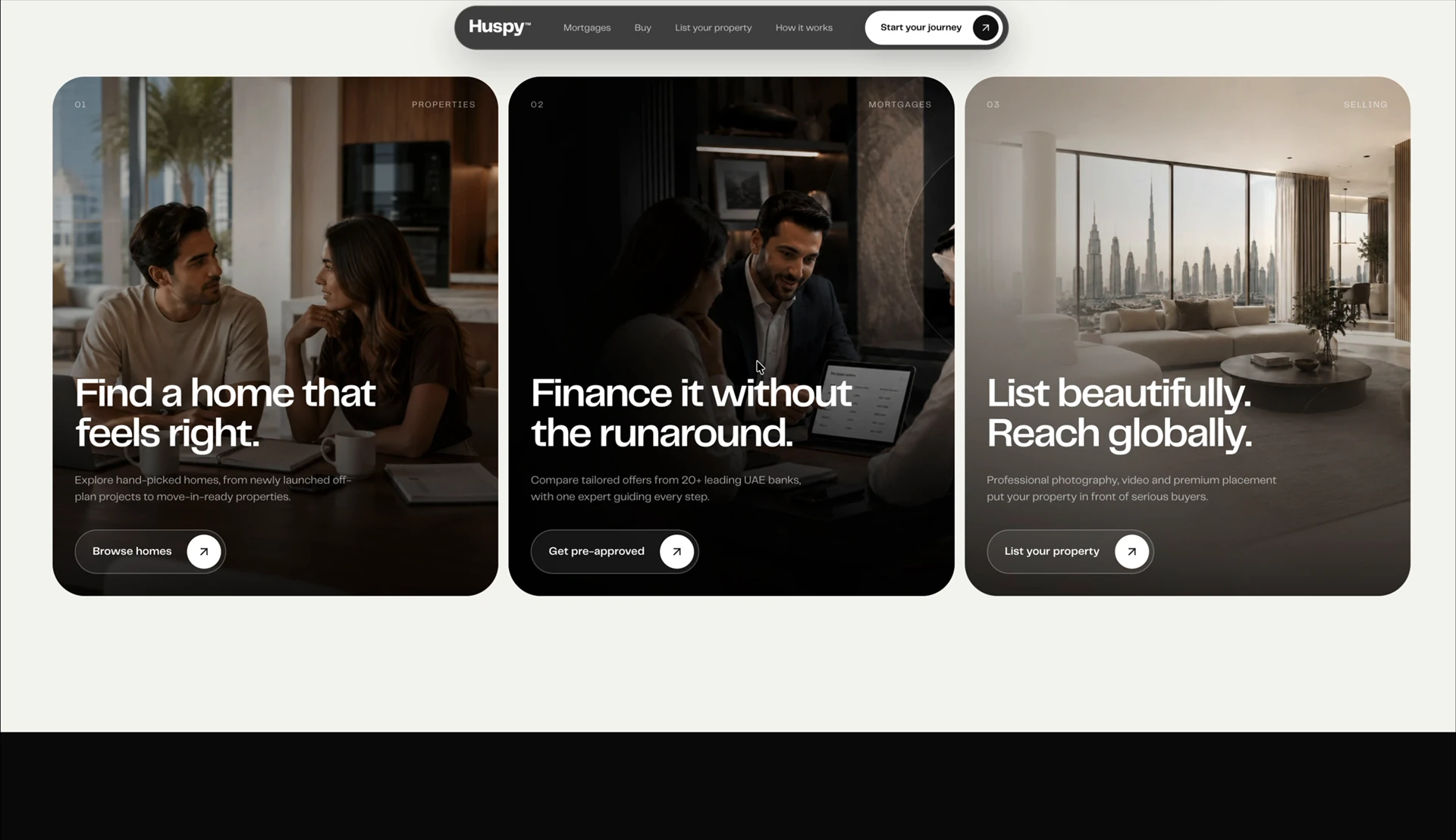
Buying, financing and selling each receive a distinct visual introduction. Instead of asking one block of content to explain everything, the page gives each part of the business its own space and a clear next step.
03 · Local context
Recognisably at home in the UAE.
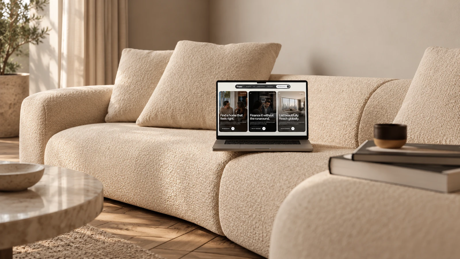
The imagery connects the brand to the environment it operates in: Dubai’s architecture, contemporary interiors and the people involved in finding and financing a home.
That local context is part of the art direction. It gives the site a sense of place and makes the service feel connected to the everyday decisions, expectations and ambitions of its audience.
04 · Content and hierarchy
One section. One clear purpose.
Each section is dedicated to a specific part of the story. Services introduce the offer, neighbourhoods support exploration, property cards reveal the details, and the journey section explains what happens next.
Consistent spacing, a clear heading hierarchy and deliberate changes of visual pace help the eye move through the page. The aim is a richer presentation that remains easy to scan.
05 · Exploring the city
A place before a property.
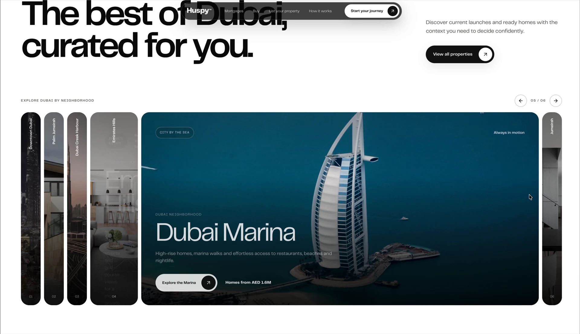
Neighbourhoods are presented as places to imagine living in, with generous photography and a focused accordion interaction. The active area opens up while the other destinations remain visible and available.
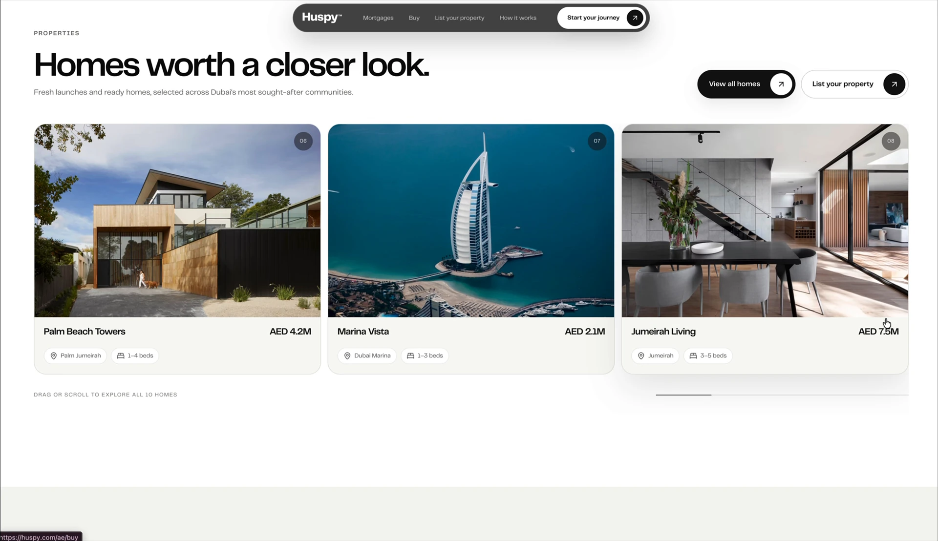
The property collection then brings the experience back to concrete options. Images, location, price and key details have a consistent hierarchy, so browsing can move from inspiration to comparison.
06 · Supporting the next step
Make the next move easier to understand.
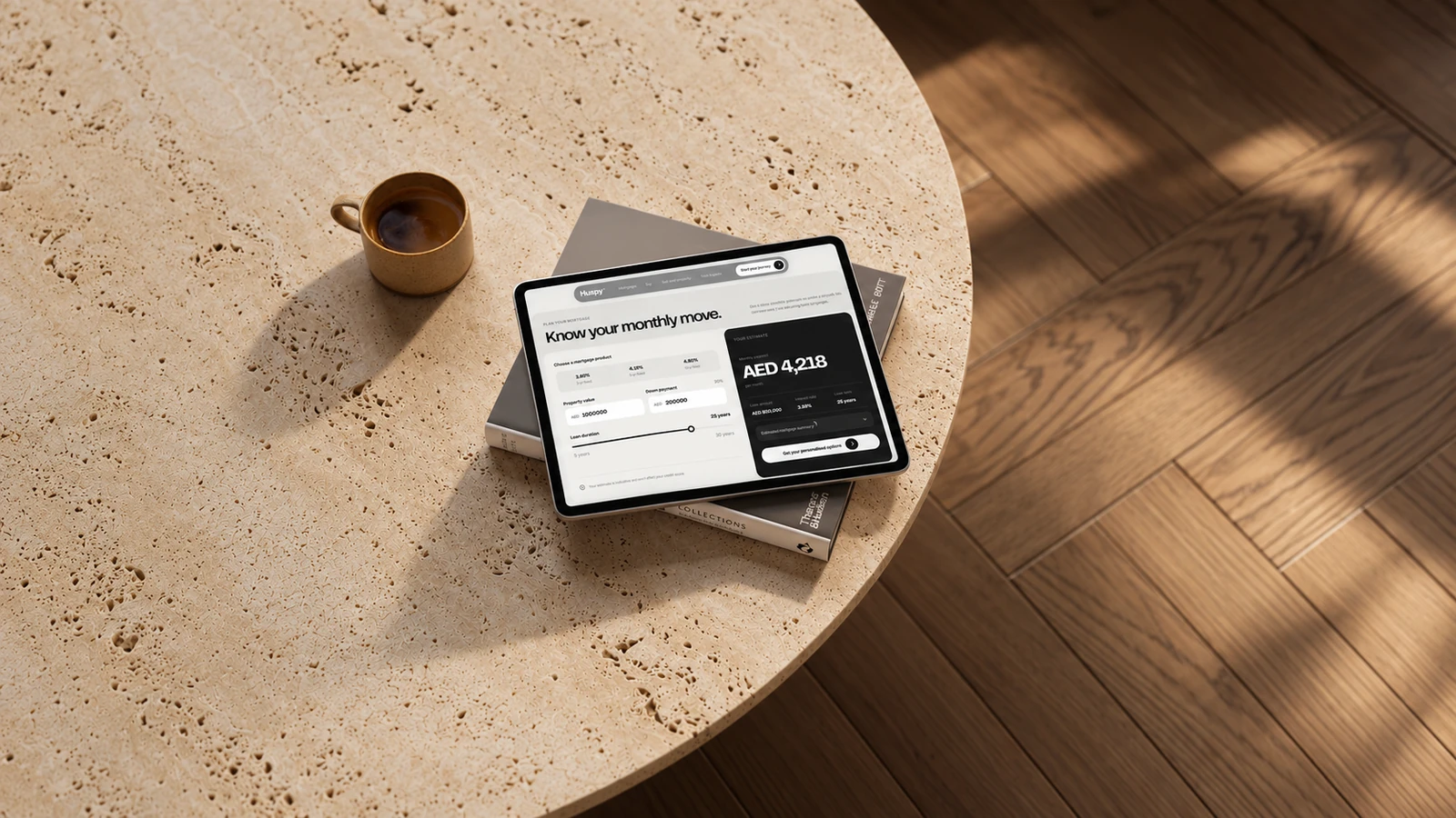
The premium presentation is paired with practical tools. The mortgage calculator makes the relationship between property value, down payment, loan duration and estimated monthly payment visible in one place.
A clear distinction between inputs and the estimate helps visitors understand what they can change and what the result means. The next action stays close to that result.
07 · Device presentations
One visual direction, wherever it is seen.
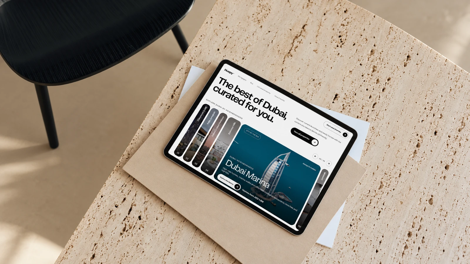
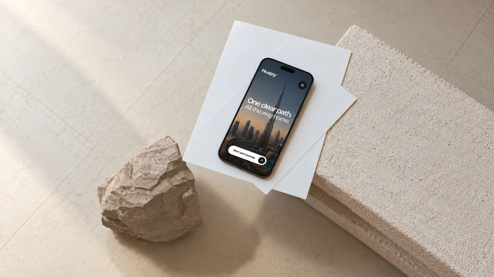
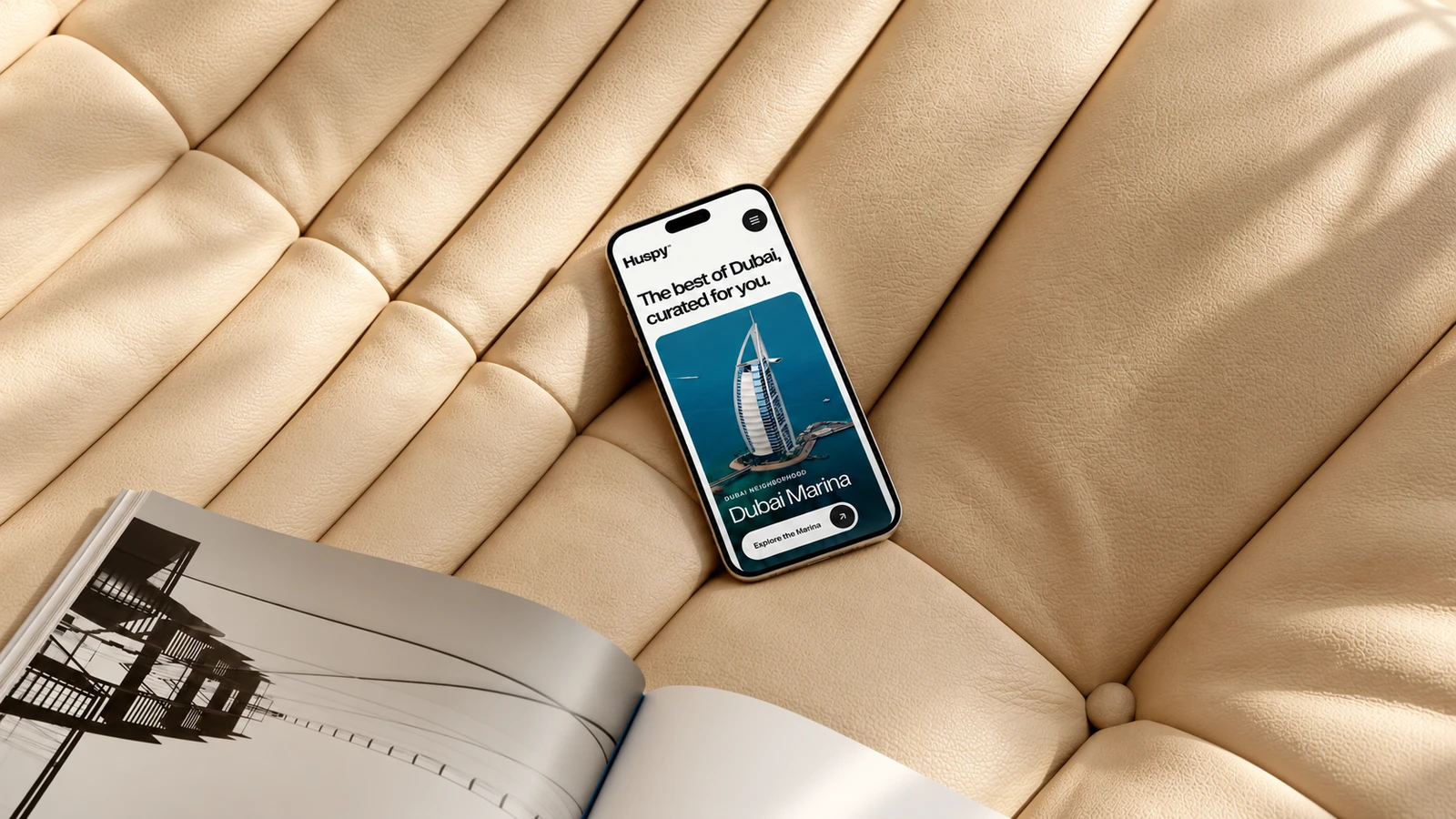
The direction carries from cinematic desktop sections to compact mobile presentations: a recognisable brand, strong imagery and a clear hierarchy rather than unnecessary visual noise.
The device mockups bring different parts of the website into quiet, minimal settings. The live experience below lets you explore the actual interactions and responsive layout.
08 · Explore the website
Experience the redesign.
Scroll through the live website, explore the neighbourhoods, browse the property collection and try the mortgage calculator. You can switch the embedded view between a wide layout and a phone-width presentation, or open the website in its own tab.
09 · The design outcome
The same business. A clearer first impression.
The redesign makes the business easier to see: its range of services, its connection to the UAE and the human support behind the home-buying journey.
The result is a more contemporary, structured presentation of the brand, with premium visuals and focused sections working together to express the confidence that people already associated with Huspy.